Welcome to your design gallery! It's a bit of a rough layout, but it should serve our purposes. I'll upload everything to this page, and as I make changes I'll keep a dated log at the top of the page here with notes about what we discuss.
7/15 7:00: letterhead and envelope mockup
When I asked you about having a back design to the letterhead, I was looking at moo.com's ordering system, which includes a back print as part of the cost. I know you order your business cards from moo, so if you'd like to order letterhead from there as well then a back design might just be a fun free extra. They are also having a 25% off sale until July 21st, so I'll try to wrap this up before then :)
Depending on what angle your screen is at, you may or may not be able to see the flourish on the bottom. It should appear like a watermark when printed.
I wanted to include some text so that you could see the letterhead in context, but I don't know what you normally write (I still need to give Veronica a call.) So I decided to include an actual letter! This is an abbreviated version of a really amazing letter from this website: http://www.lettersofnote.com/2012/01/to-my-old-master.html
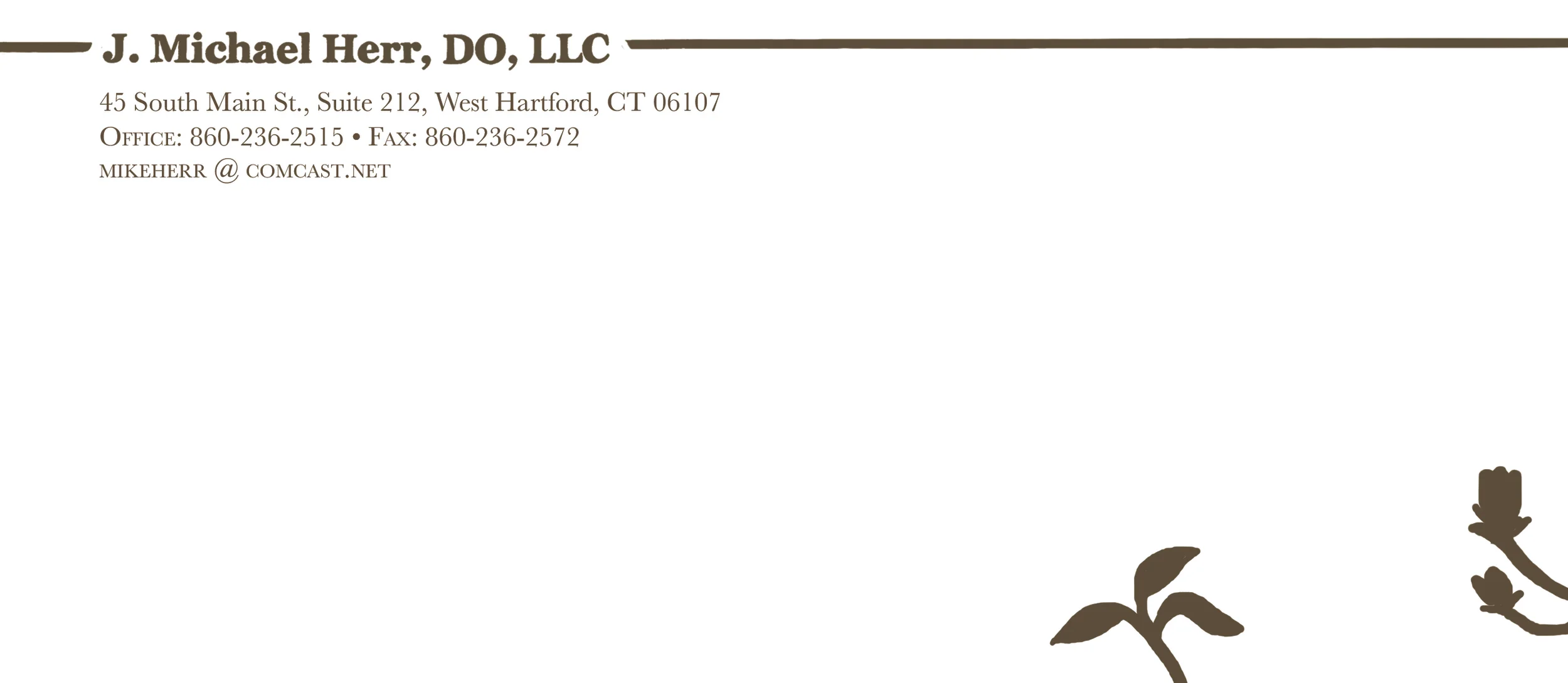
Here's a fancy mockup of the envelope, front of letterhead, and back of letterhead.
7/3 1:00: business card mockups
These would be 2-sided cards, with your name on the front and contact info on the back.
Option A: black and white
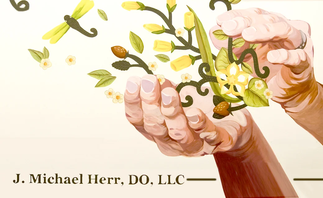
Option B: hands
4/22 9:41: first final design for review.
first final design for review


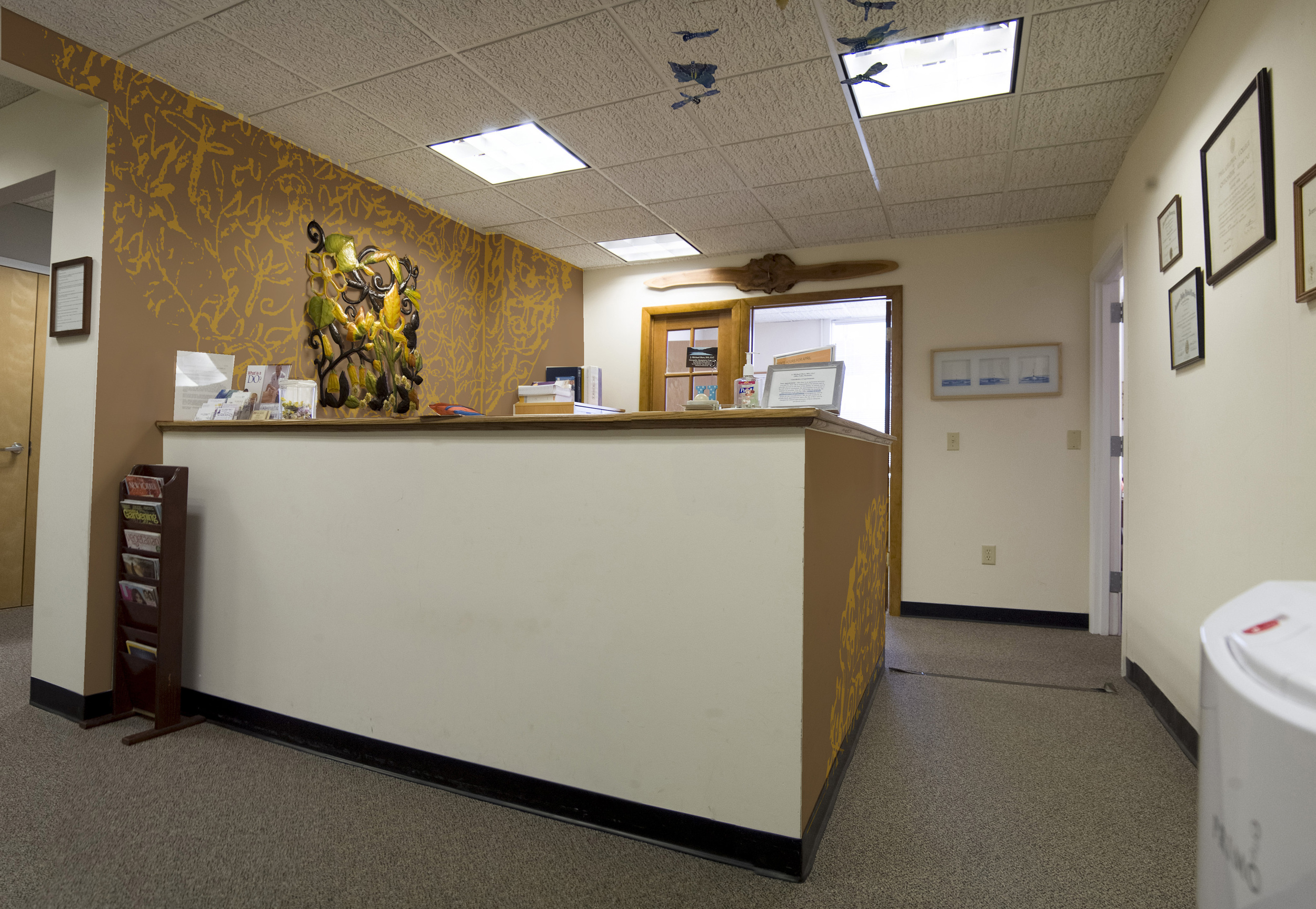
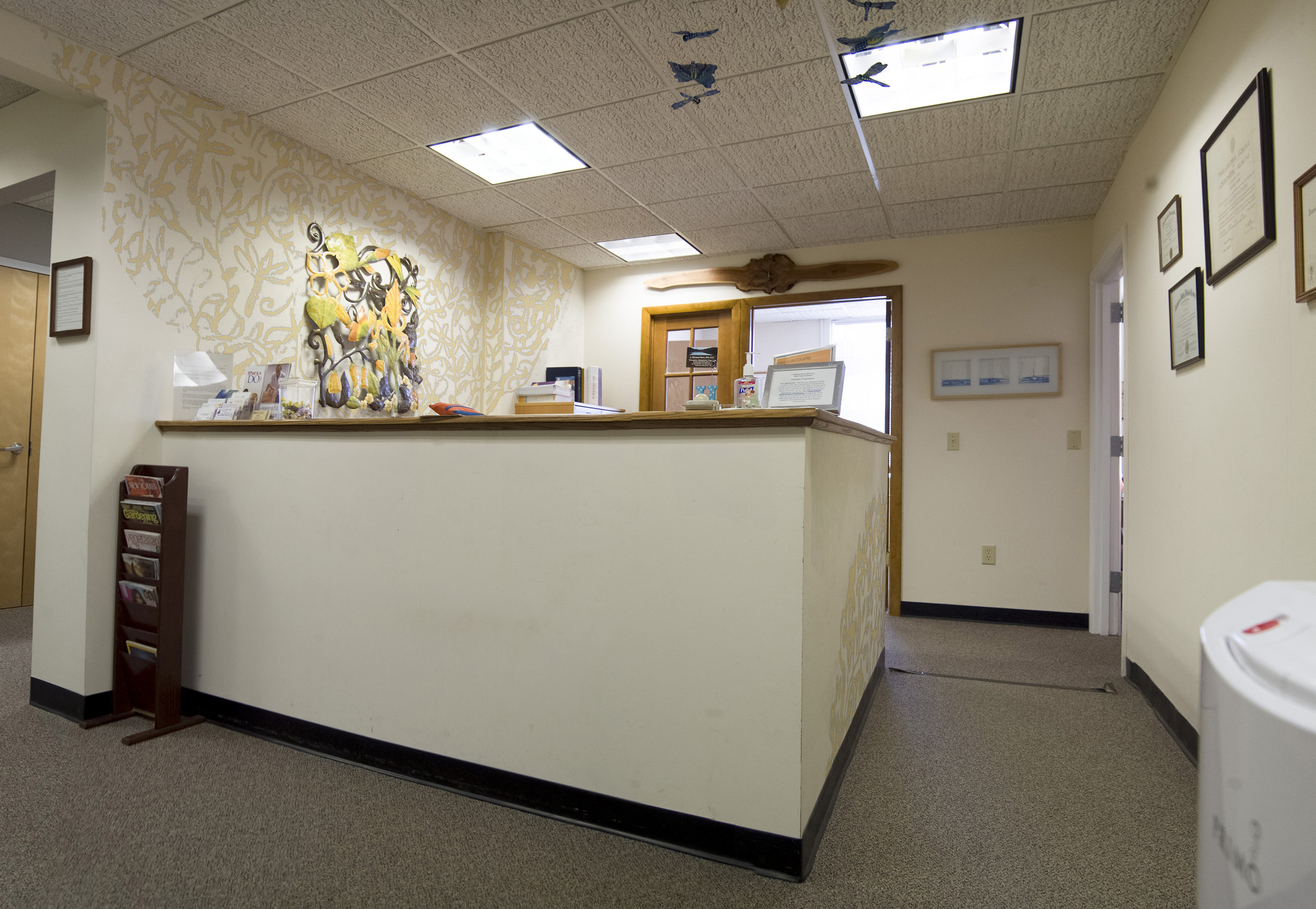
These are images of 3D renders of your office based on the measurements I took. They're what the next images are based on. (click to zoom in)
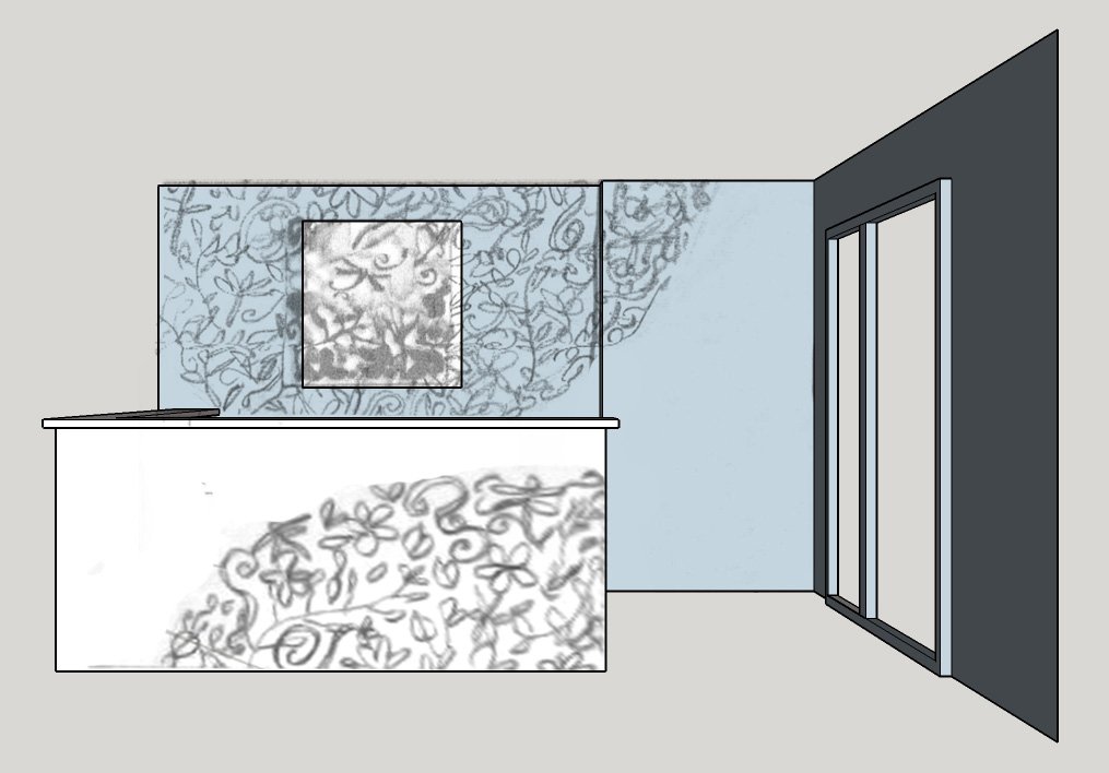
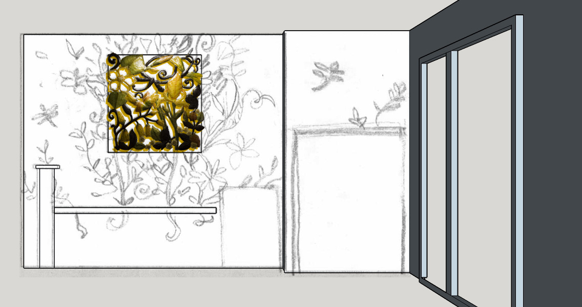
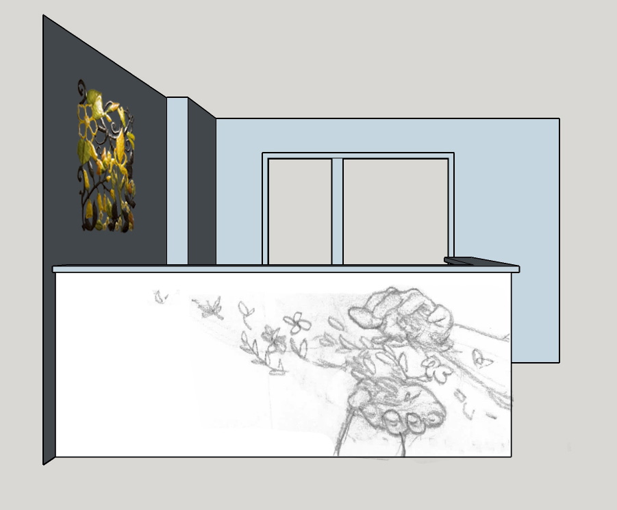
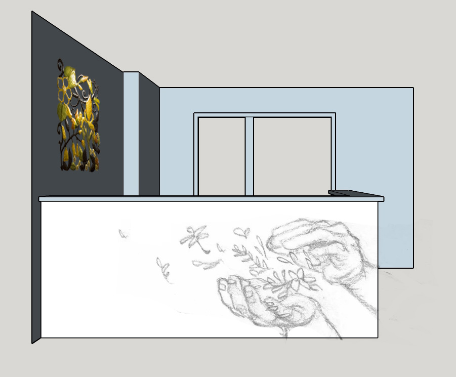
As you can see there are a couple of options for each spot. After laying these out I put them in some actual pictures of you office, to get more of a sense of space.
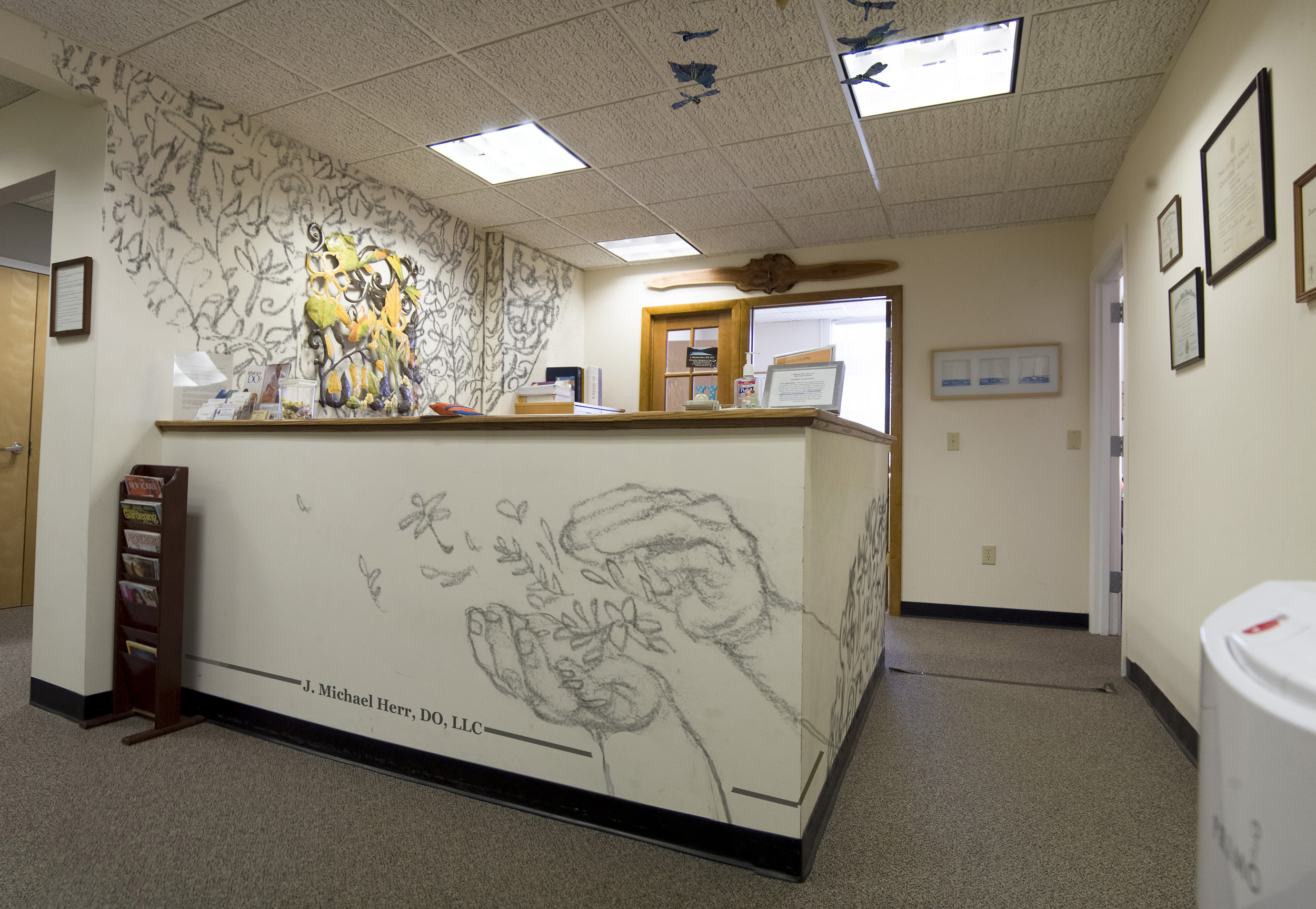
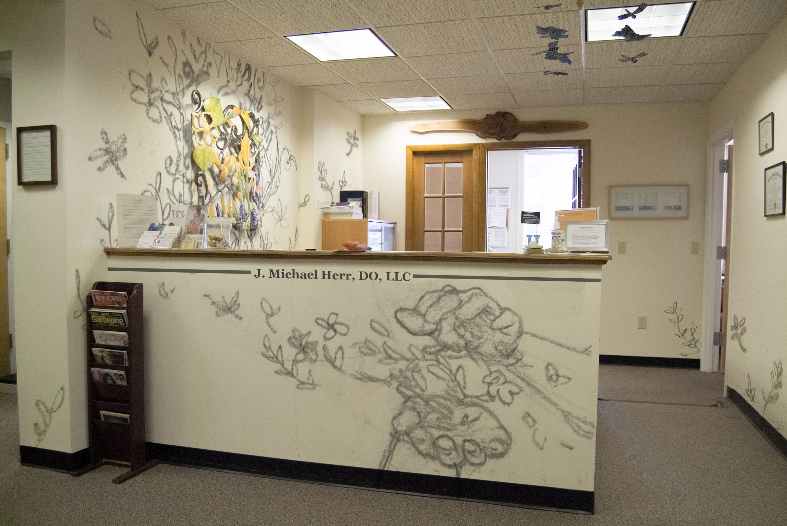
There are two different ways the hands can be arranged with your name. Here are all four resulting possibilities:
(click to zoom in)


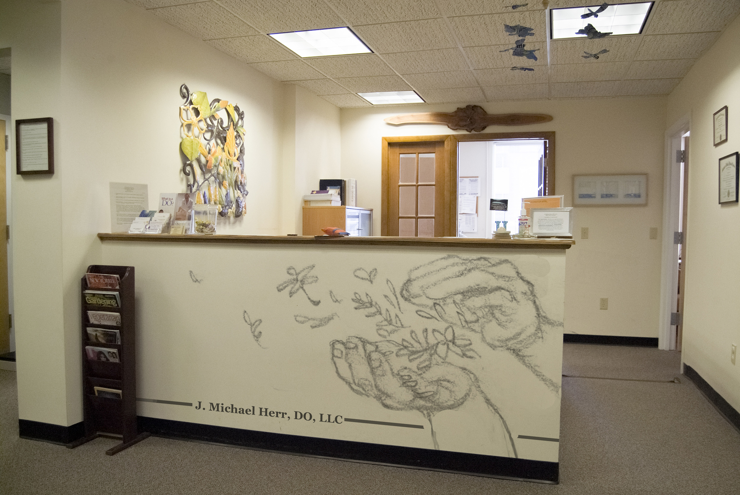
That's all of the possible layouts, but don't stop scrolling yet - there are more choices to be made!
Hands style:
- similar to the metal art - maybe in pattern's colors, simpler, heavily stylized, reliant on line for volume.
- more realistic - realistic colors, somewhat stylized with flat shapes (rather than realistically modeled), an interesting contrast, my preference
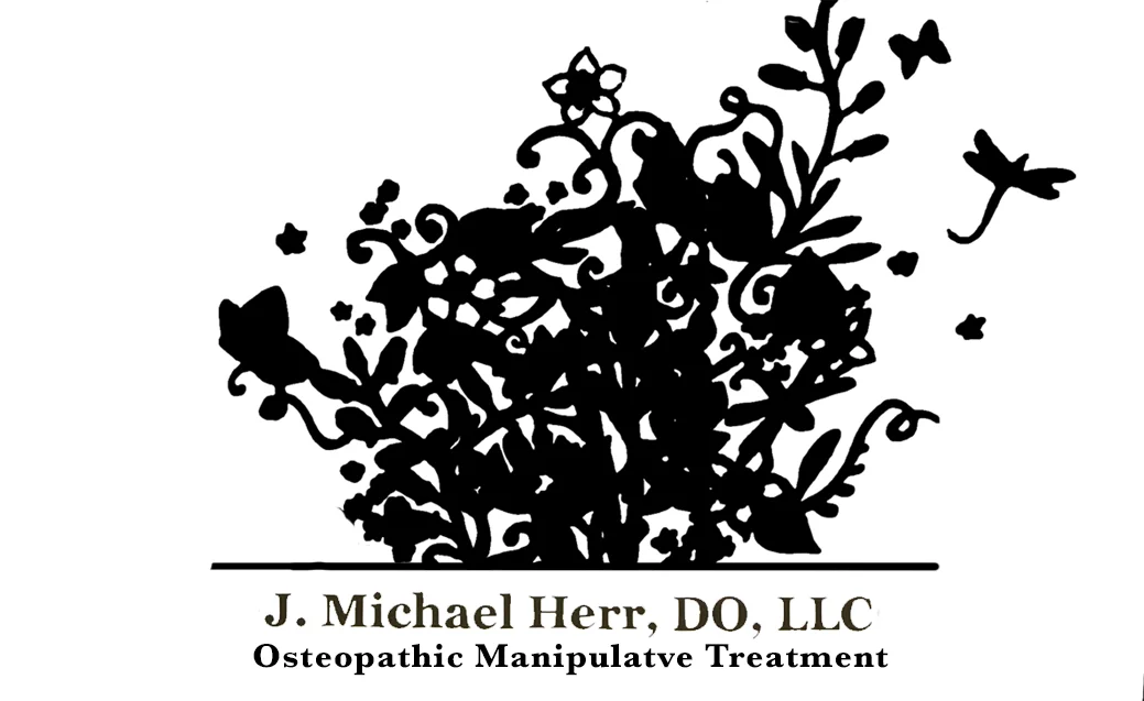
metal art (click)
more realistic (click)
Pattern style:
- similar to the metal art - flat, full color, detail lines etc
- flat with details - one color, with detail lines
- silhouette - one color, possibly close to the wall color... a MUCH subtler choice.
(click)


Wall Color:
- as is, with the necessary new coat in places where the mural will be (absolutely recommended for pattern style: metal art)
- accent wall possibilities! (best with one-color pattern)
(click)