
colorful decadence
RICH PAINTERLY TEXTURE, SATURATED COLORS
IMPROVISED ON THE WALL
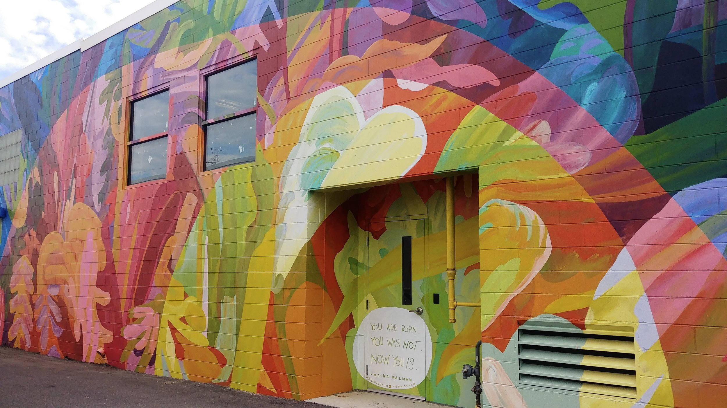
This wall is squinched between a few buildings in Scott’s Addition, an old industrial neighborhood in Richmond, VA that now has fresh crops of co-working spaces, luxury apartments, breweries, etc. This mural adds some life to an otherwise sterile alley between an excellent coffee shop (Afterglow) and an extraordinary restaurant (Brenner Pass) and my now-deceased favorite coffee shop in the city (Chairlift, RIP)
There's a mix of concepts that got me to this final design, including trust, safety, passing time, and the complex beauty of the world around us. I designed and painted this in the first couple months of the COVID-19 lockdown period, just before some of the first moments of the 2020 uprising. Even though it’s one of my more abstract designs, it’s very informed by that deeply charged period of time.
I think that the doorway is an interesting feature of the wall, so I used it as a place for people to 'find' a quote that ties into my inspiration for the design, led there by the rest of the composition. “You are BORN. You was NOT. Now you IS.” is a quote from Chicken Soup, Boots by Maira Kalman. It’s an amazing kid’s book about all the ways you can live your life, as long as you’ve got it.
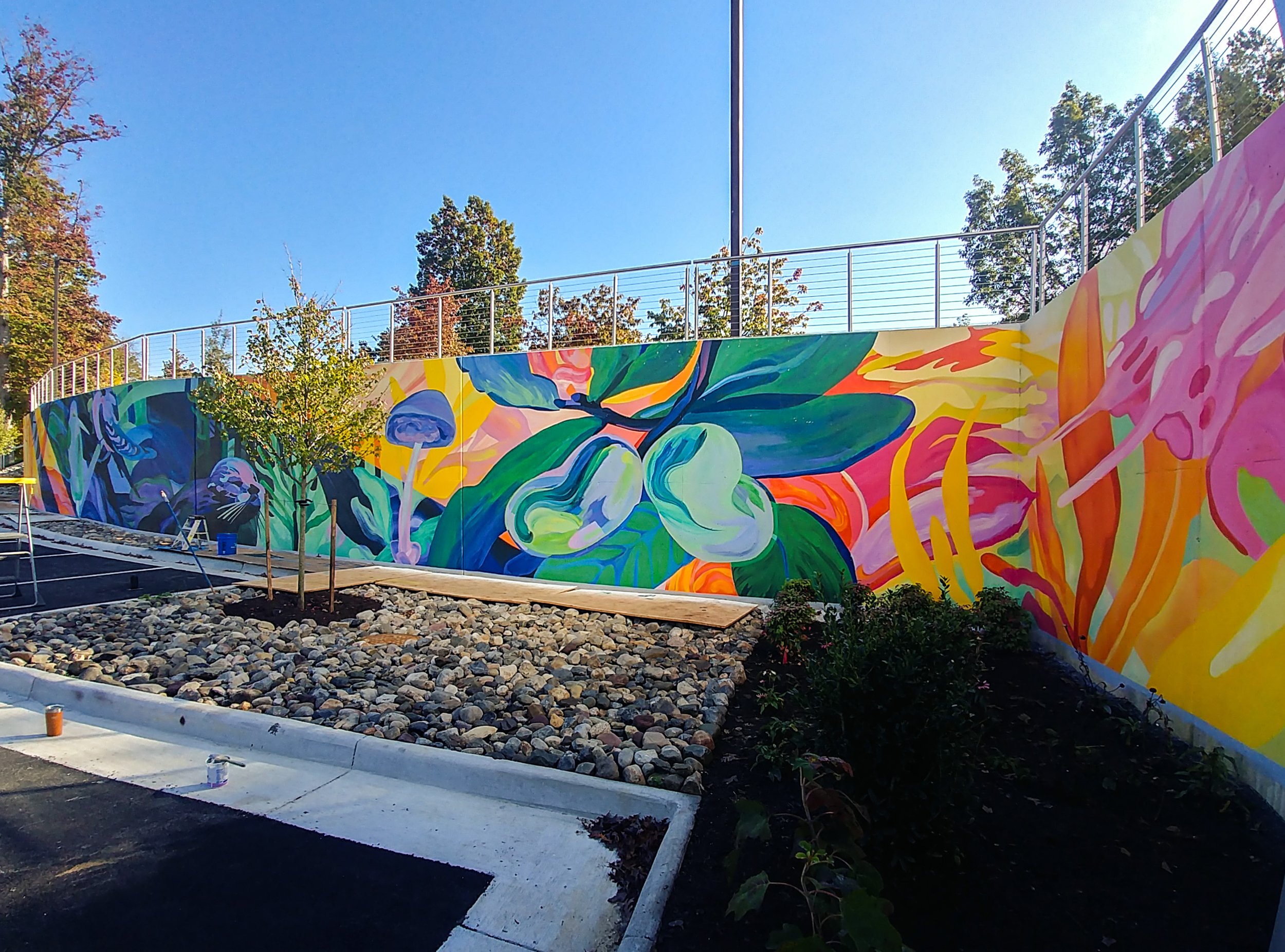
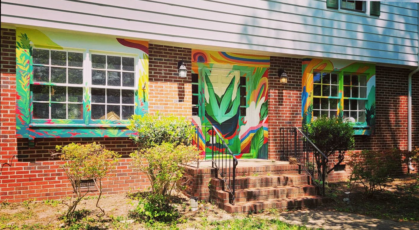
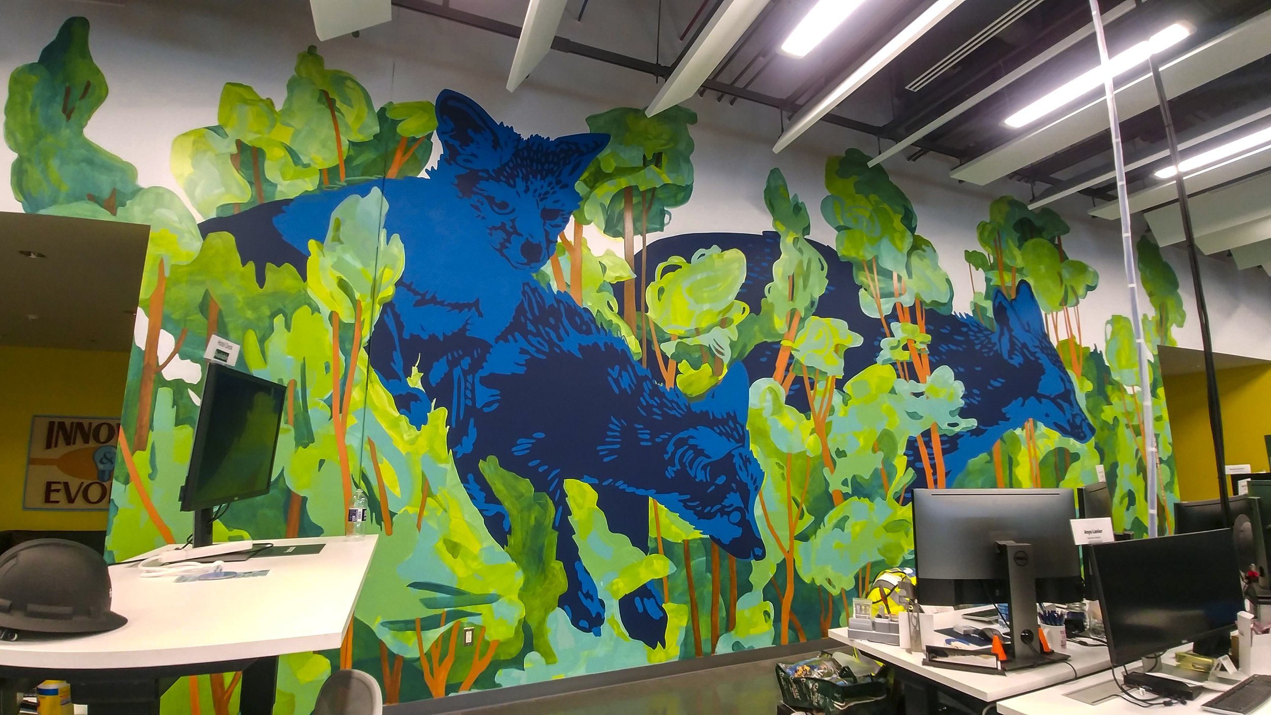
Way out on the edge of the city of Richmond, just past the airport, Meta née Facebook built a data center. 90% of the building is for the electronics, and in the last 10% they did a lot to make the meatspace pleasant for their employees.
I seek to bring an illustrative mindset to muralism, creating a sense of place, character, and narrative. In such a digital environment, an injection of the natural world acts as an agent of balance.
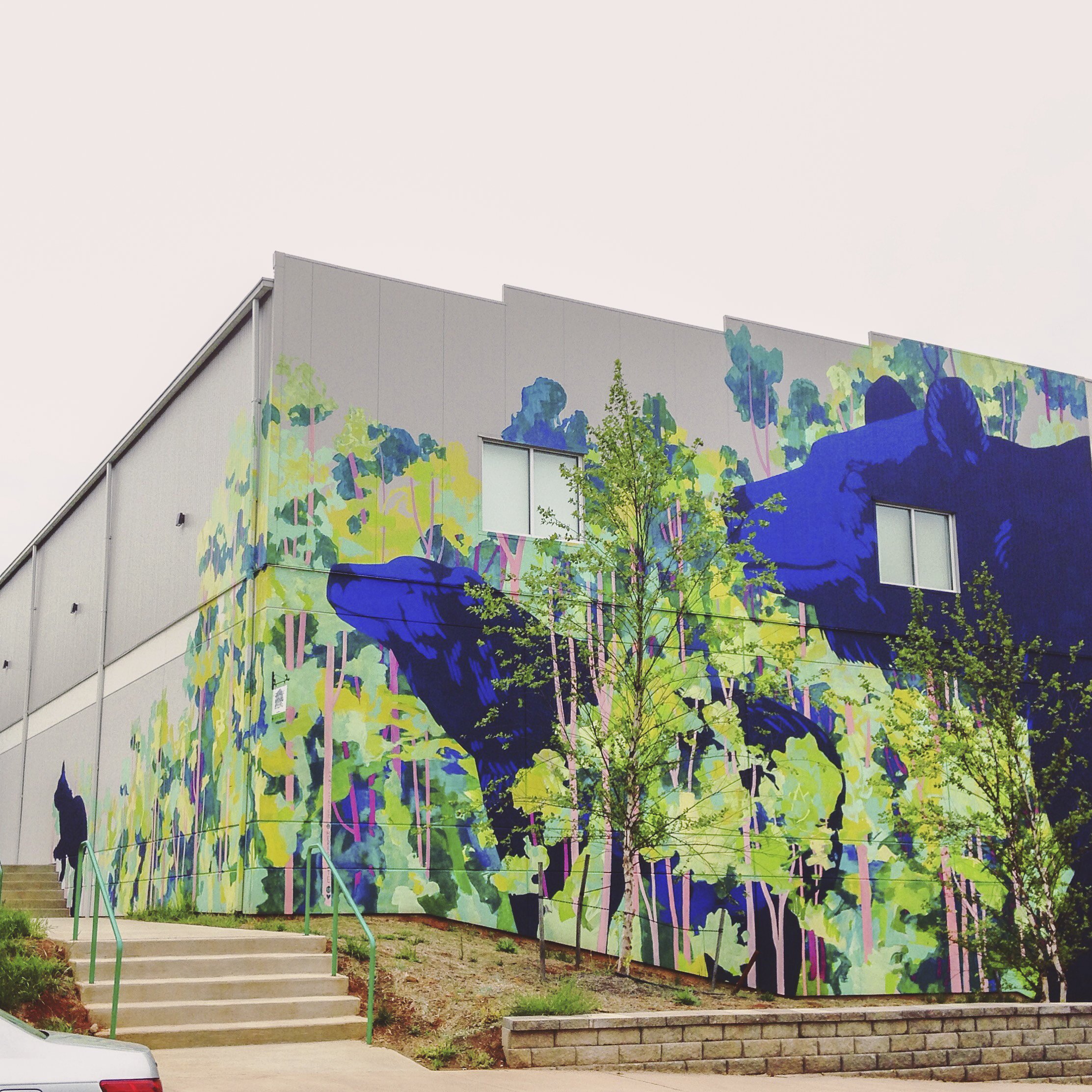
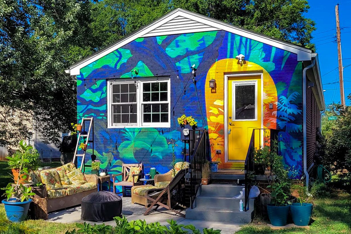
Mural in Charlottesville, VA painted for Tom Tom Fest 2017 on Charlottesville Day School.
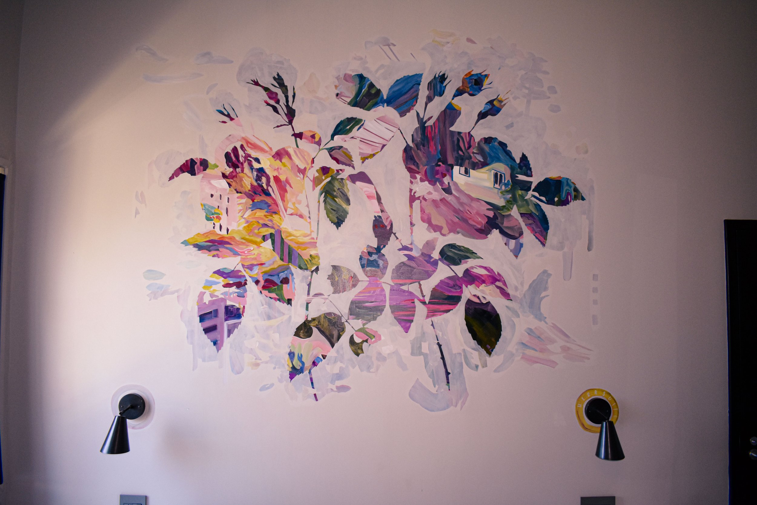
This piece is a love letter and an invitation to love. A pair of roses silhouette a painted collage - the pictures I filled this space with are all slices of Richmond. Glimpses of skyline, reflections on the river, phone lines against the sky all blur together to create a warm textured portrait of the city.
As shown below, the first layer of this process is the energetic broad strokes of this portrait, creating an abstract frenzy of color. The second layer is the delicate transparent white that carves away at the frenzy to sculpt the shapes of the two roses. For me this is a joyful and honest display of the creative process - “write drunk, edit sober” as they say. It also alludes to the romaticization of everyday life - every day is over-filled with criss-crossing intentions and plot-lines, but with a gentle and visionary hand, you can compose the story of your experience that you want to tell.
From Quirk Hotel’s website: Each room not only spotlights Richmond's established artists, but supports its next generation of talent with a percentage of each booking benefiting VisArt's Make Space, a program pairing sixth-grade girls with female artists for a year of mentorship and art-making.
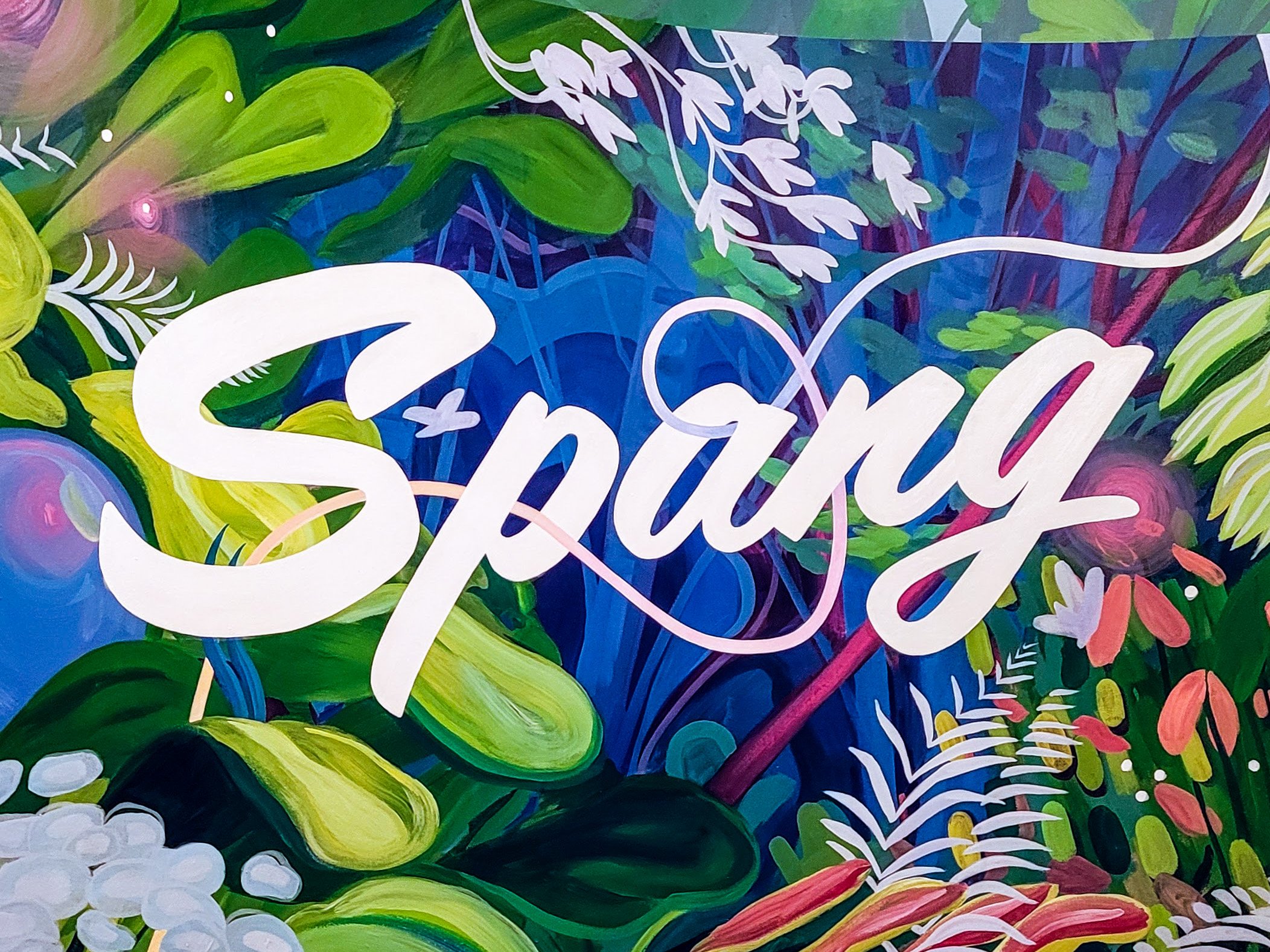
Spang TV is a video production company based in Richmond, with a glorious production space in Northside. THIS space is a smaller, cozier office nestled downtown for post-production. Here, the magic of graphics, animation, color-correction, music, formatting take place. Here, they bring it all together and add the final touches.
This mural in their entryway acts as a sign, but also sets the mood for making the magic happen. I had fun with this opportunity to embellish a typical botanical landscape with luxurious color and imagined elements. The shape of the logo acts as a viewfinder for the lush landscape overflowing the wall - inside the viewfinder, everything is a little brighter, richer, and more intriguing….
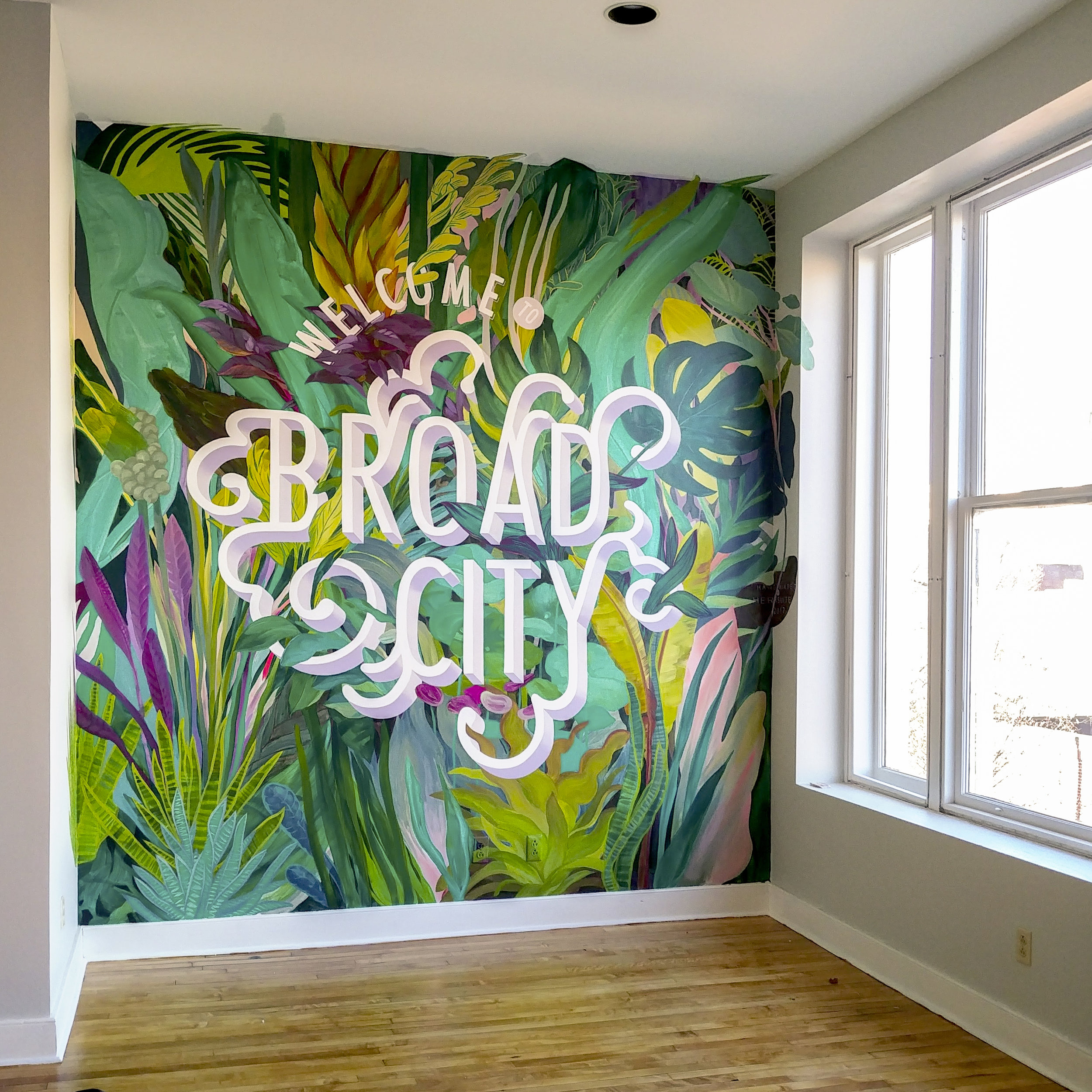
This accent wall was designed for The Broad. From their site:
"The Broad is a MAKING SPACE in Richmond.
A community center where we can learn from each other, a workspace where we can get it done, and a clubhouse where we can connect IRL - a place that exists to make more space for women* in Richmond, in our community, and in our world.
A space to take a meeting over coffee, catch up with a friend with a glass (or two) of wine, put in some work during the 9-5, get your yoga on in our weekly classes, enjoy a workshop or a panel on art or money or flower arranging or love - because we are multifaceted people in a multifaceted world and it's totally cool to be into astronomy AND astrology, curious about super serums AND the supernatural, and invested in the stock market AND the outcome of Bachelor In Paradise.
At The Broad, we're making space so you have space. Space to learn, grow, connect, work, and BE. The Broad is a space for us.
*The Broad is an LGBTQIA+ Friendly Space that does not have a binary view of womanhood"
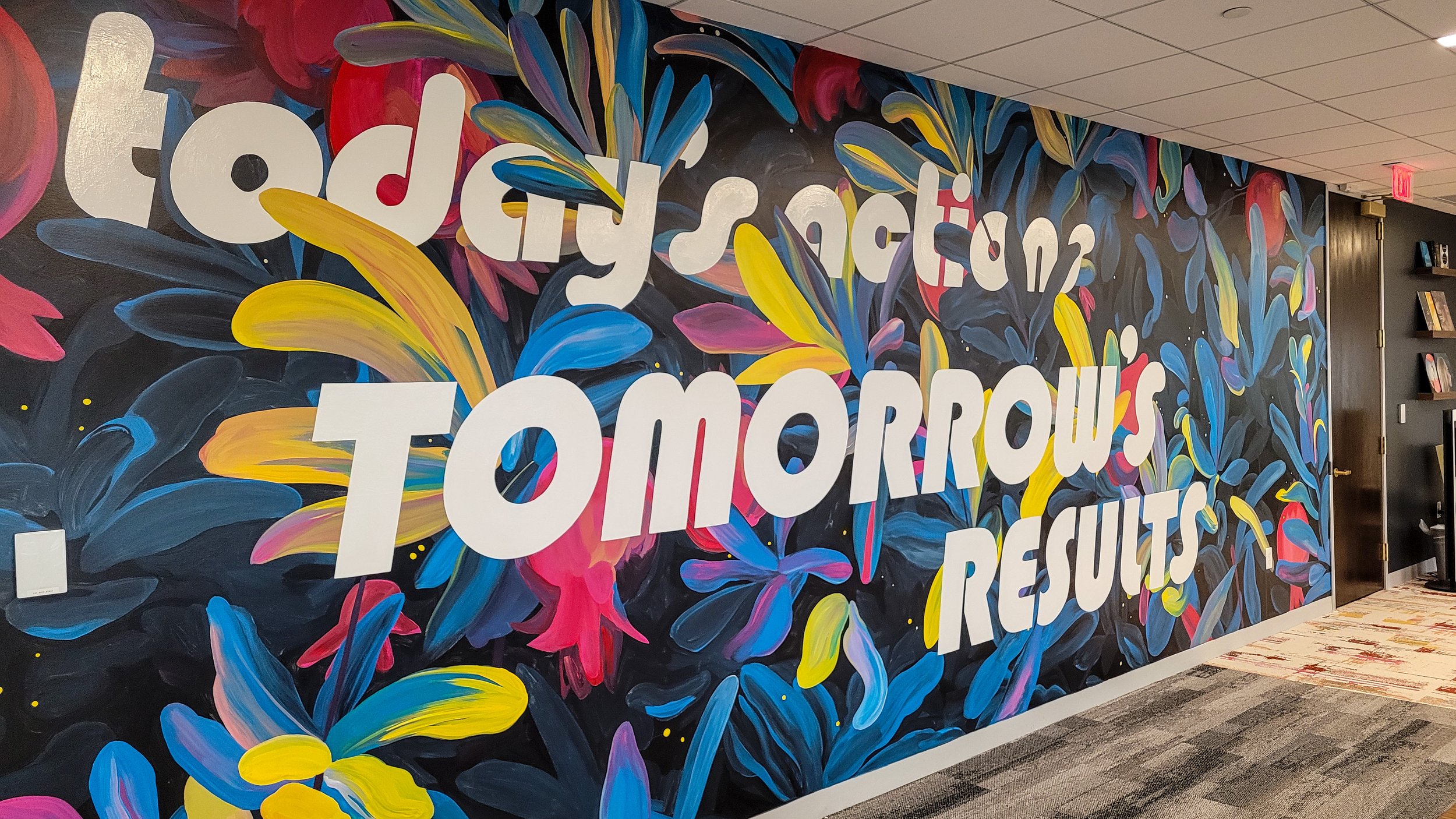
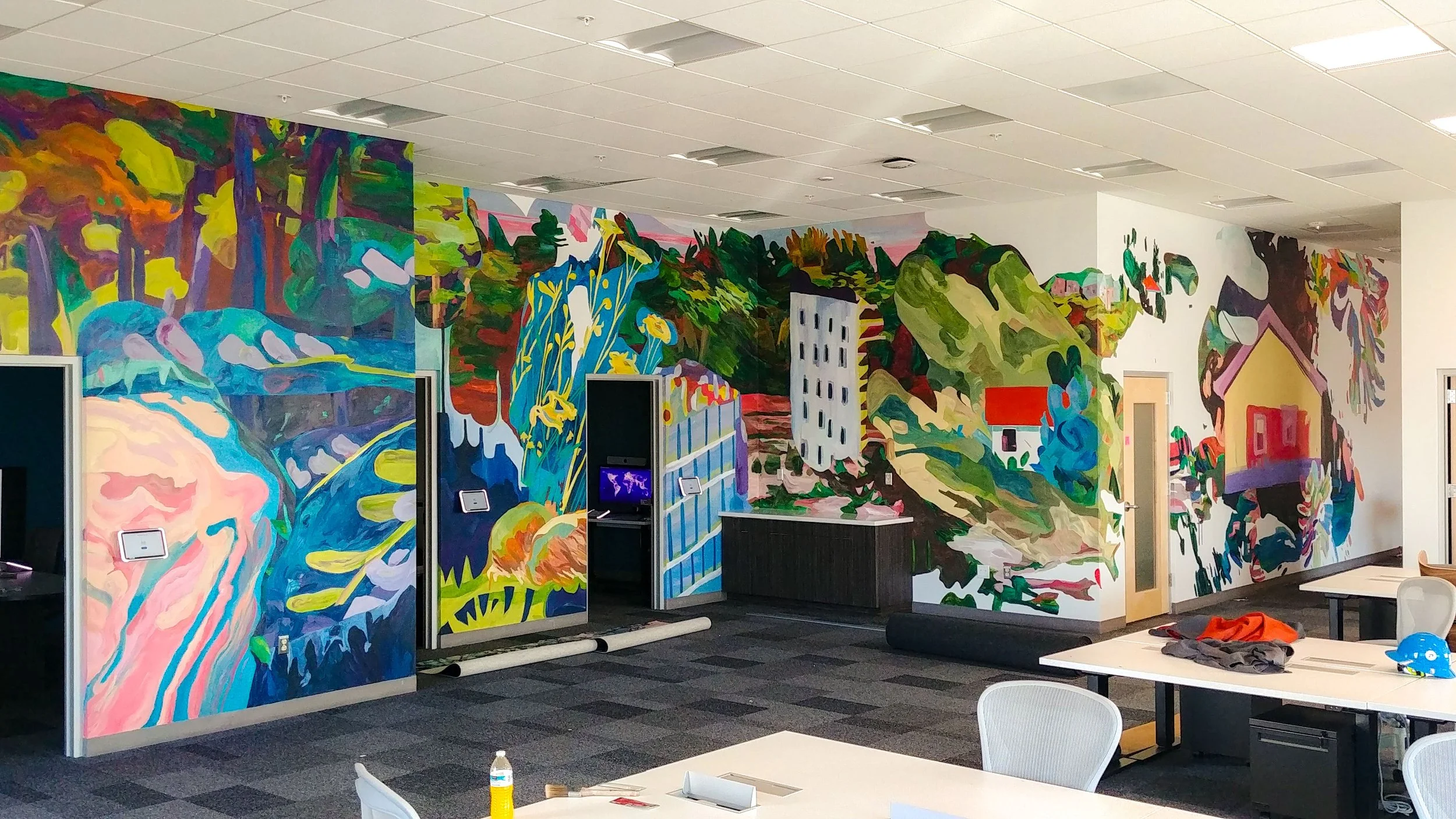
Outside of Washington DC, “the majority of the world’s internet traffic passes through the town of Ashburn in Loudoun County, Virginia, home to one of the world's major internet exchanges.” Meta née Facebook built a data center there in 2019. 90% of the building is for the electronics, and in the last 10% they did a lot to make the meatspace pleasant for their employees.
In such a digital environment, an injection of the natural world acts as an agent of balance. This design is collaged together from my gouache paintings of many places I've been, put through the filter of my eyes and brain and hands and paint and paper and computer and projector and eyes and brain and hands and friend and paint again. Smooshed.
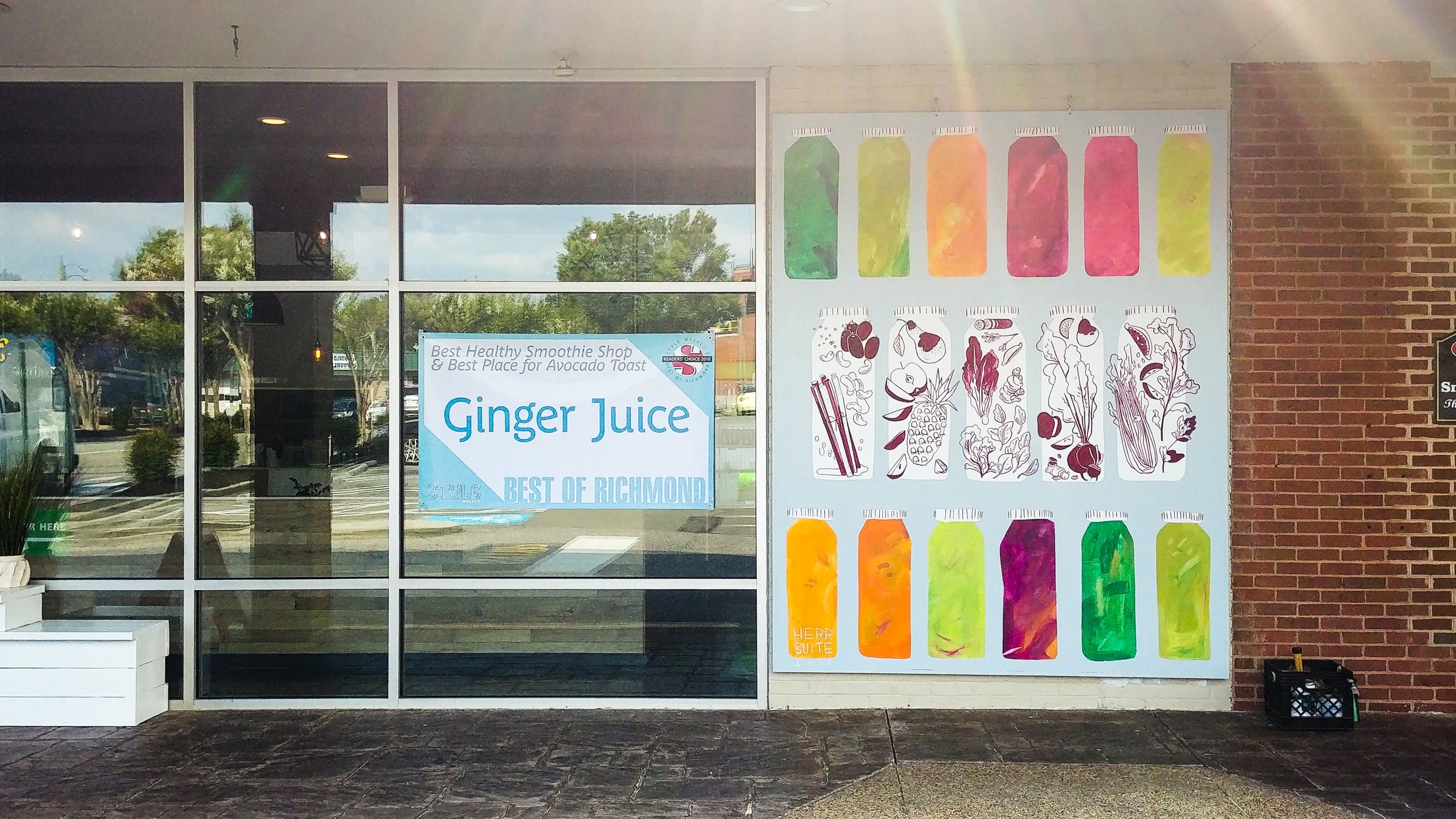
A simple, sweet, healthy display to call attention to the fruits and vegetables behind the colorful juice.
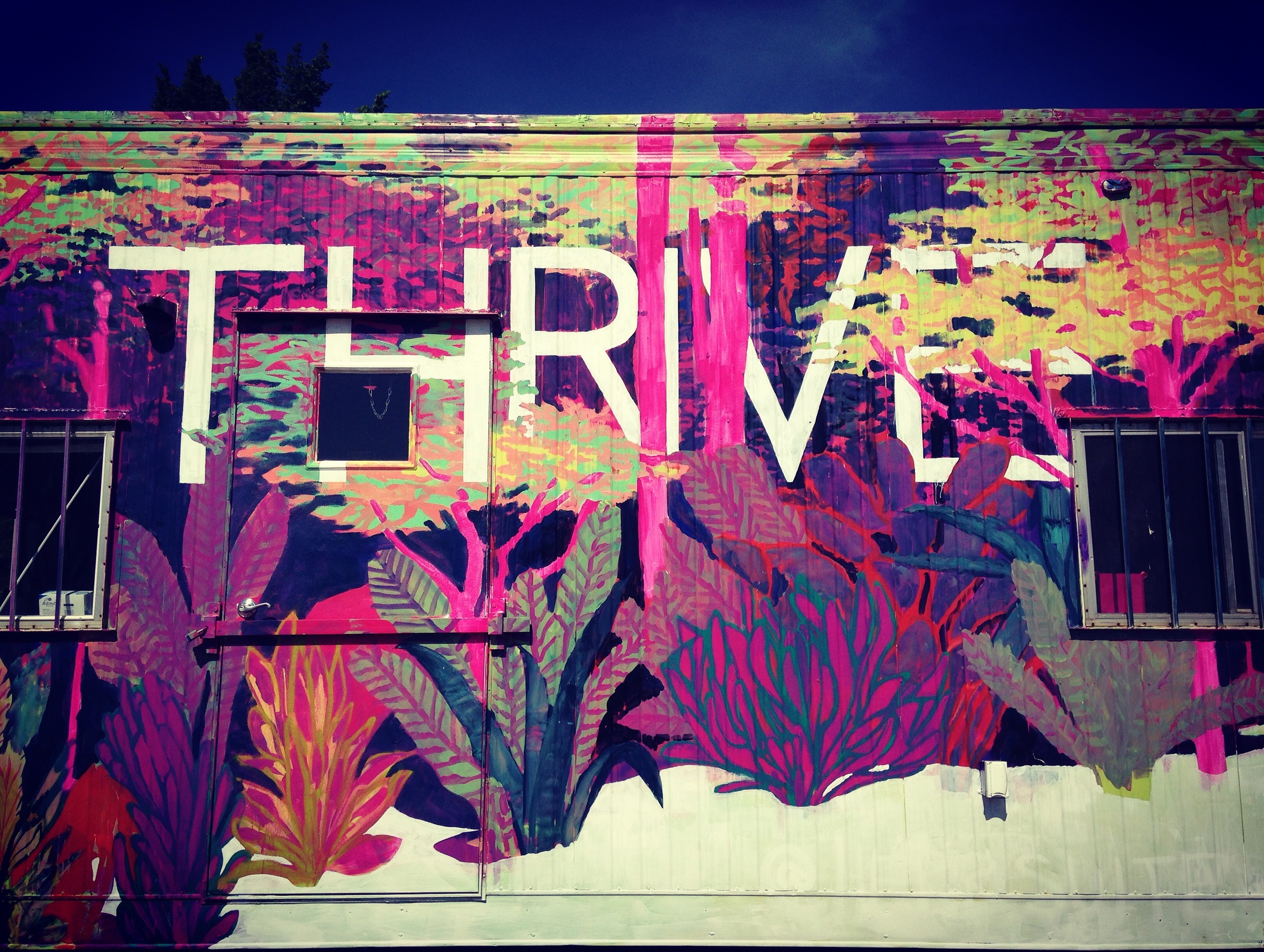
2016 is my second year participating in the RVA Street Art Festival, which is a local event run by some of the most active art proponents in the city: Ed Trask and Jon Baliles. This was the VIP lounge for the duration of the festival - I painted the front, and Sir James Thornhill painted the back.
This design is based on a little silk painting I did a while ago, crossed with a small piece I did for Light Grey Art Lab's show Botanica. The word "thrive" has really stuck with me, and I think it's a message I'm willing to repeat over and over. Words are often a natural addition to a lot of my design solutions, but I avoid them because I think they narrow the possible interpretations of an image. Sometimes, however, they amplify or focus the imagery in a totally positive way.
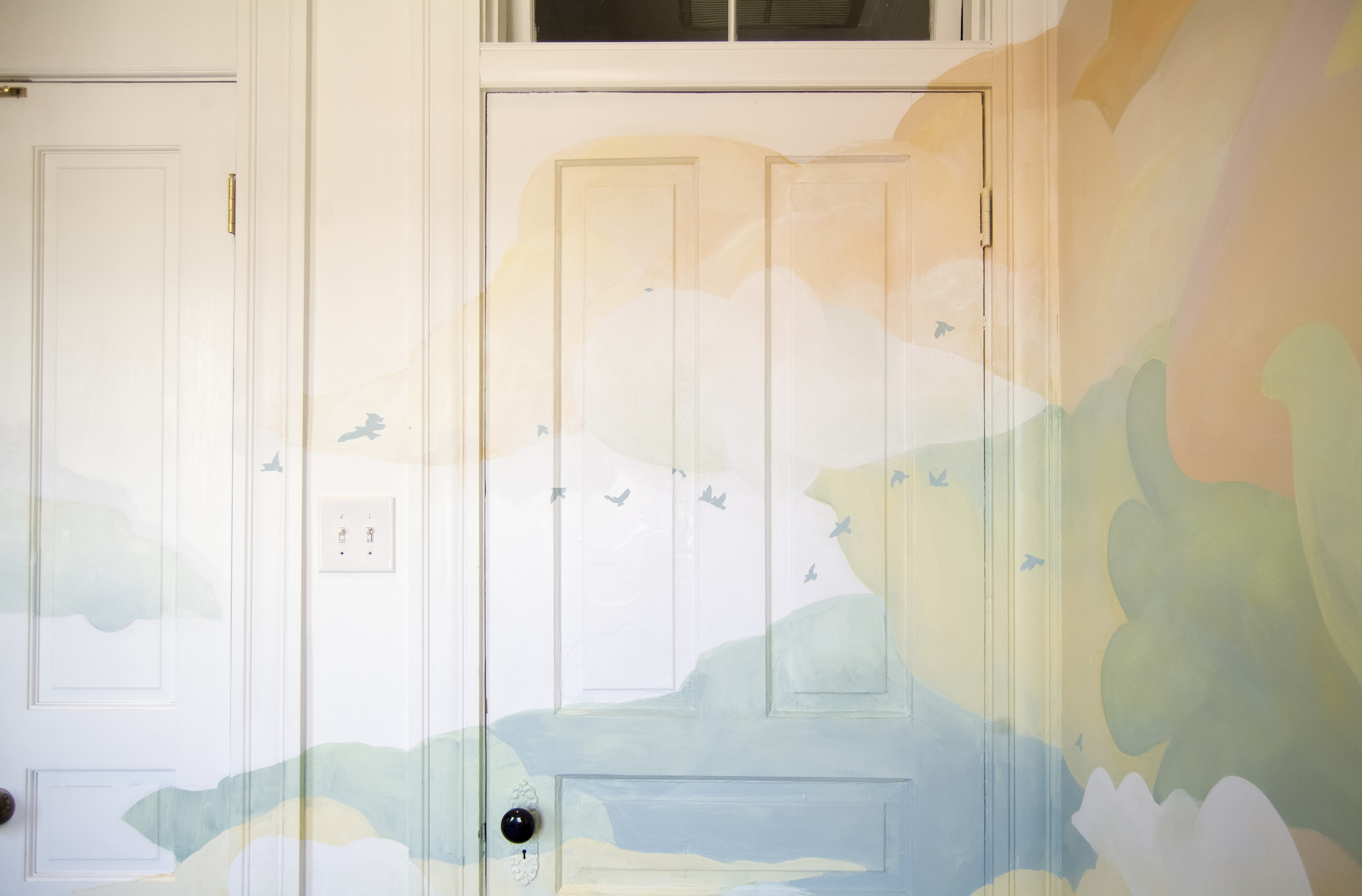
In preparing for their third child, the Carleys decided they would leave the gender of the baby a surprise. Therefore the room they converted to a nursery needed to be warm, comforting, whimsical, and gender-neutral. Hopefully these clouds will inspire the newest Carley's imagination as she or he grows up!
Painted for Väsen Brewery. The guys at Väsen brought me in on this project really early- when I first visited the site they didn't even have a floor, much less walls. They talked to me about their inspiration and experiences of Scandinavian shamans and outdoor lifestyles and nature spirits.