
graphic
SIMPLE DESIGNS
FLAT COLOR
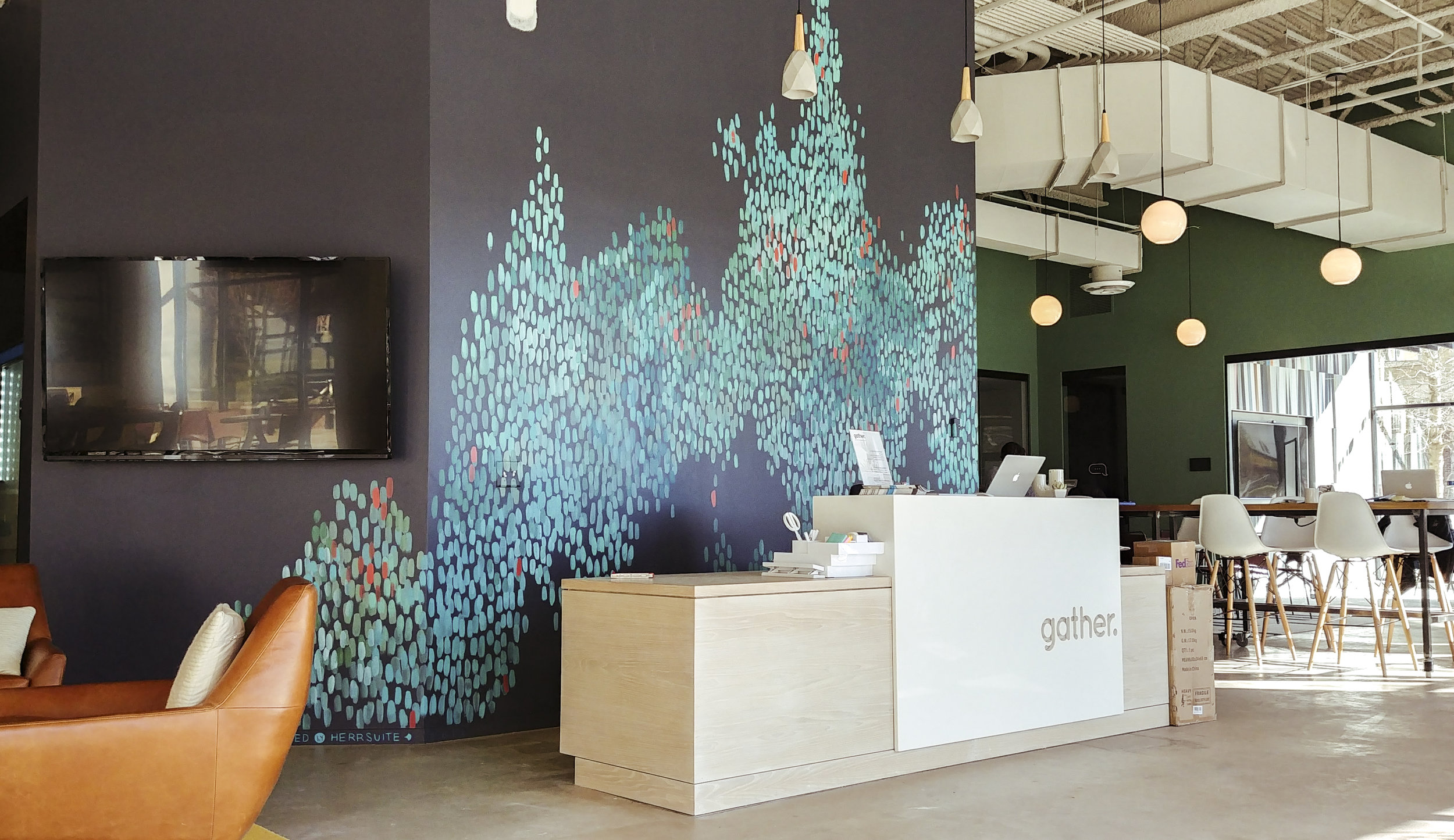
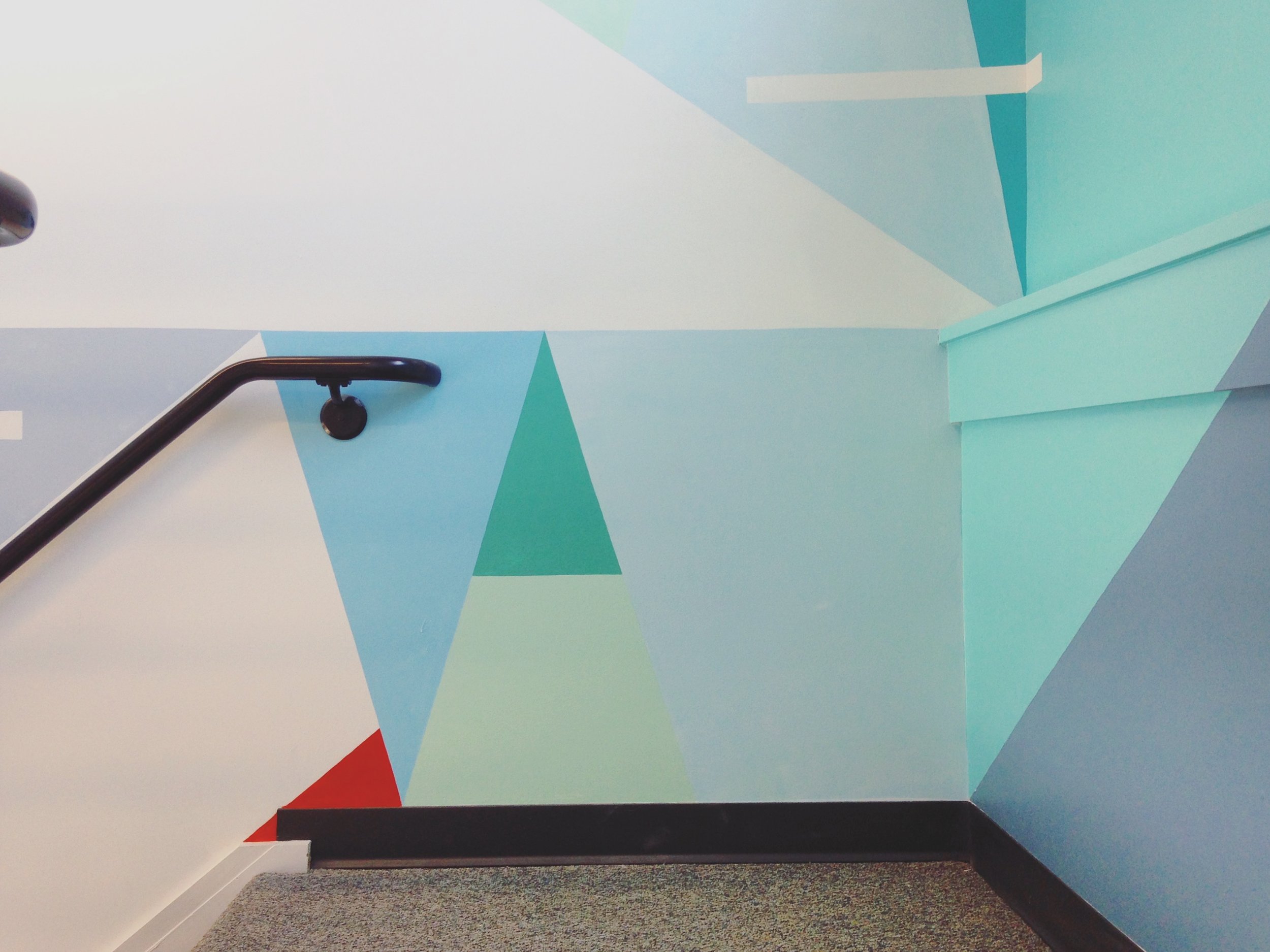
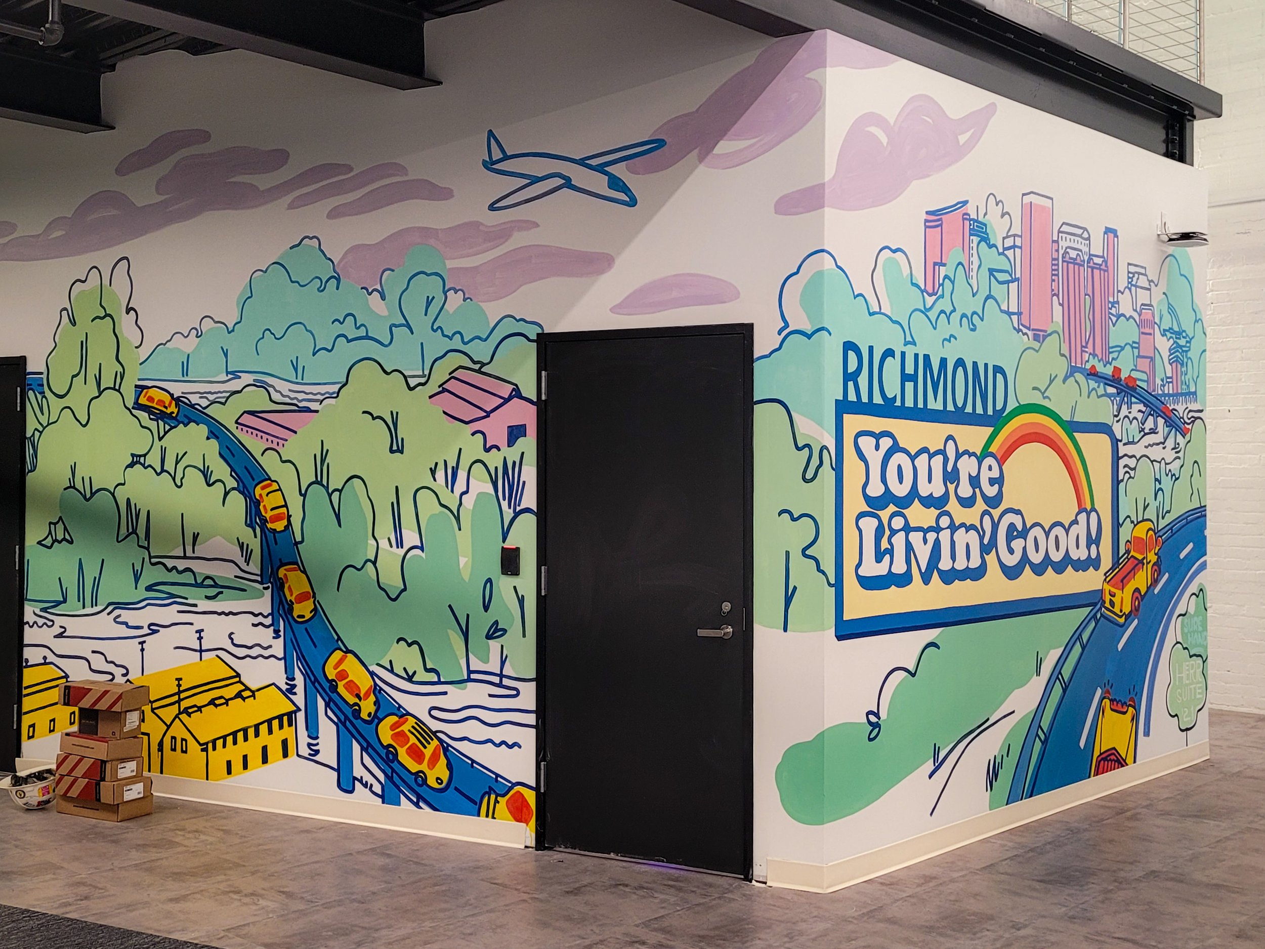
Campfire & Co.'s interior design for Gather, a co-working space opening their third location, called for an accent wall flowing abstract colors reminiscent of water.
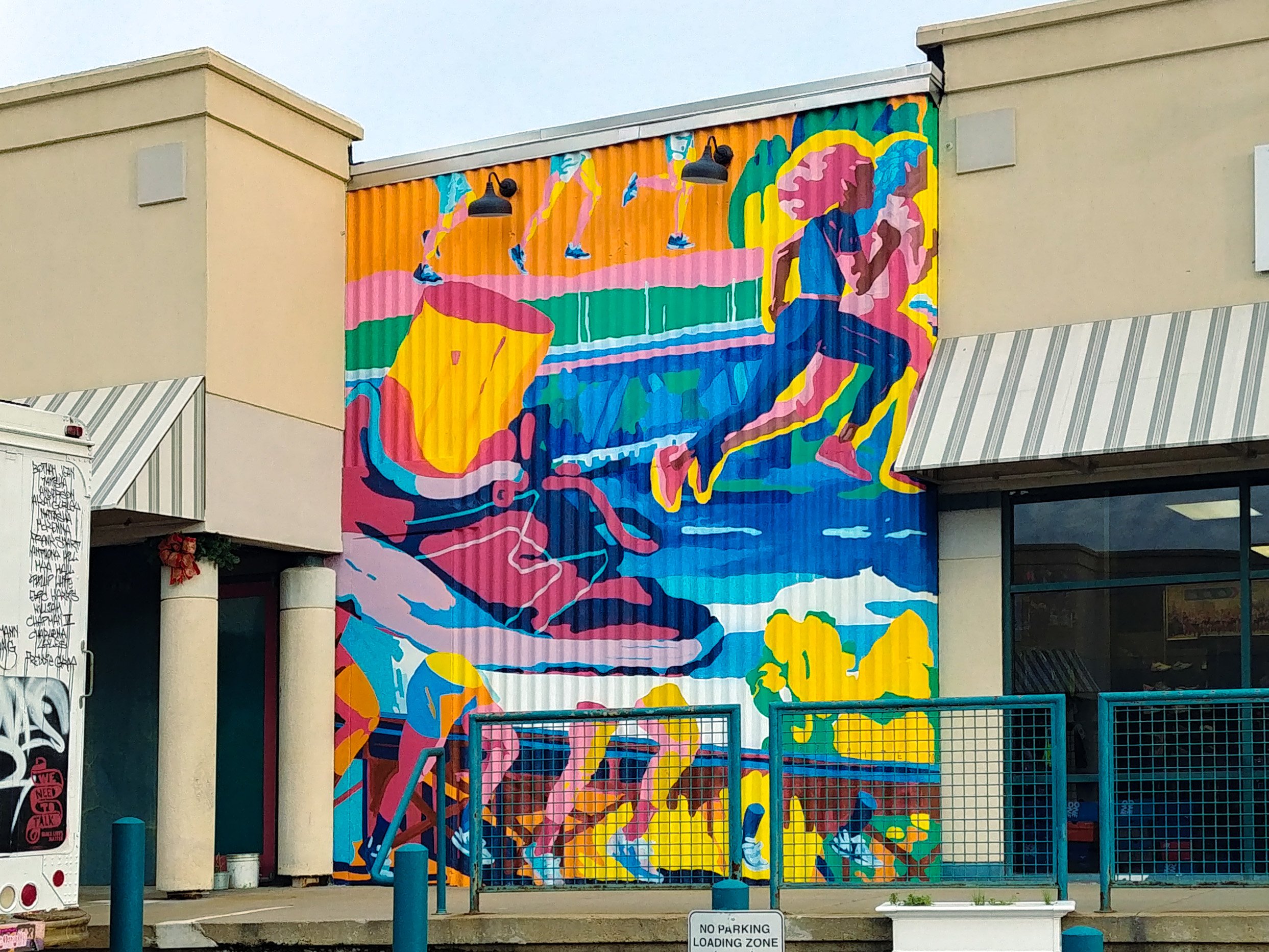
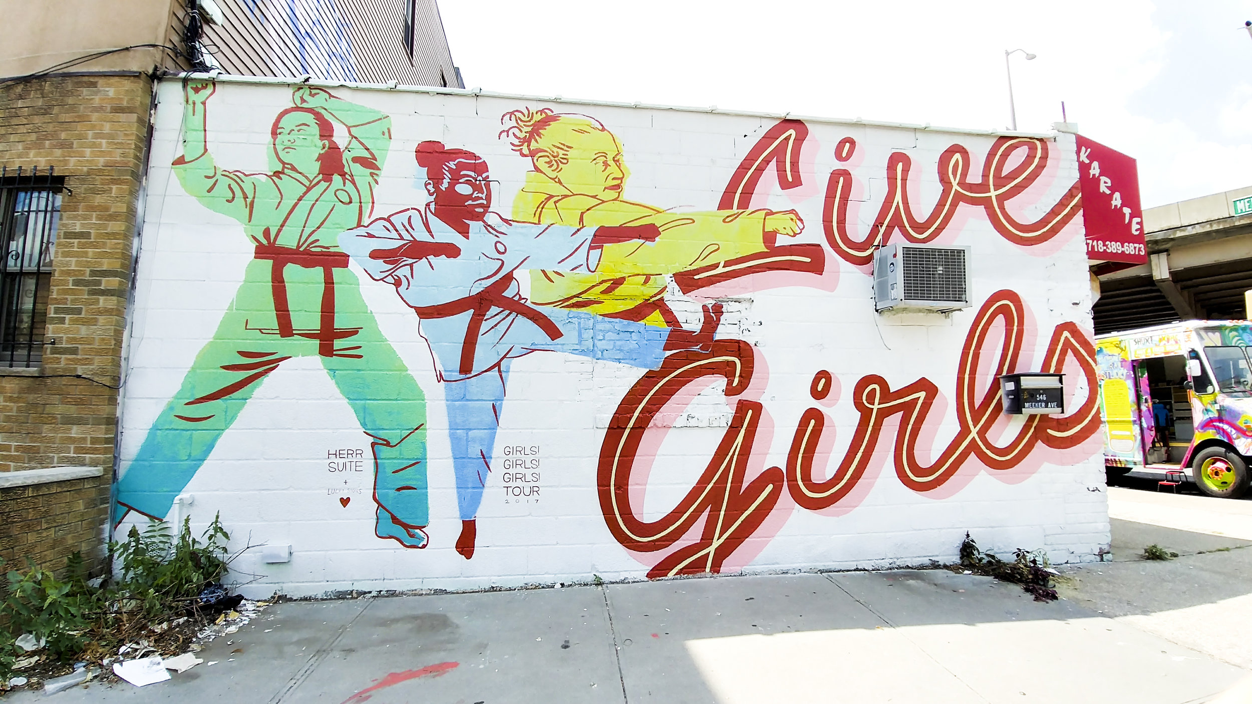
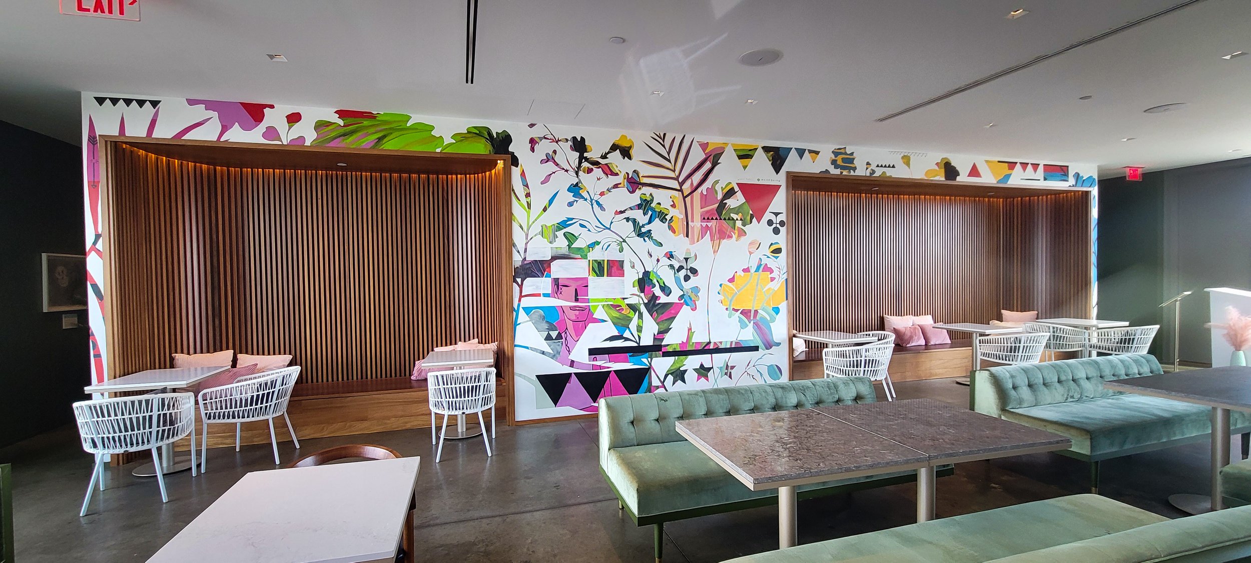
When Quirk Hotel started work on a second location, I was absolutely delighted to work with André Shank to create something special for their rooftop bar and restaurant. Since we’d both worked with Quirk before on a few different projects, this was a comfortable opportunity to go out on a limb! They entrusted us with a free-reign approach, and the two of us approached the wall with only an idea for the process but no design.
André and I were able to bounce off of each other’s colors and shapes to discover this footloose and fancy-free mural that surprised both of us! Huge thanks to André for being an extraordinary vibesmith and to Adam Dorland and Katie Ukrop for encouraging our experimentation.
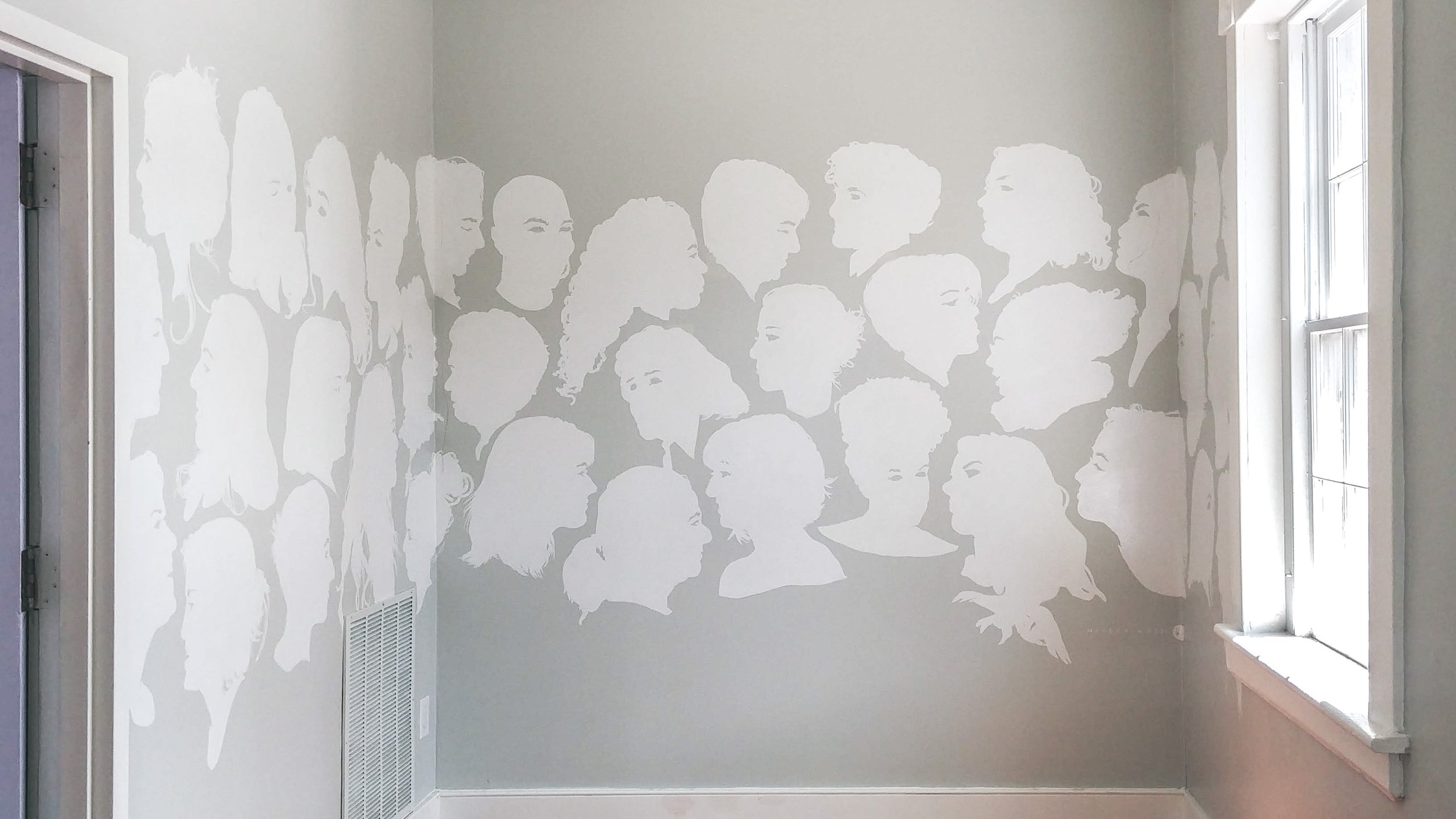
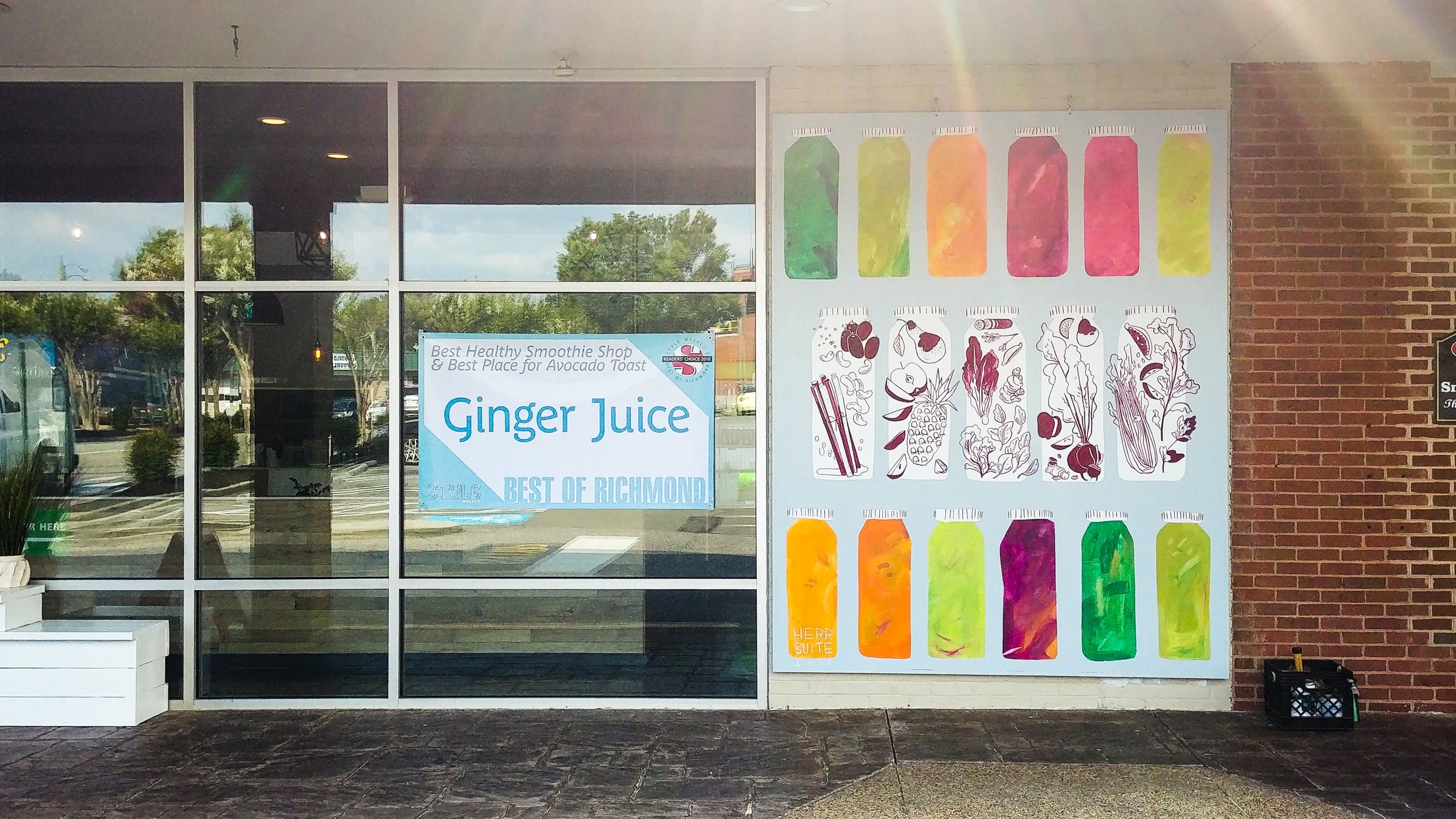
A simple, sweet, healthy display to call attention to the fruits and vegetables behind the colorful juice.
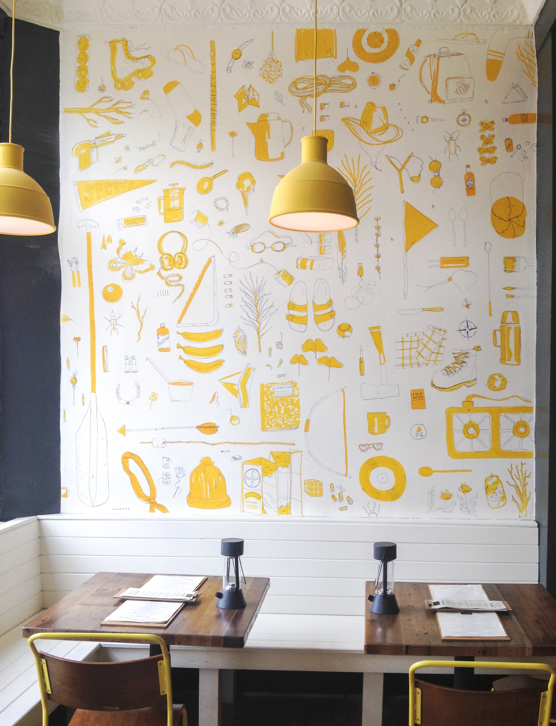
Two walls painted for a new restaurant under Campfire & Co's design direction, in just 12 hours, with the help of two awesome friends.
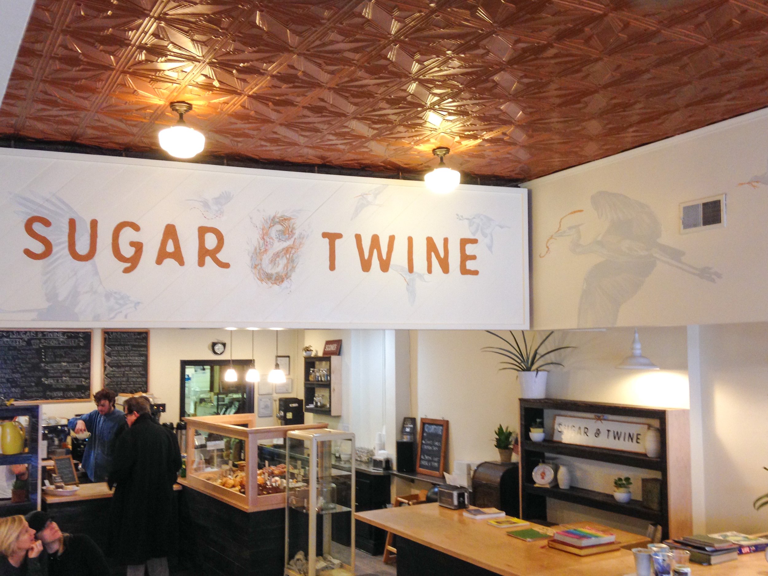
Definitely definitely go eat at Sugar & Twine, best cookies, best sandwiches, best people <3 I worked with the owner to select a range of birds native to the area, all gathering nesting material appropriate to their species, flying together to build a nest at the center “&” of the logo.
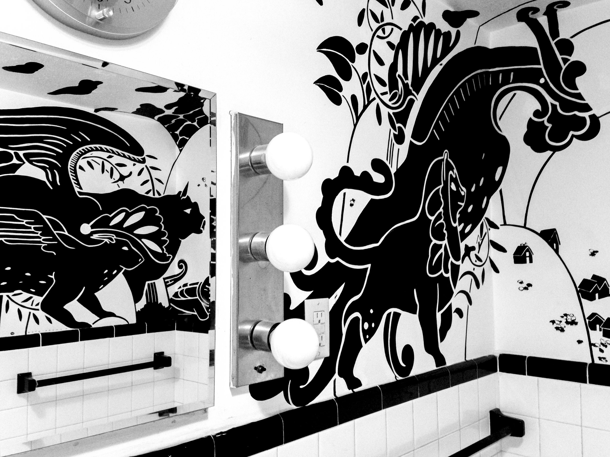
The mystical creatures overlooking this simplified Icelandic countryside are all based on real motifs in viking artifacts.
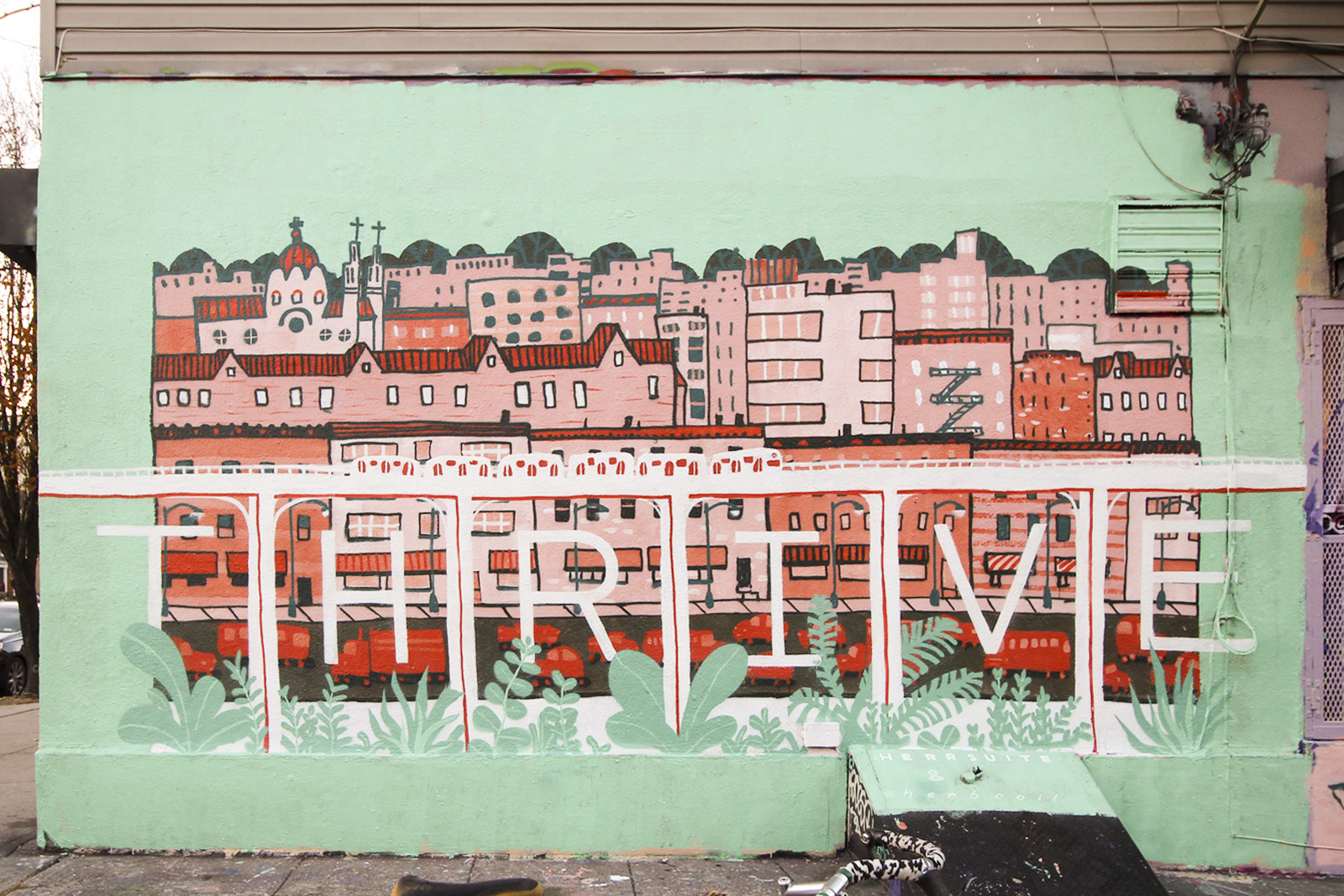
My friend Ellie and I threw this cutie up in just NINE HOURS! Basically from sunup to sundown (winter sunlight, what can i say) we did some quick painting and decision-making, not to mention learning how to use spray paint for the first time. The design is based on a print Ellie did of this neighborhood (Bushwick), smooshed with my Thrive motif.
This is a communal wall offered by a spray paint shop called Low Brow Artique, which means we painted over someone else's art to put ours up. In turn our mural was painted over after just two days - unusually fast for that spot, but our image was also a pretty unusual style in a neighborhood totally covered in all kinds of graffiti. Next time, we're determined to find somewhere a little more permanent.
Cobalt Studios is a top-tier scenic painting studio in White Lake, NY. I was lucky enough to spend part of a summer there learning about scenic painting techniques with the inimitable Rachel Keebler and Kimb Williamson. As part of a much longer trip, I found some time to stop back by Cobalt and throw some paint around in the house where students live while enrolled. My friend Sarah Abernathy gave me a great excuse to come visit and a helpful hand in the actual painting.
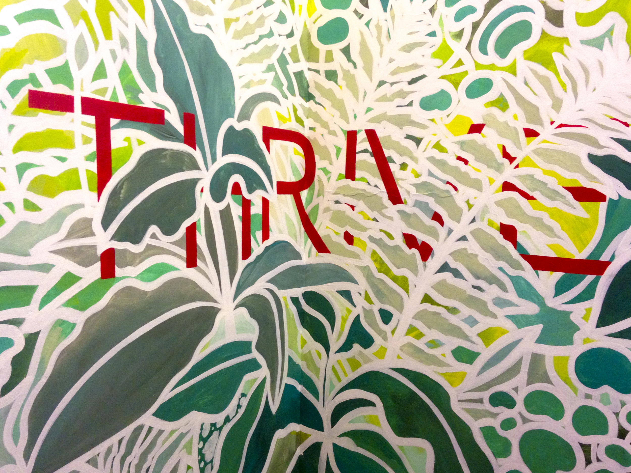
This design is based on a little silk painting I did a while ago and fell in love with. The word "thrive" has really stuck with me, and I think it's a message I'm willing to repeat over and over. Words are often a natural addition to a lot of my design solutions, but I avoid them because I think they narrow the possible interpretations of an image. Sometimes, however, they amplify or focus the imagery in a totally positive way.
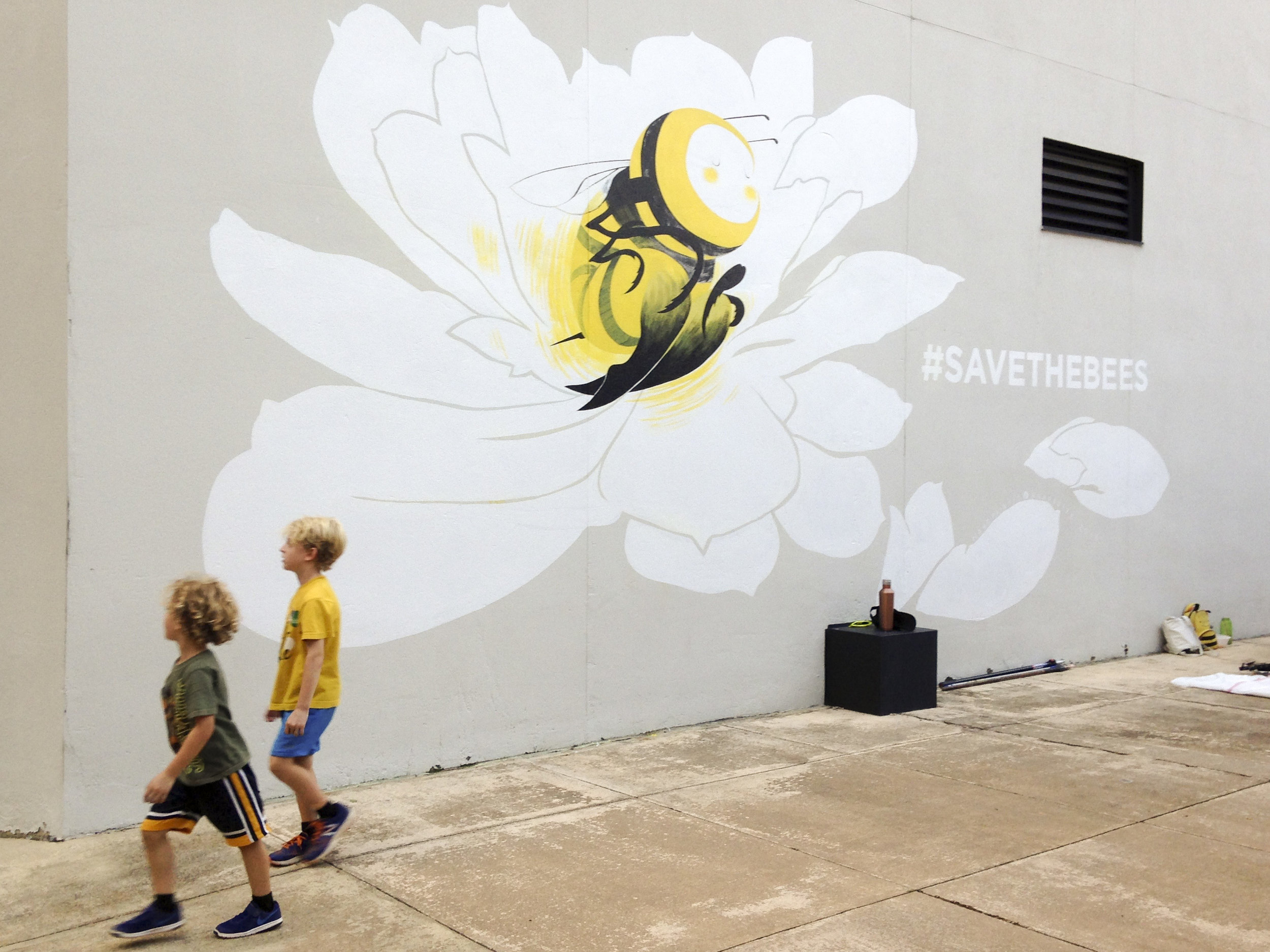
This design was inspired partly by a friend's band, Early Bizrd and the Bees, and partly by this wonderful campaign by Louis Masai.
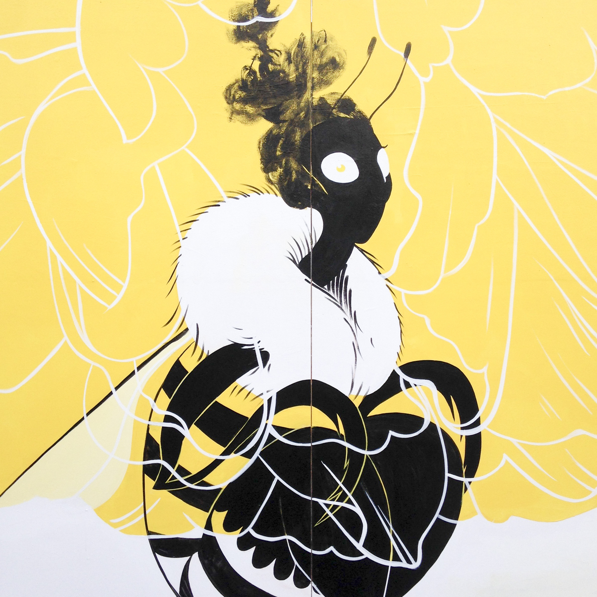
I got to join a dozen other painters at the Richmond Tattoo and Arts Festival and put up another little bee lady. She was painted 8’ x 8’ on plywood and later auctioned off to benefit Art 180. ART 180 is a Richmond, Virginia based group that creates and provides art-related programs for young people living in challenging circumstances, encouraging personal and community change through self-expression with the goal of turning lives and communities around 180 degrees.
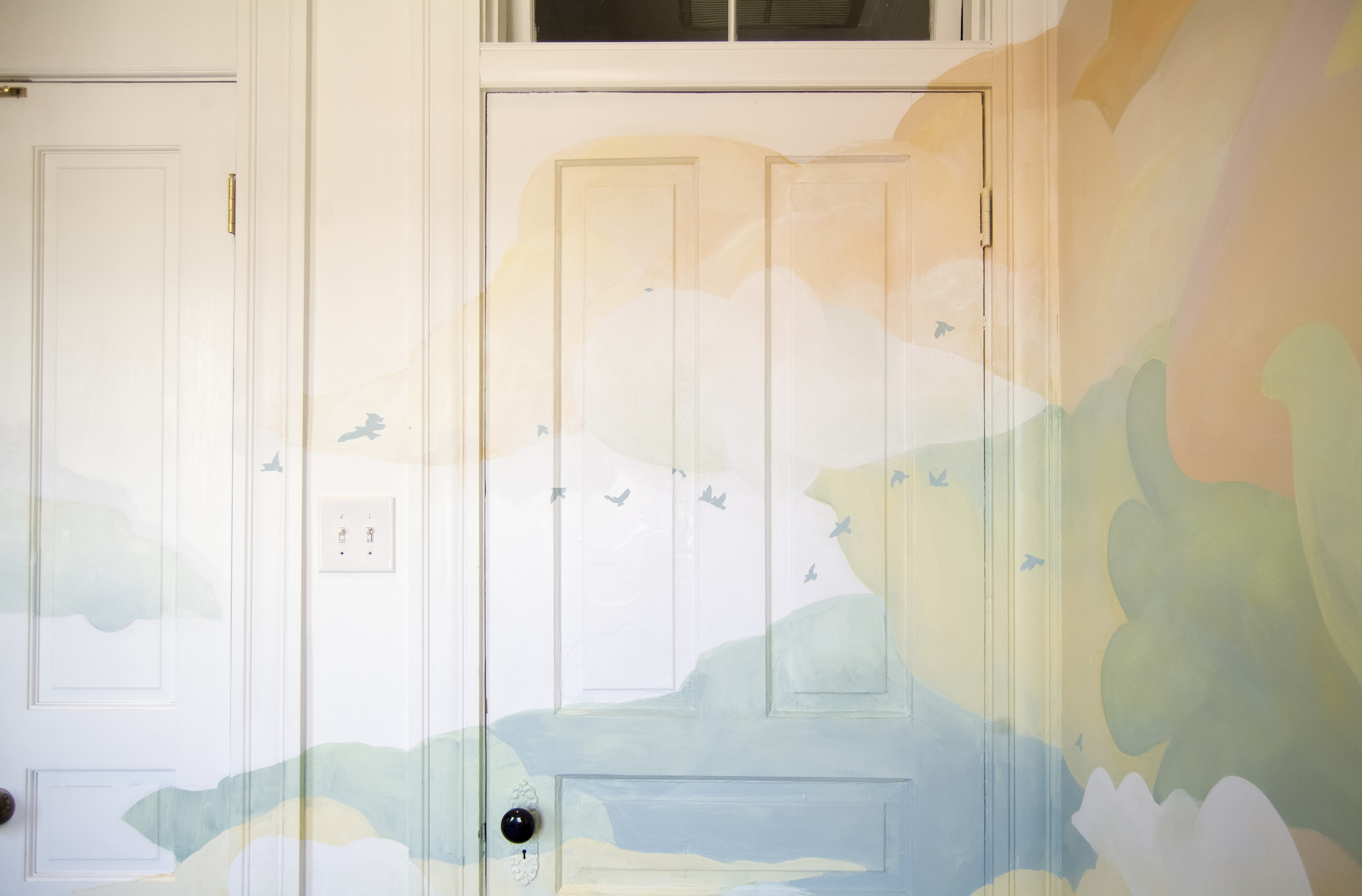
In preparing for their third child, the Carleys decided they would leave the gender of the baby a surprise. Therefore the room they converted to a nursery needed to be warm, comforting, whimsical, and gender-neutral. Hopefully these clouds will inspire the newest Carley's imagination as she or he grows up!
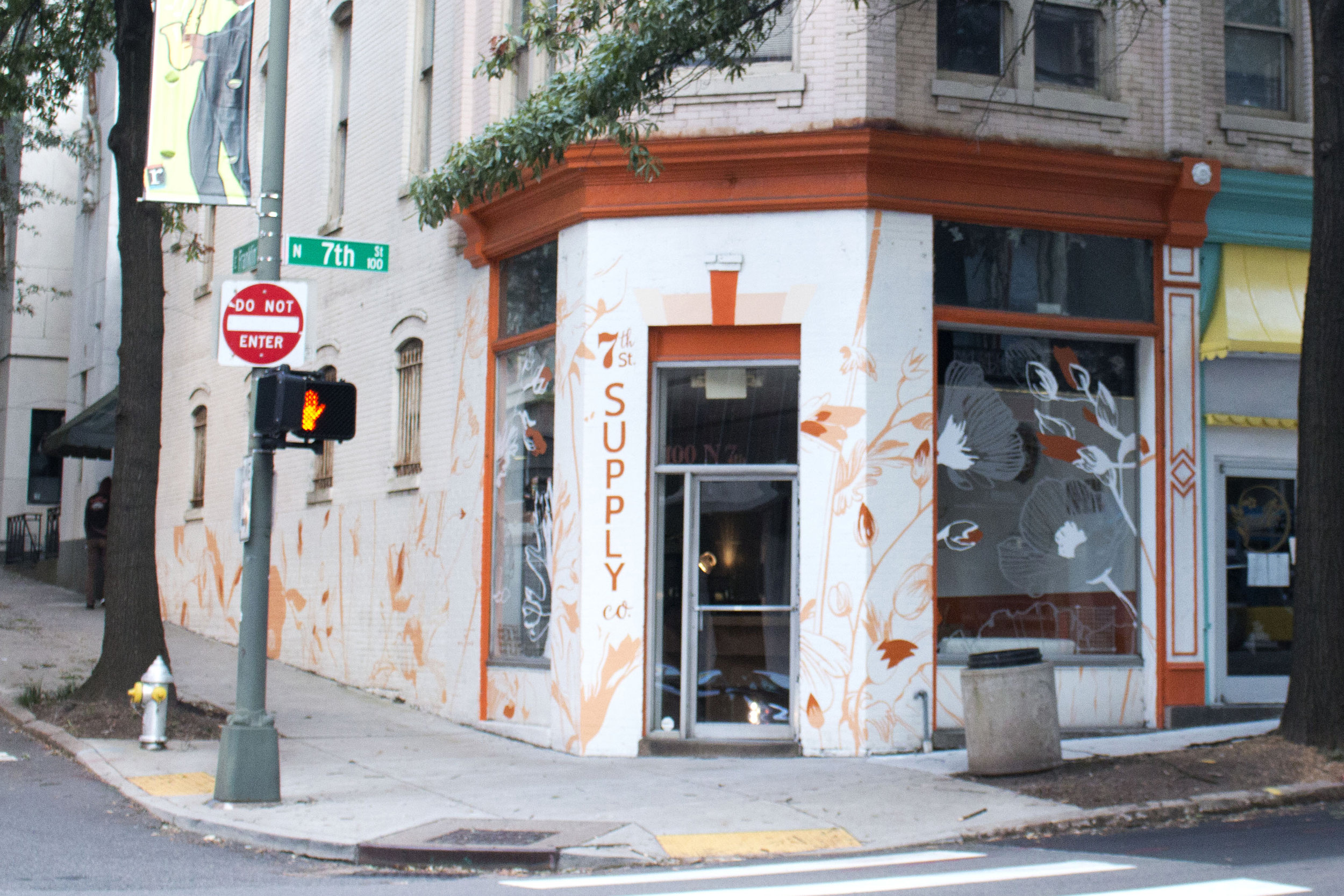
The owner of Sefton Coffee Co. and Apropos is opening a new store just around the corner called 7th St. Supply Co. She asked for a mural that was flowery and subtle, matching the colors that she had already picked for the building's exterior.
To accommodate the giant plate windows, I worked with Cut Cut: a vinyl shop just next door that specializes in working on unique creative projects. They took my design and applied vinyl that carried the flowers from wall to window.
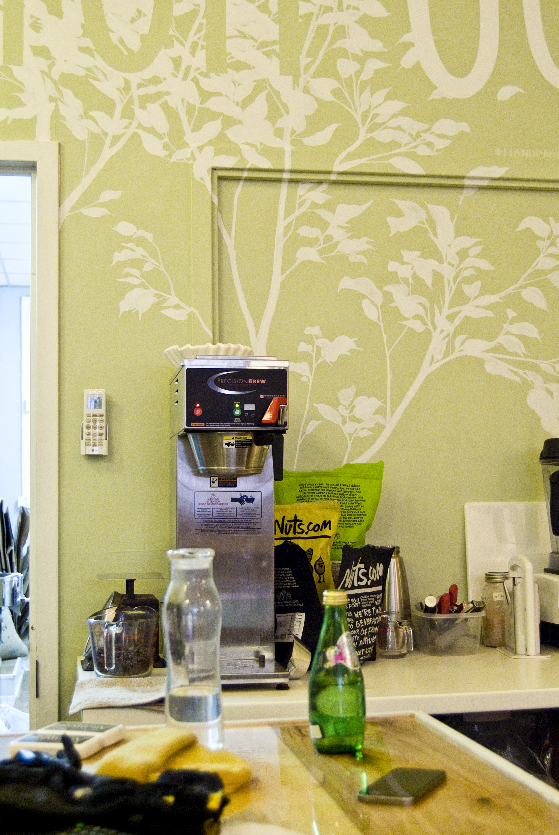
Sefton Coffee Co. is my new favorite coffee shop in Richmond because of their sweet and airy space, extensive menu (for a coffee shop), and friendly folk. I'm lucky enough that in addition to these nice qualities they also had a big blank wall that needed some painting.
I sketched a design which I thought would flow with the organic, soft, and simple feel of the place. It needed to be fairly large without feeling like it was screaming for attention, so I stuck with the very low contrast of white on green (the original wall color). As always I tried to incorporate the architecture and structural flow of the space, in this case by growing the tree up from the door frame and counter, spilling over the molding, and wrapping the words around to the next wall.
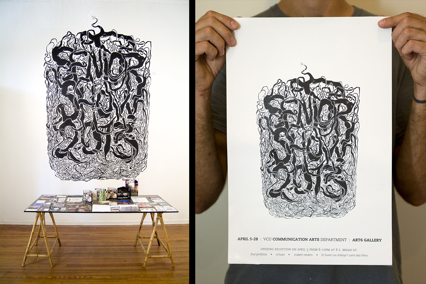
Starting in 2012, I initiated and organized the senior portfolio show for my graduating class at VCU's Communication Arts department. This epic, year-long undertaking gave me experience with event coordination, booking a space, volunteers, printing, hanging a show, liaison duties, and delegation, not to mention preparing work for a show and selling art.
The best part of this process was painting a mural for the show.
The mural design was key: the image would not only be a 13 foot tall announcement welcoming people to the show as they entered the gallery, it would also serve as the identity for the show, get printed on posters and postcards, and function online for social media and the department's website.
This design was inspired by the imagery of a potted plant - when you pull it out to re-pot it, its roots have likely spiraled and snared around each other, outgrowing their current container but with nowhere to go. For us, graduation was a time of release and exposure. All packed in cozily together as we were, it will take us a few stretches now to find our new shapes.
With several volunteers helping, I was also able to make a spotlit list of all the artists participating in the show, as well as hand-label each artist's spot with their name.
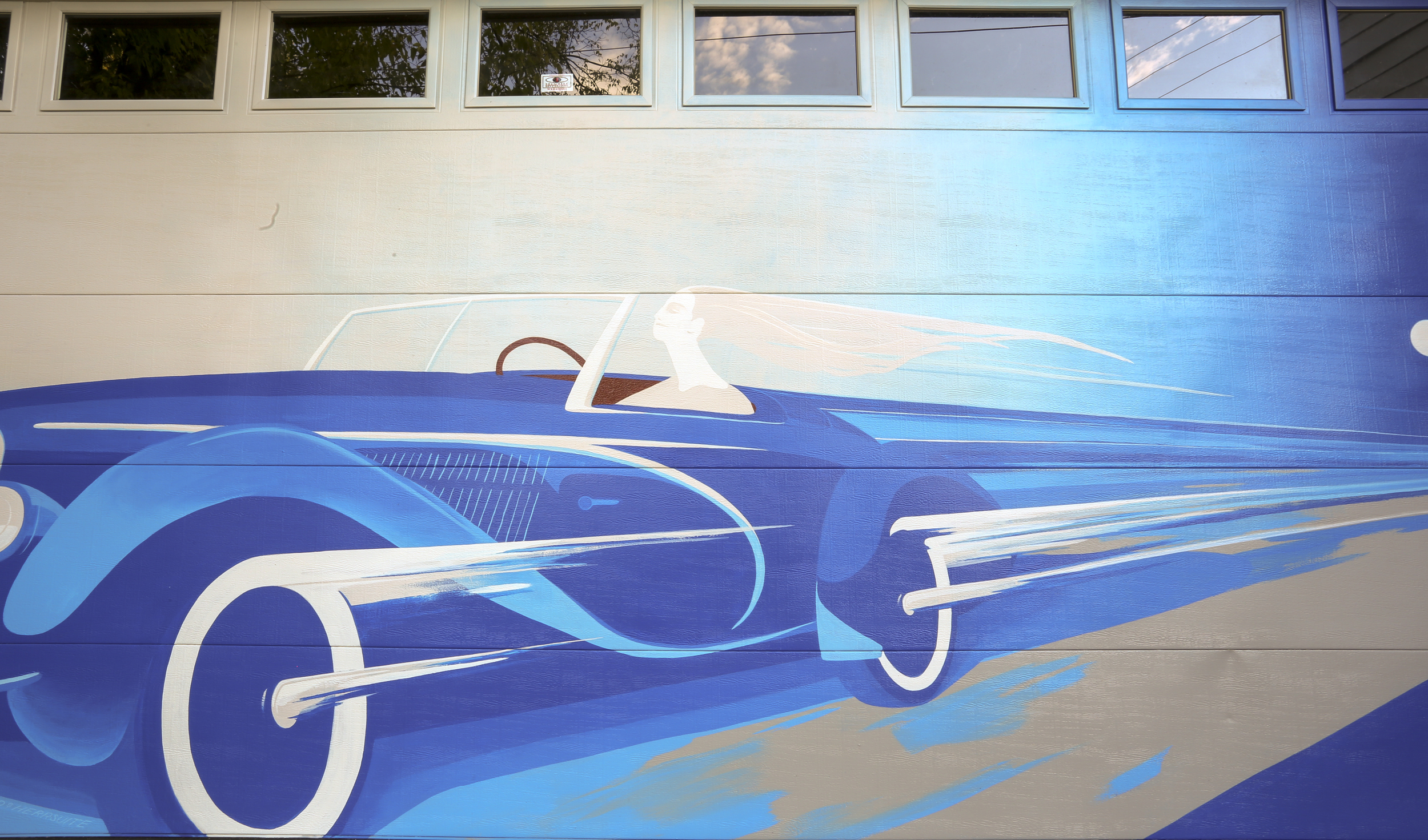
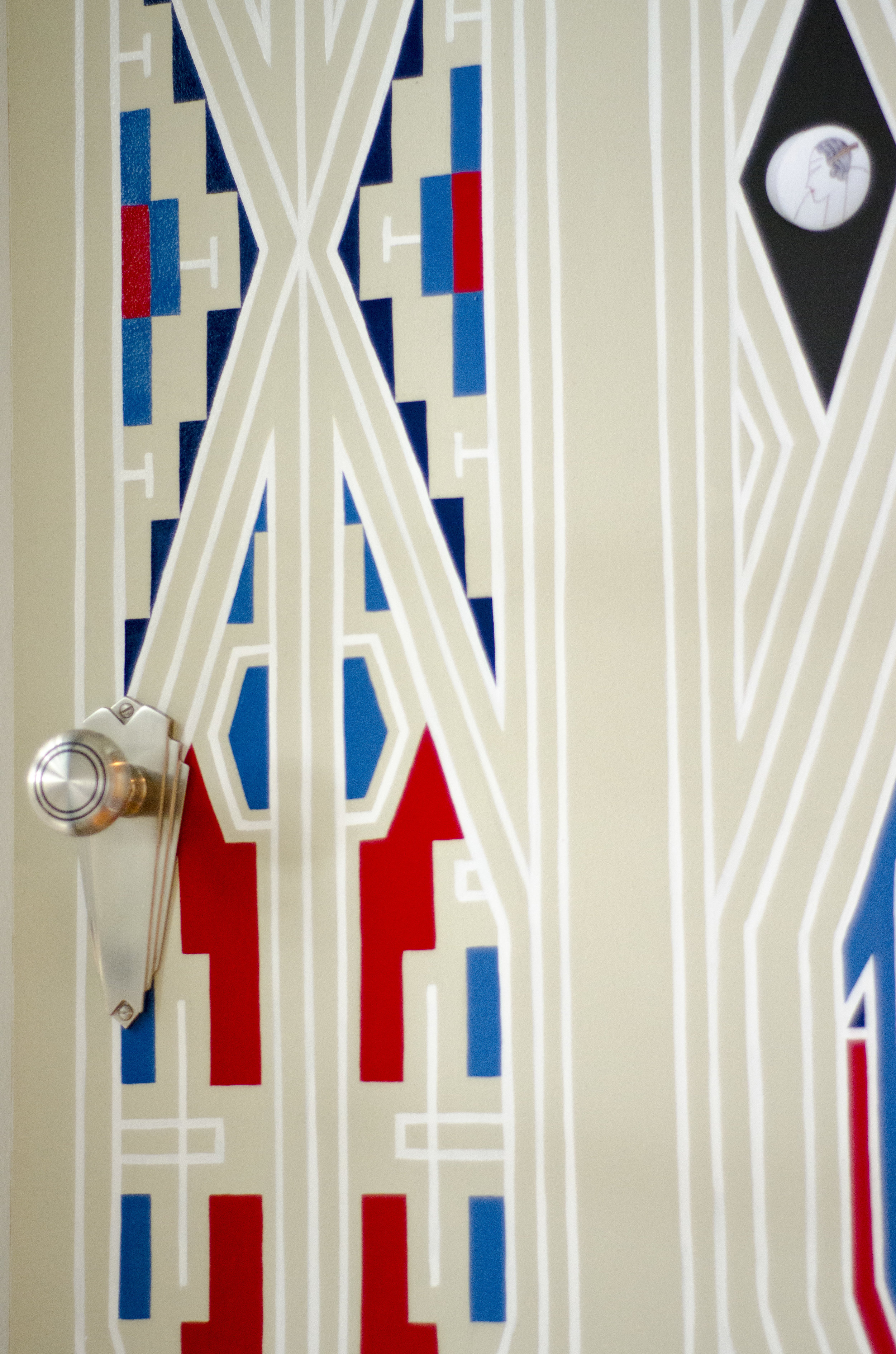
The Shugars’ are connoisseurs of Art Deco, particularly of Art Deco-era automobiles. Their beautiful home is filled with tastefully curated artwork and custom furnishings befitting those themes. Their garage is filled with two sporty cars, one a handsome restoration project and one a speedy and well-outfitted toy. And the back of their garage, the only part of their home visible from the alley.... was beige. Unacceptable.
A car was the obvious solution; an Art Deco car even more so. I worked with them to delve into a vast expanse of visual reference material, choosing an aesthetic and a specific vehicle to work from. The details of the car and the luxury of the driver were key for them, so we reached a design that cut away any other distractions.
Now when you drive down the Floyd-Ellwood alley, perhaps on your way to the Belmont Library or the pocket park hidden deeper in, you'll get a peek of what it looks like to love a car.
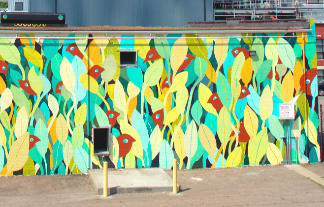
HerrSuite was invited to collaborate on a mural with Sure Hand Signs as part of the new program Welcoming Walls. Our styles work well together - Ross's "Rise and Shine" meshed nicely with a birds-and-plants pattern that you may recognize from a couple of my other small projects.
This was an awesome and intense 3-day experience. On the first half-day we got help from Altria volunteers, but the rest was just us and the hot hot sun in front of a white reflective wall on top of a big asphalt heat sink. I'd love to do it again.
"Welcoming Walls RVA is a project dedicated to bringing large scale public art to the highways and gateways of Richmond Virginia in an effort to boost civic pride, increase tourism, and solidify our city's reputation as a capital of culture and creativity."
- www.welcomingwallsrva.com
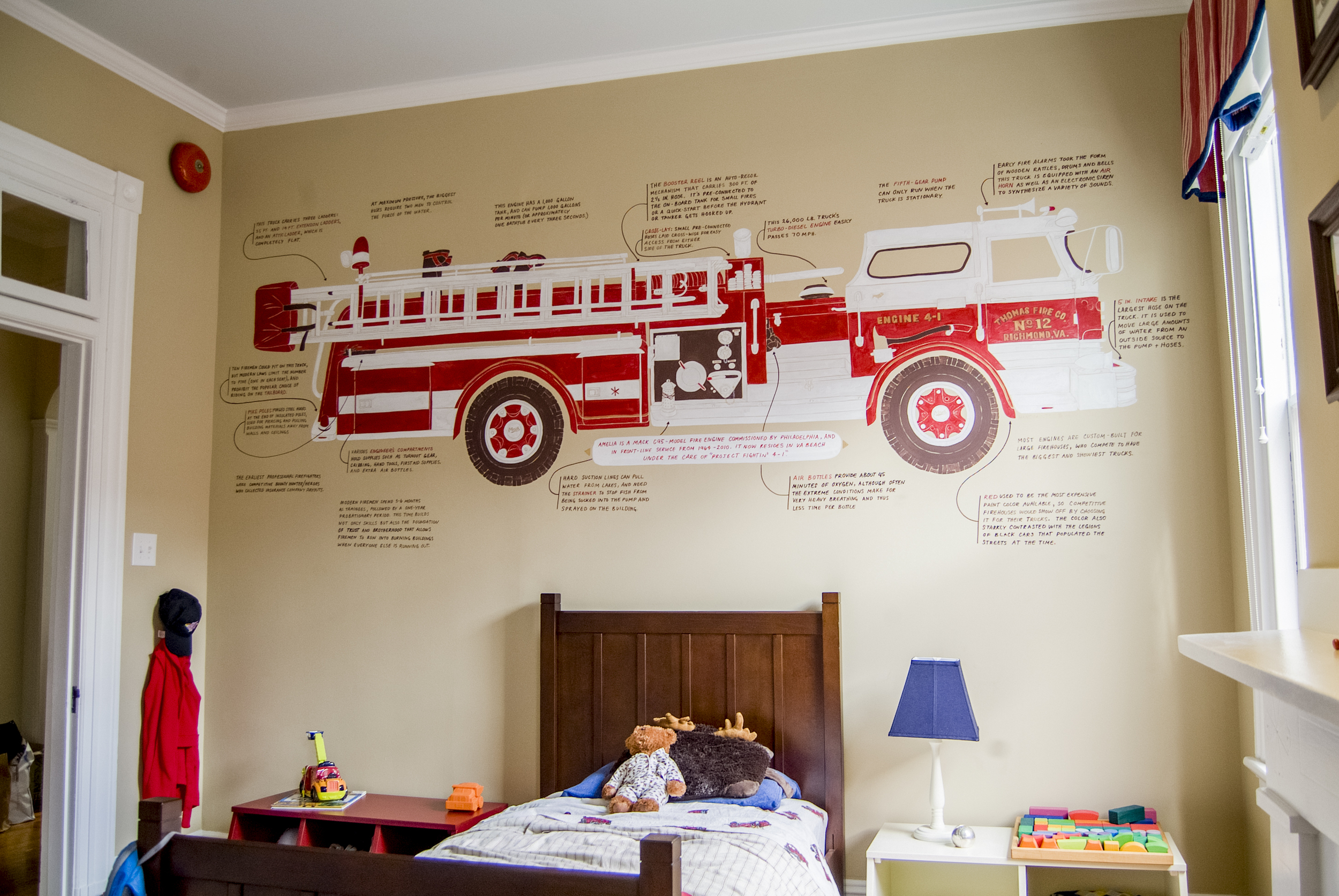
The Carleys’ son Thomas is really really into firetrucks. He can identify more kinds of firehouse-related vehicles than I've even heard of. (Do you know the difference between a tanker truck and an engine? Thomas does.) He was already well on his way to having a firetruck themed room before I came along.
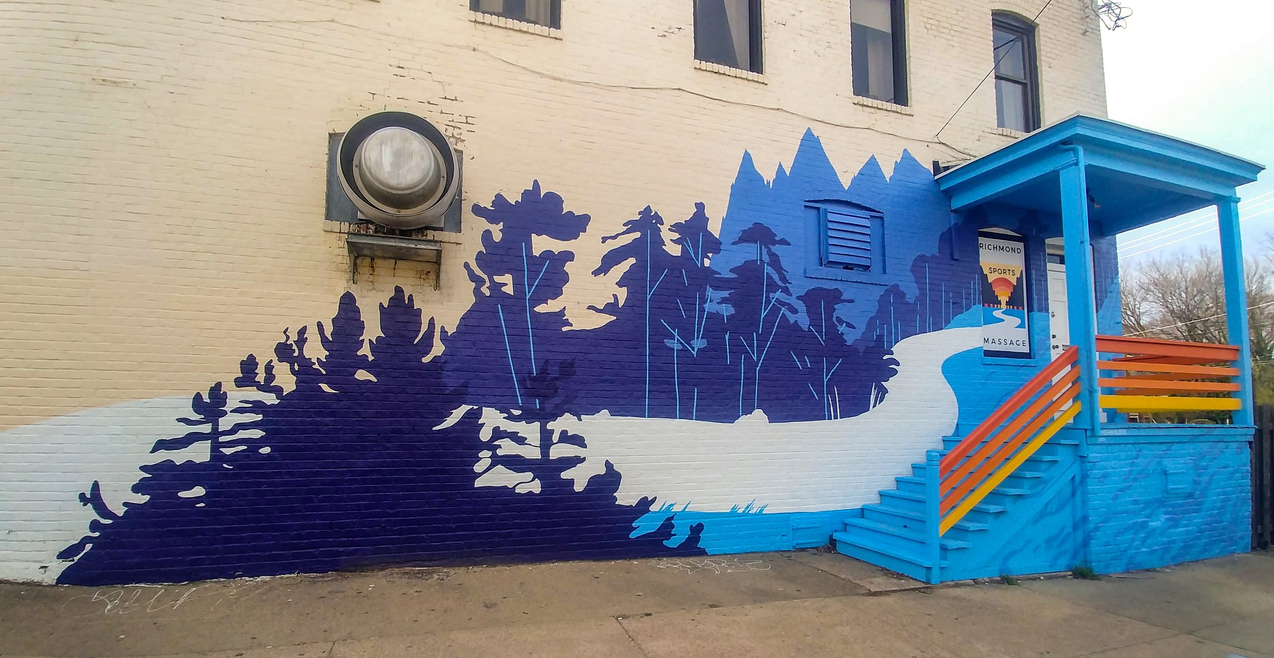
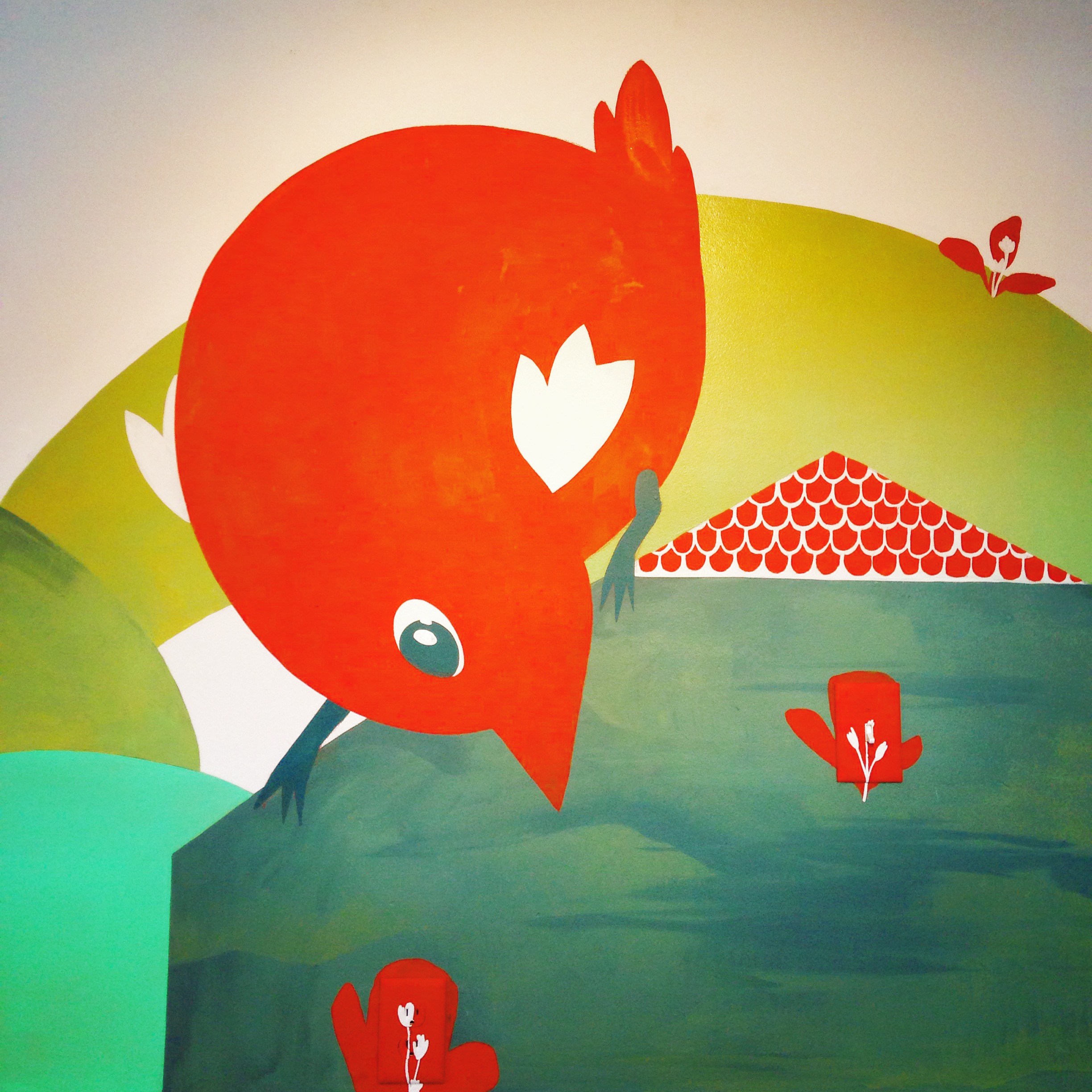
HerrSuite was the Artist of the Month at New Normal Apparel, a local shop that designs, fabricates, and screen-prints clothing and accessories. This involved two custom HerrSuite prints, a solo show of my work, and two murals (one of which I painted live at the show opening.)
After two months (bonus time!) the murals were painted over to make way for the next artist.
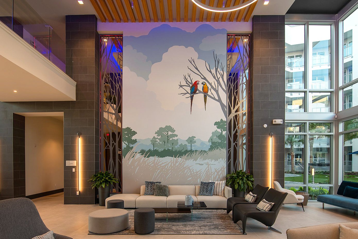
This office in Glen Allen houses support for all of the Kroger grocery stores in the Mid-Atlantic region. I got to bring some easy, fun imagery into their entryway to greet employees, visitors, and the many many shipping and receiving workers that flow in and out of this space every day.
The imagery of this design was inspired by Kroger’s Zero Hunger / Zero Waste mission:
Zero Hunger | Zero Waste is Kroger’s mission and goal to eliminate hunger in our communities and waste in our stores by 2025. We donate food we can’t sell (and even some we can sell) to food banks, we compost, recycle, etc. at all levels of the business to support our communities and protect the earth. These goals are very important to us and drive a lot of charitable giving and community events, too.