
lettering
LETTING WORDS MAKE AN APPEARANCE
SOME SIGNS, MOSTLY NOT
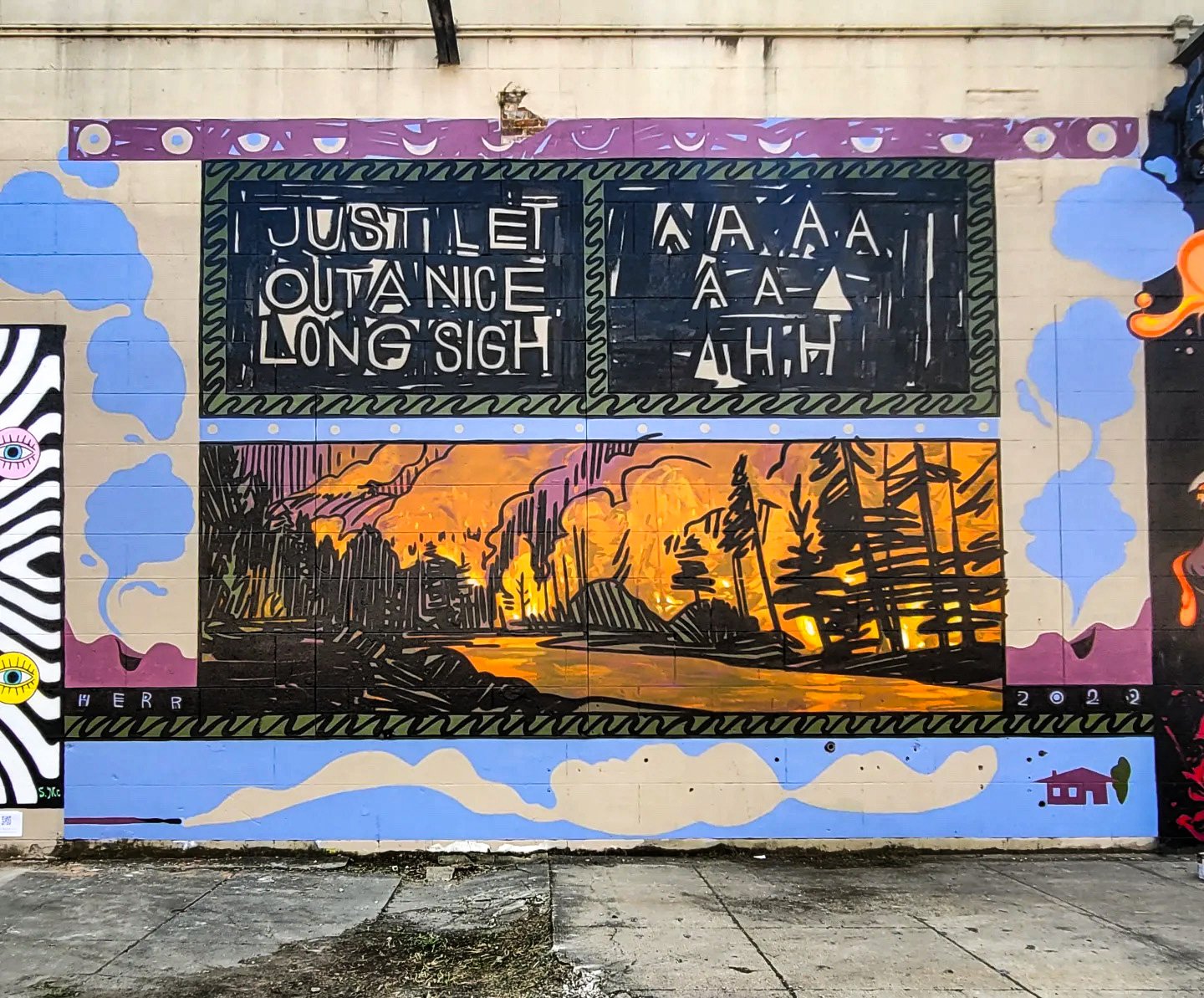
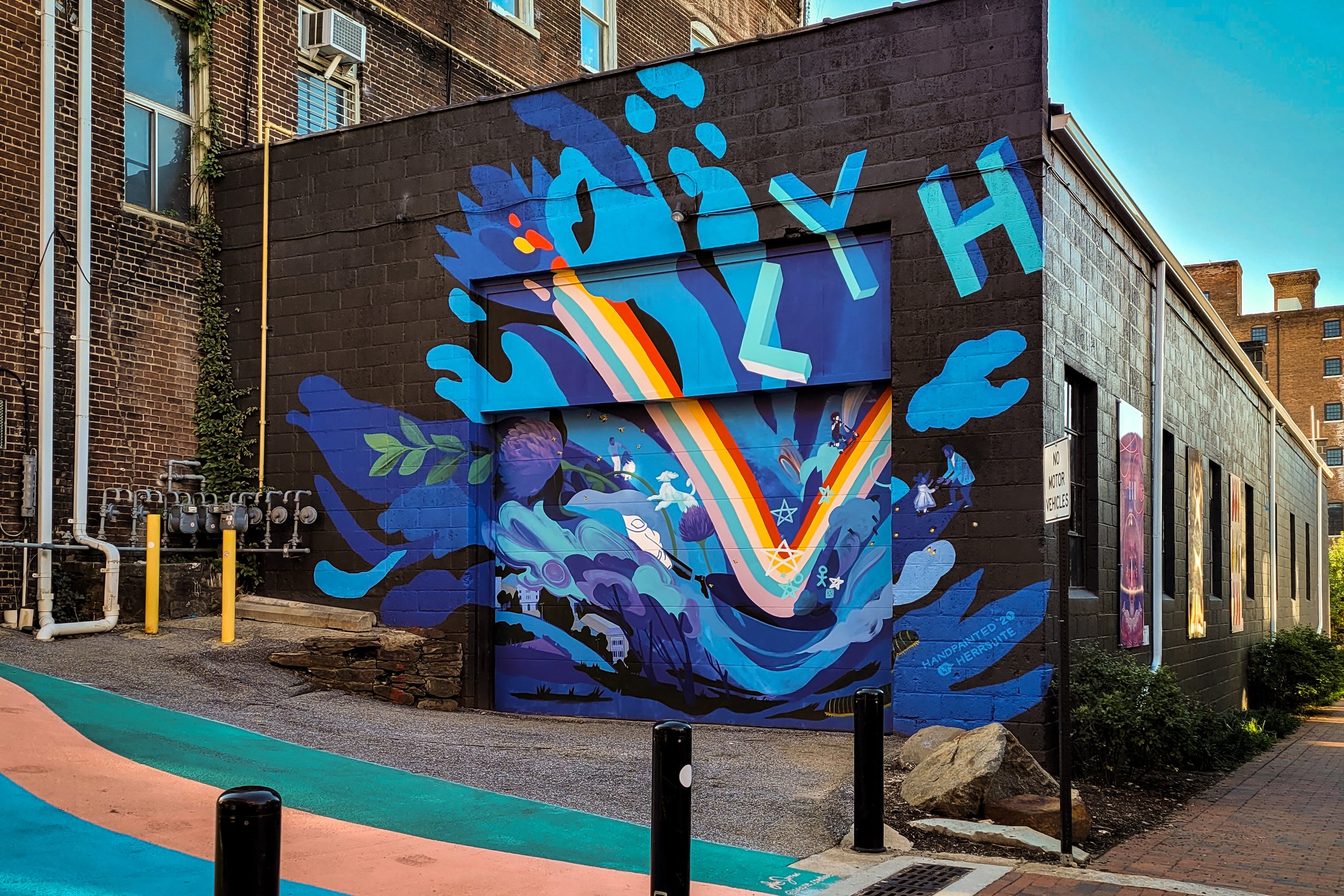
The street art festival is my favorite event in Richmond hands down. I feel so lucky to have the opportunity to paint in such an iconic place with so many iconic artists! This one is open to your interpretation, and I'd love to hear your take on it, or just hear you take a big breath ;)
Thanks to my wall neighbors Chris Visions and Sean McClintock and to my whole famdamly for showing up to say hi. Also big thanks to Zammuto for writing a song that kept me company and helped me and my friends laugh during some of the most baffling moments of 2020. It Can Feel So Good is a banger forever.
The fire is from a photograph of a wildfire that started in a national park in Tennessee near Chattanooga and Dollywood in 2016, and was the most fatal fire on this side of the country.
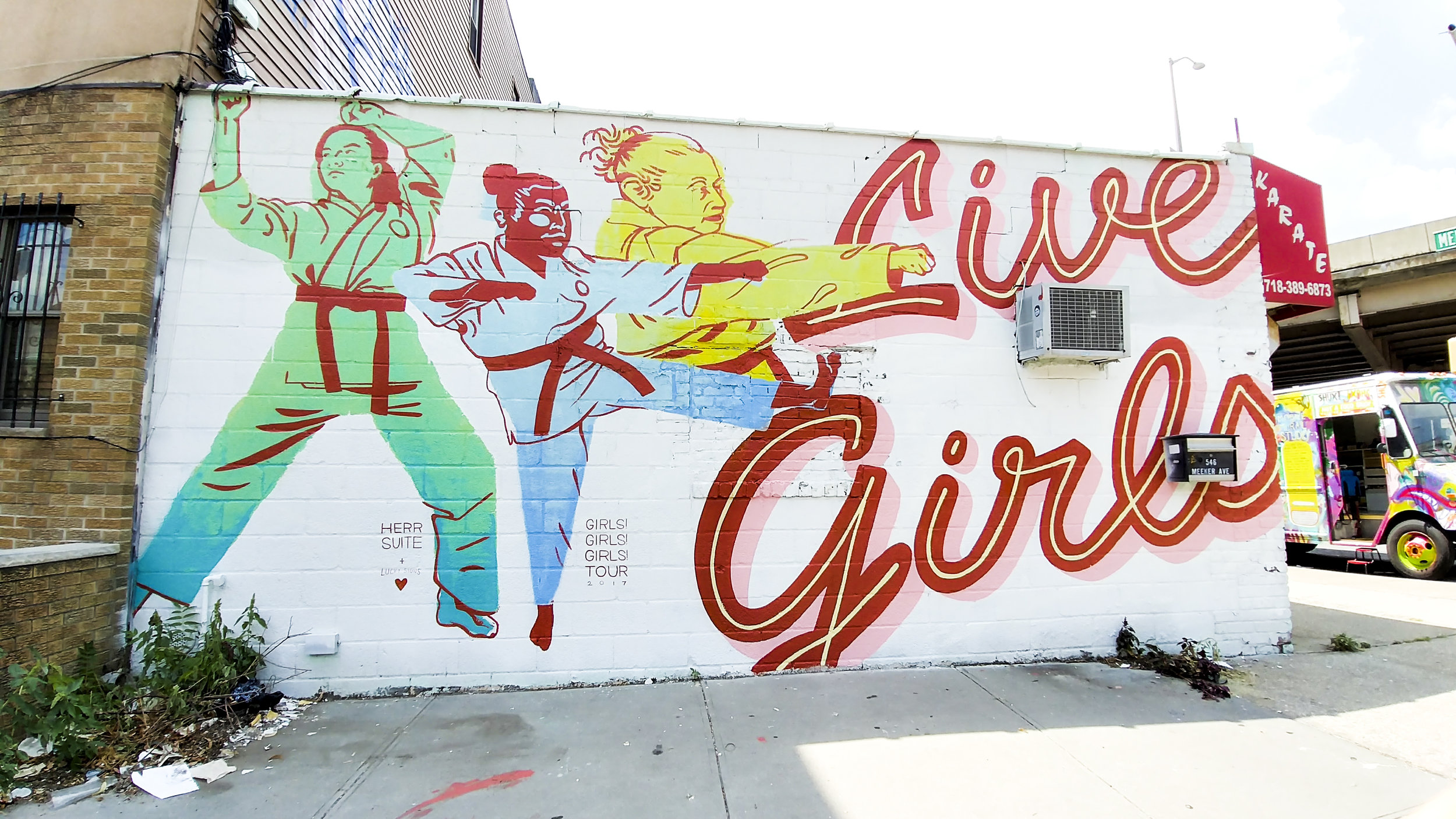
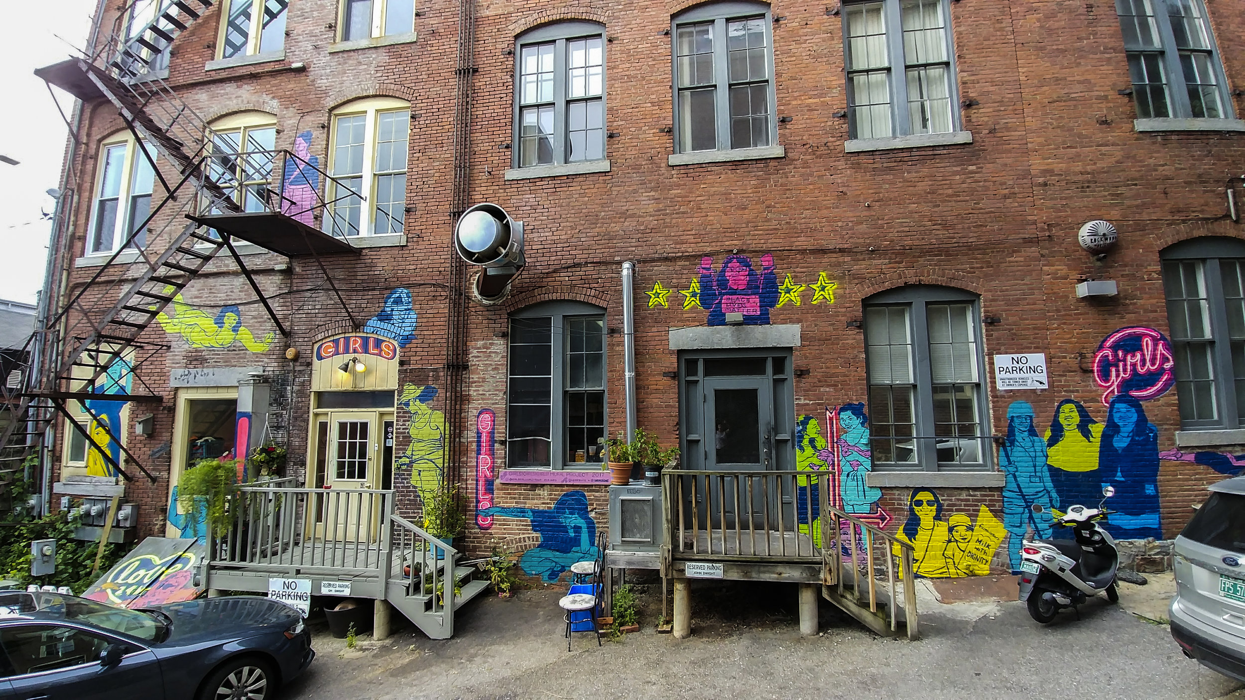
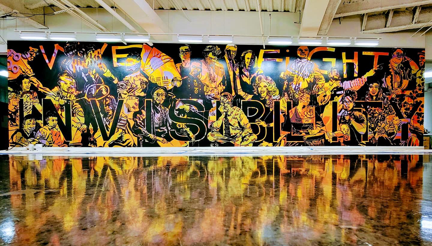
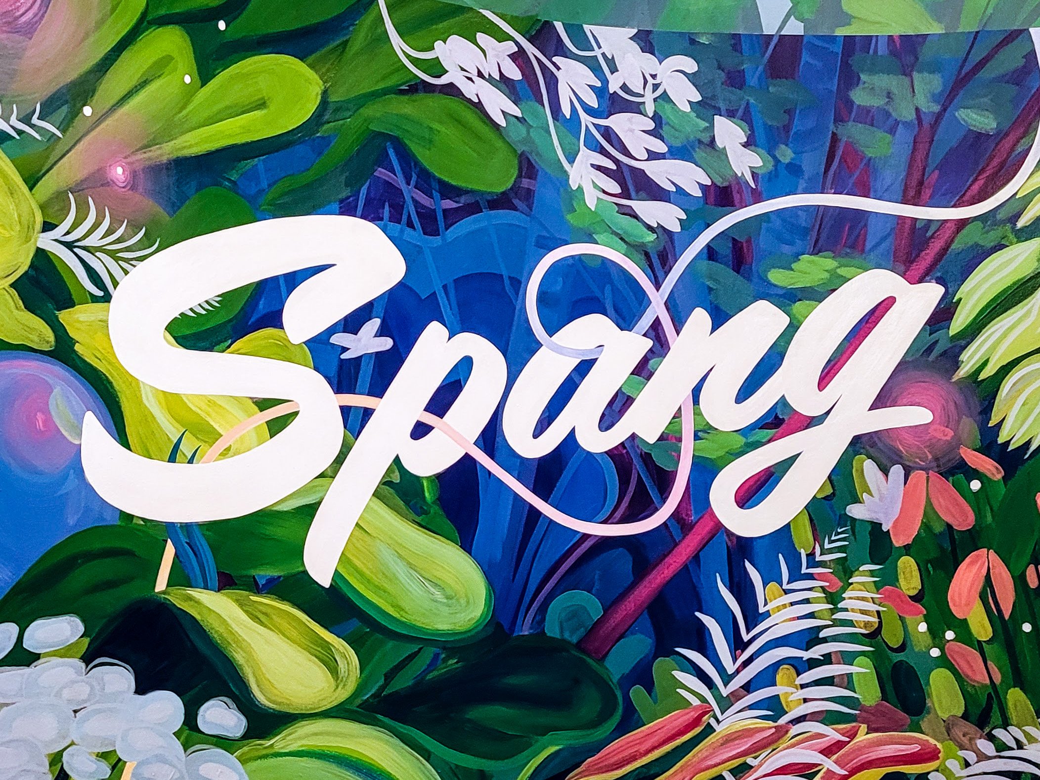
Spang TV is a video production company based in Richmond, with a glorious production space in Northside. THIS space is a smaller, cozier office nestled downtown for post-production. Here, the magic of graphics, animation, color-correction, music, formatting take place. Here, they bring it all together and add the final touches.
This mural in their entryway acts as a sign, but also sets the mood for making the magic happen. I had fun with this opportunity to embellish a typical botanical landscape with luxurious color and imagined elements. The shape of the logo acts as a viewfinder for the lush landscape overflowing the wall - inside the viewfinder, everything is a little brighter, richer, and more intriguing….
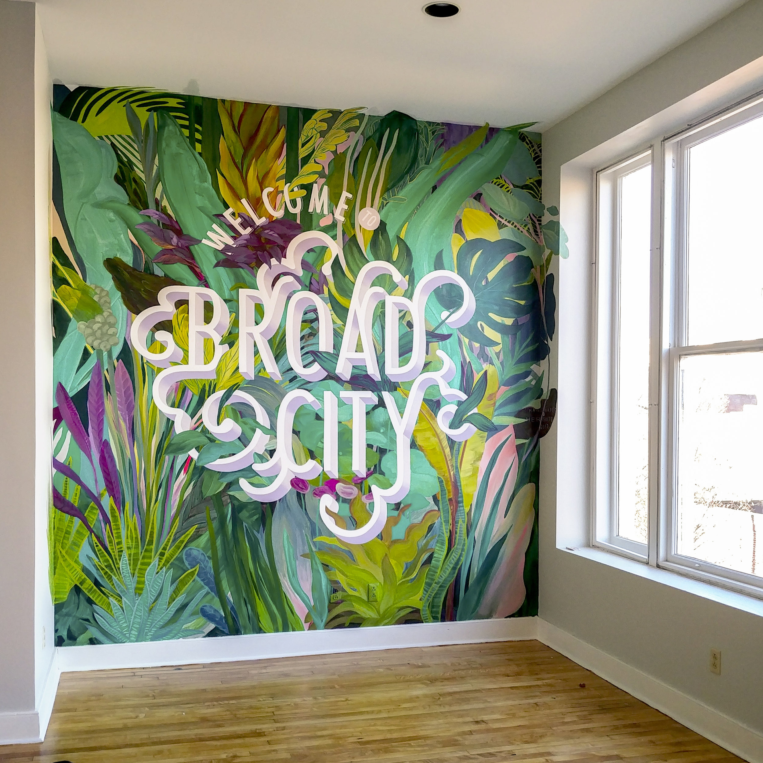
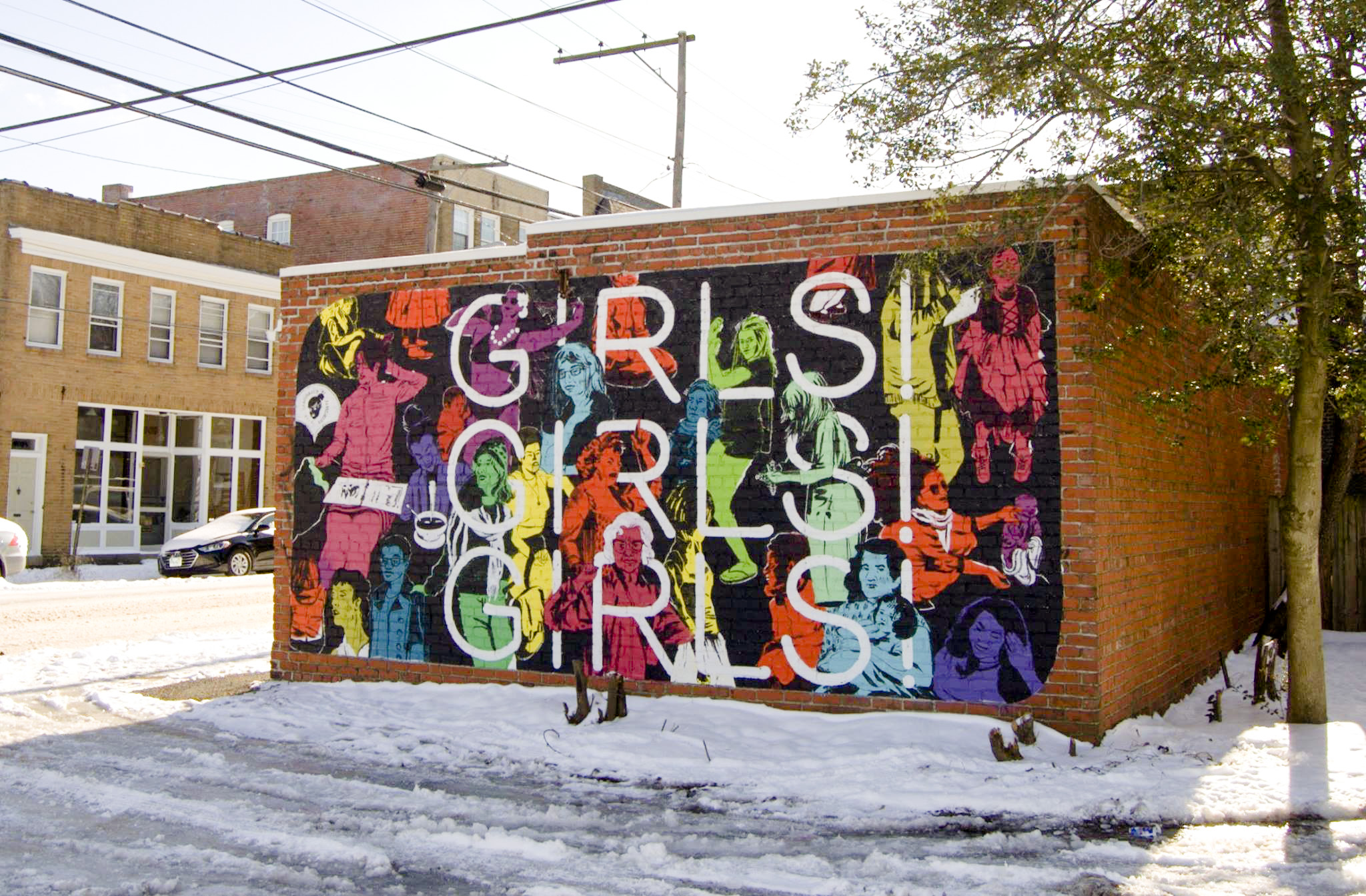
This accent wall was designed for The Broad. From their site:
"The Broad is a MAKING SPACE in Richmond.
A community center where we can learn from each other, a workspace where we can get it done, and a clubhouse where we can connect IRL - a place that exists to make more space for women* in Richmond, in our community, and in our world.
A space to take a meeting over coffee, catch up with a friend with a glass (or two) of wine, put in some work during the 9-5, get your yoga on in our weekly classes, enjoy a workshop or a panel on art or money or flower arranging or love - because we are multifaceted people in a multifaceted world and it's totally cool to be into astronomy AND astrology, curious about super serums AND the supernatural, and invested in the stock market AND the outcome of Bachelor In Paradise.
At The Broad, we're making space so you have space. Space to learn, grow, connect, work, and BE. The Broad is a space for us.
*The Broad is an LGBTQIA+ Friendly Space that does not have a binary view of womanhood"
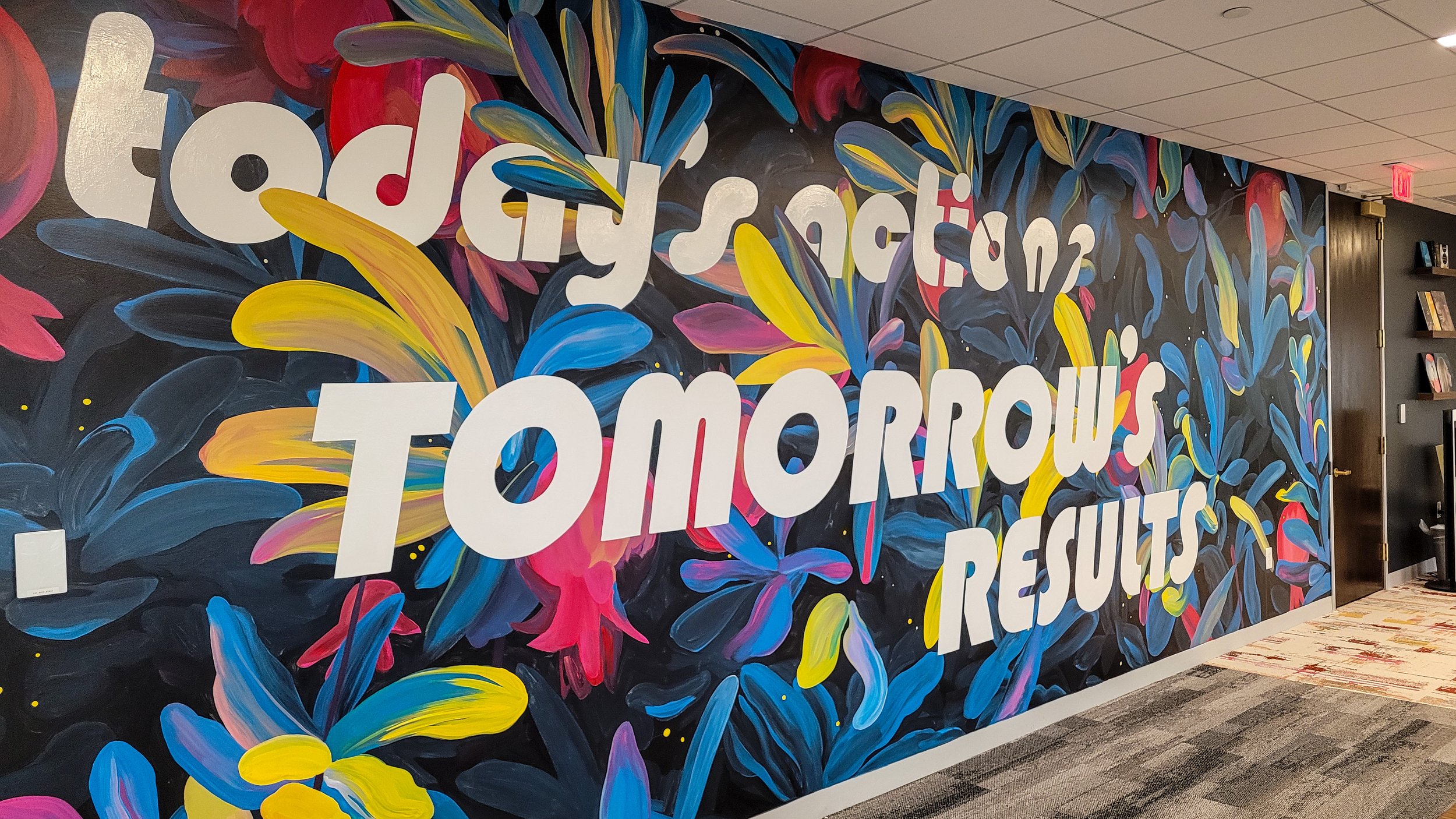
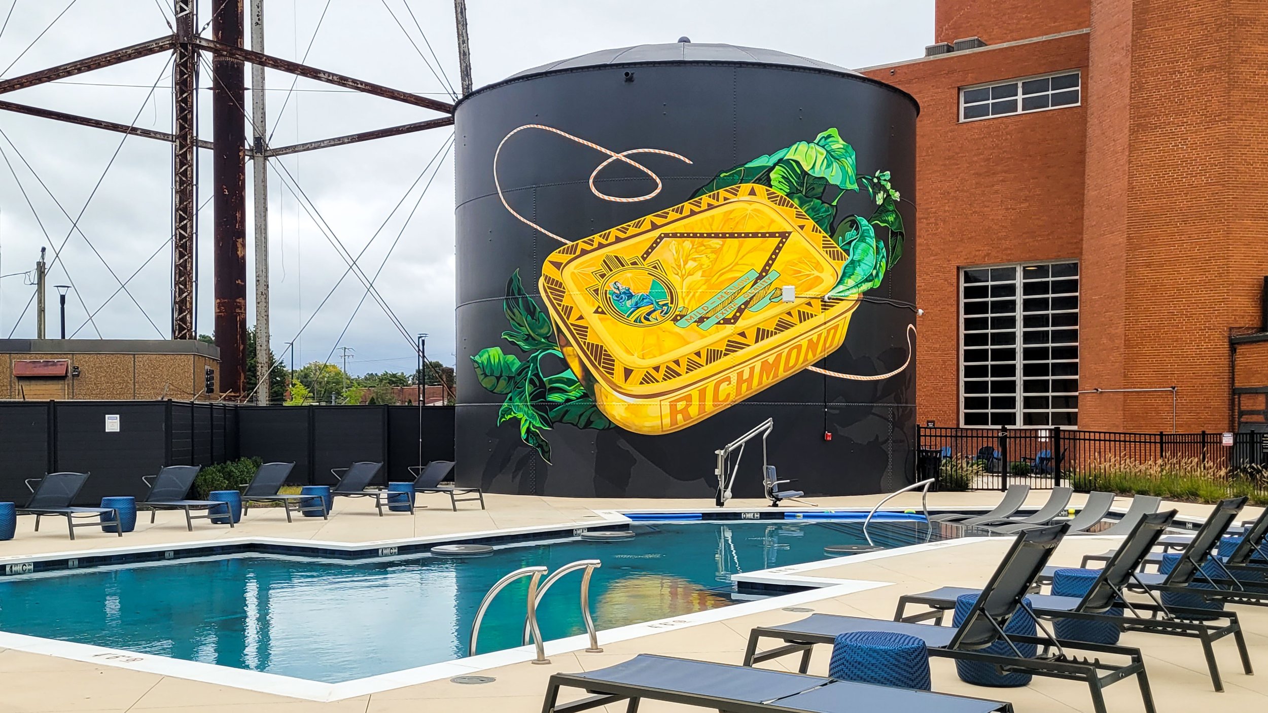
Nicole Bourgea, a prolific muralist from DC, invited me to collaborate on this fun and decorative piece for the Model Tobacco Lofts in Richmond. After chatting online for a few years, this was an opportunity to meet in person and jam on a design together!
The complex is an impressive brick factory from Richmond’s notorious tobacco-based economic history, with many hints of art deco design throughout the property. We took the excuse to get inspired by local history, visiting the Valentine Museum and the VMFA to find some examples of tobacco ephemera and art deco design. Our custom tobacco tin references this time period, the cash crop itself, and the luxurious feel the developers aim to provide for their tenants.
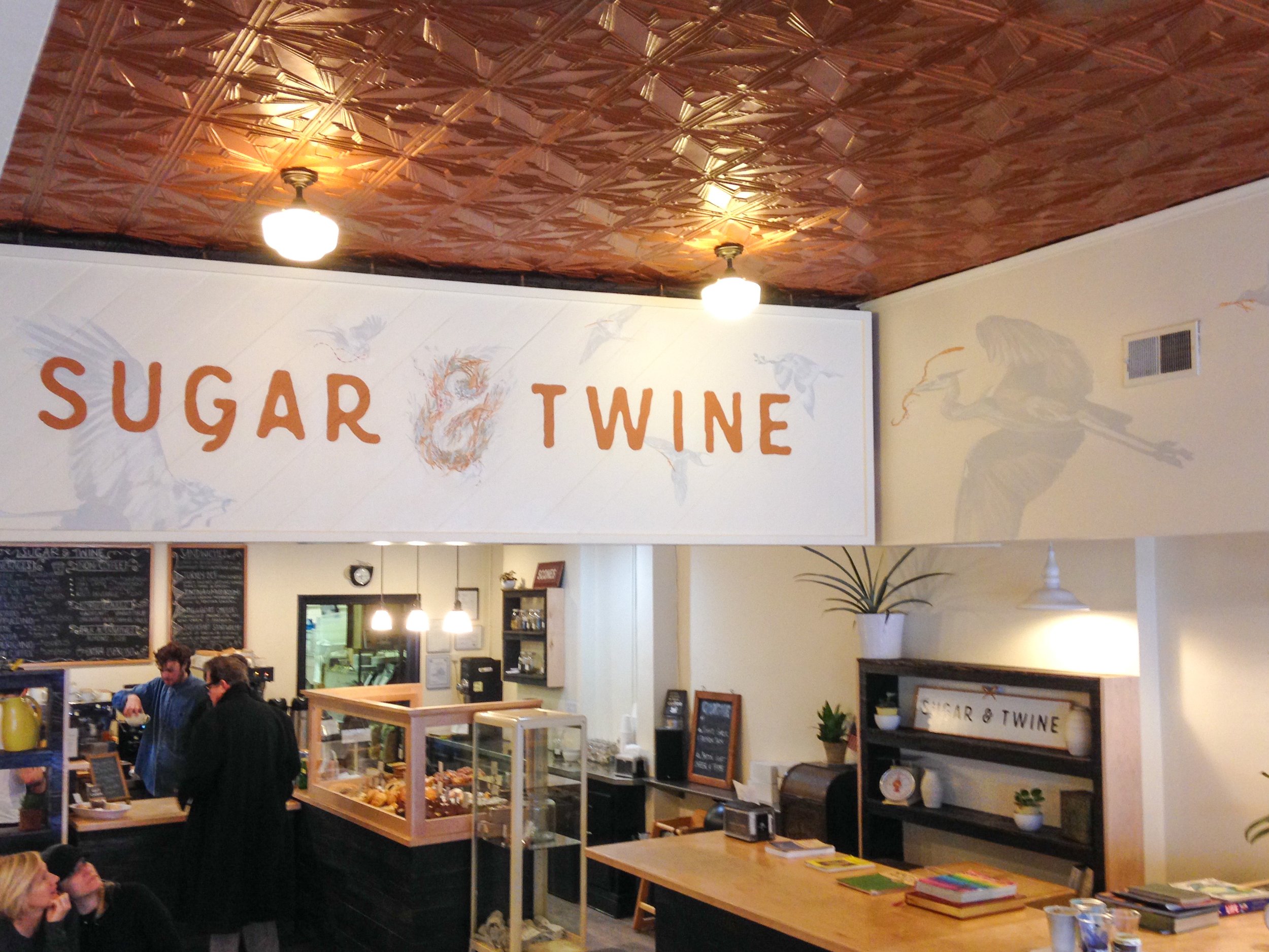
Definitely definitely go eat at Sugar & Twine, best cookies, best sandwiches, best people <3 I worked with the owner to select a range of birds native to the area, all gathering nesting material appropriate to their species, flying together to build a nest at the center “&” of the logo.
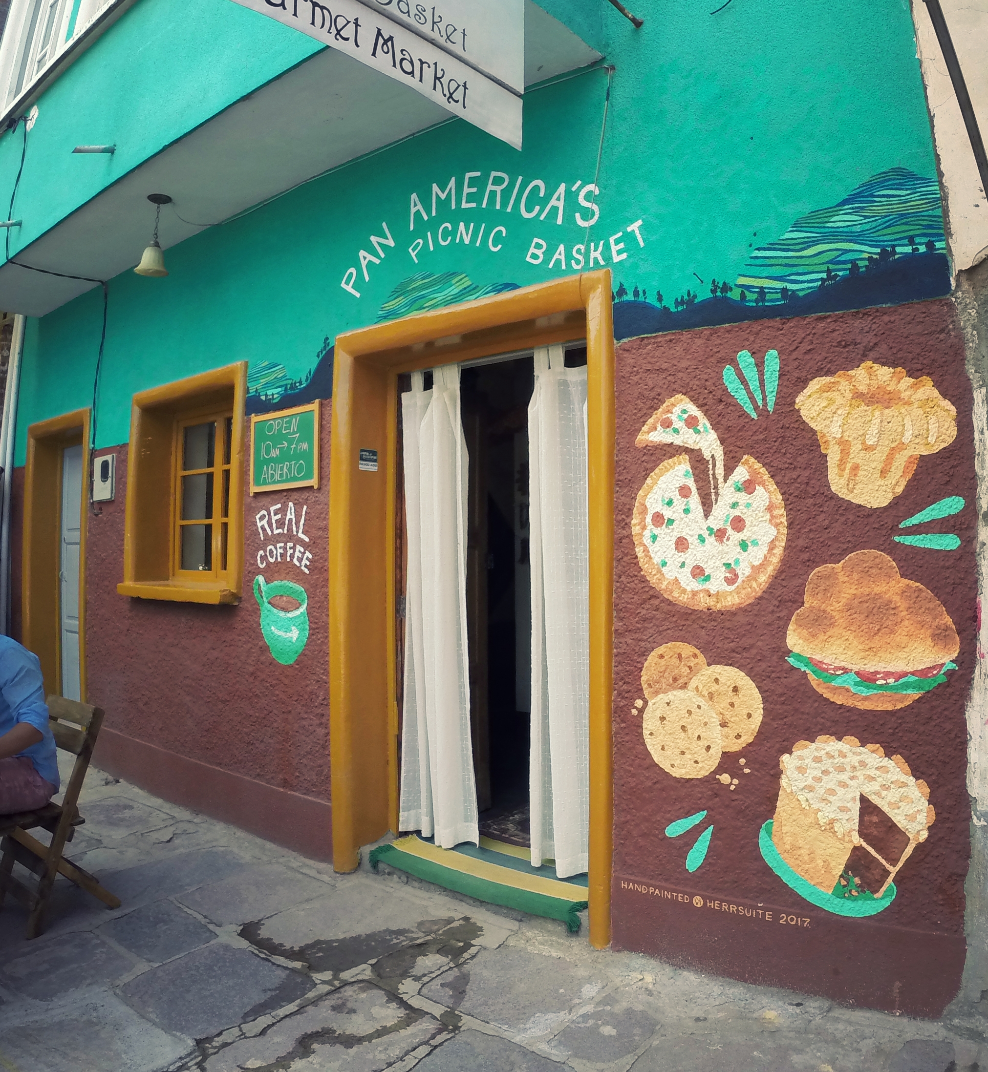
Painted for a tiny pizzeria / bakery / cafe tucked into a corner of Bolivia, on the town square in Copacabana.
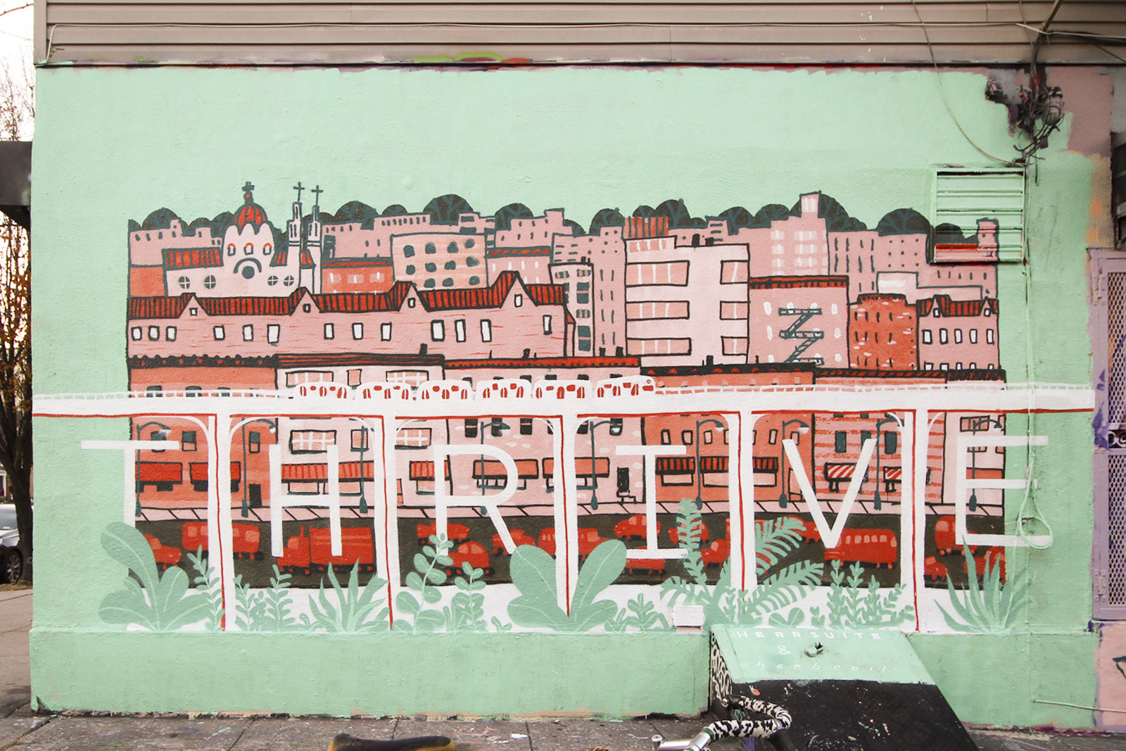
My friend Ellie and I threw this cutie up in just NINE HOURS! Basically from sunup to sundown (winter sunlight, what can i say) we did some quick painting and decision-making, not to mention learning how to use spray paint for the first time. The design is based on a print Ellie did of this neighborhood (Bushwick), smooshed with my Thrive motif.
This is a communal wall offered by a spray paint shop called Low Brow Artique, which means we painted over someone else's art to put ours up. In turn our mural was painted over after just two days - unusually fast for that spot, but our image was also a pretty unusual style in a neighborhood totally covered in all kinds of graffiti. Next time, we're determined to find somewhere a little more permanent.
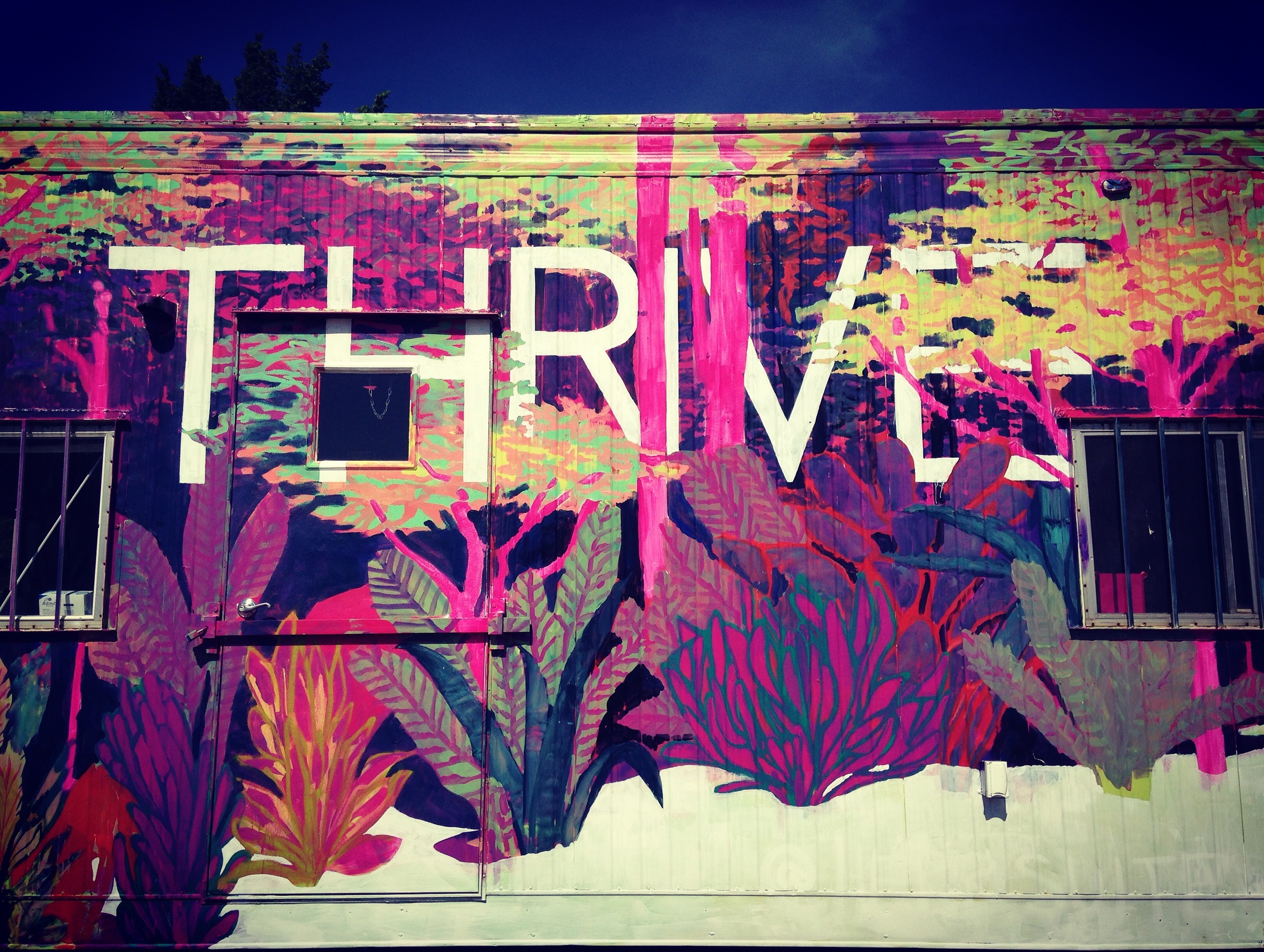
2016 is my second year participating in the RVA Street Art Festival, which is a local event run by some of the most active art proponents in the city: Ed Trask and Jon Baliles. This was the VIP lounge for the duration of the festival - I painted the front, and Sir James Thornhill painted the back.
This design is based on a little silk painting I did a while ago, crossed with a small piece I did for Light Grey Art Lab's show Botanica. The word "thrive" has really stuck with me, and I think it's a message I'm willing to repeat over and over. Words are often a natural addition to a lot of my design solutions, but I avoid them because I think they narrow the possible interpretations of an image. Sometimes, however, they amplify or focus the imagery in a totally positive way.
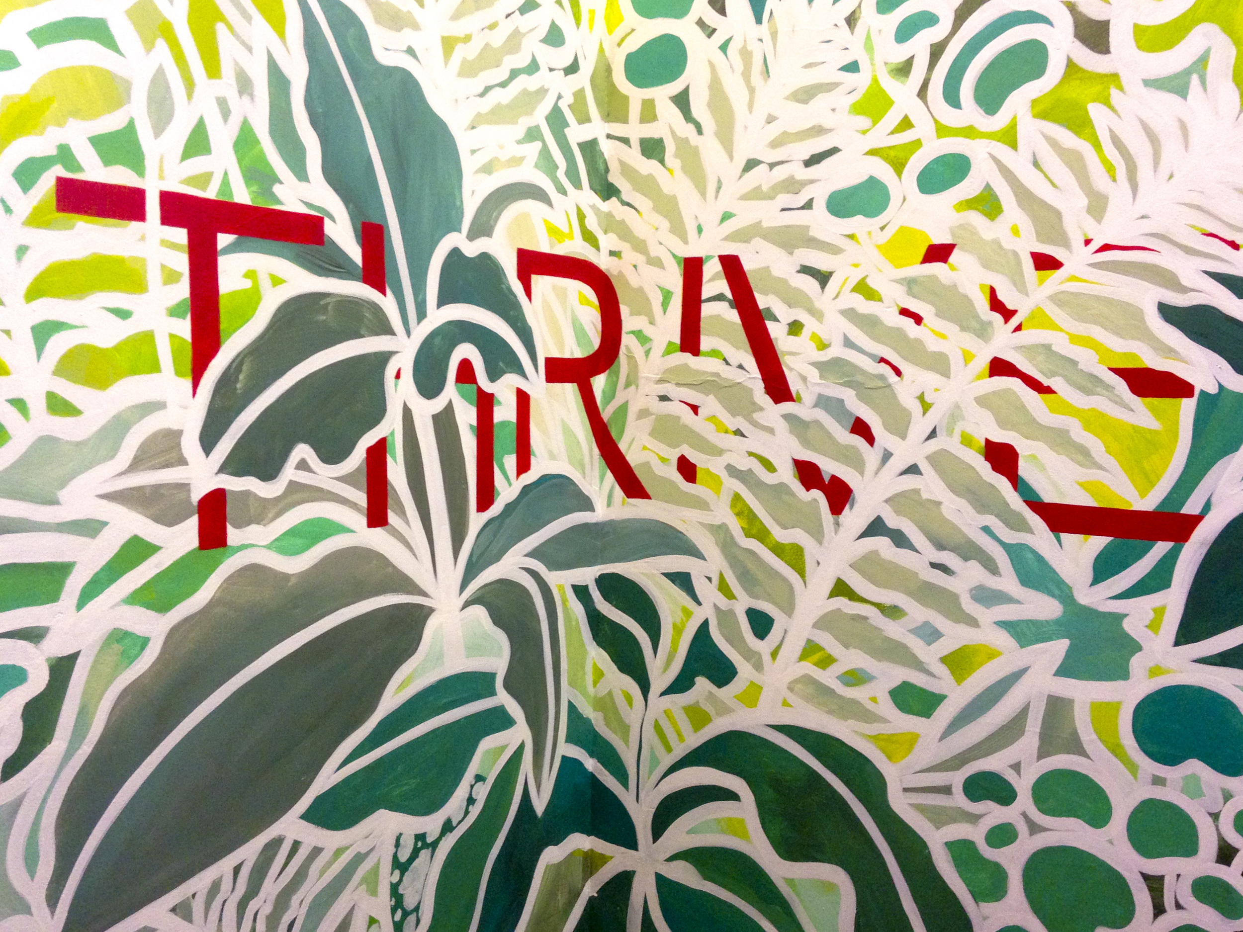
Cobalt Studios is a top-tier scenic painting studio in White Lake, NY. I was lucky enough to spend part of a summer there learning about scenic painting techniques with the inimitable Rachel Keebler and Kimb Williamson. As part of a much longer trip, I found some time to stop back by Cobalt and throw some paint around in the house where students live while enrolled. My friend Sarah Abernathy gave me a great excuse to come visit and a helpful hand in the actual painting.
This design is based on a little silk painting I did a while ago and fell in love with. The word "thrive" has really stuck with me, and I think it's a message I'm willing to repeat over and over. Words are often a natural addition to a lot of my design solutions, but I avoid them because I think they narrow the possible interpretations of an image. Sometimes, however, they amplify or focus the imagery in a totally positive way.
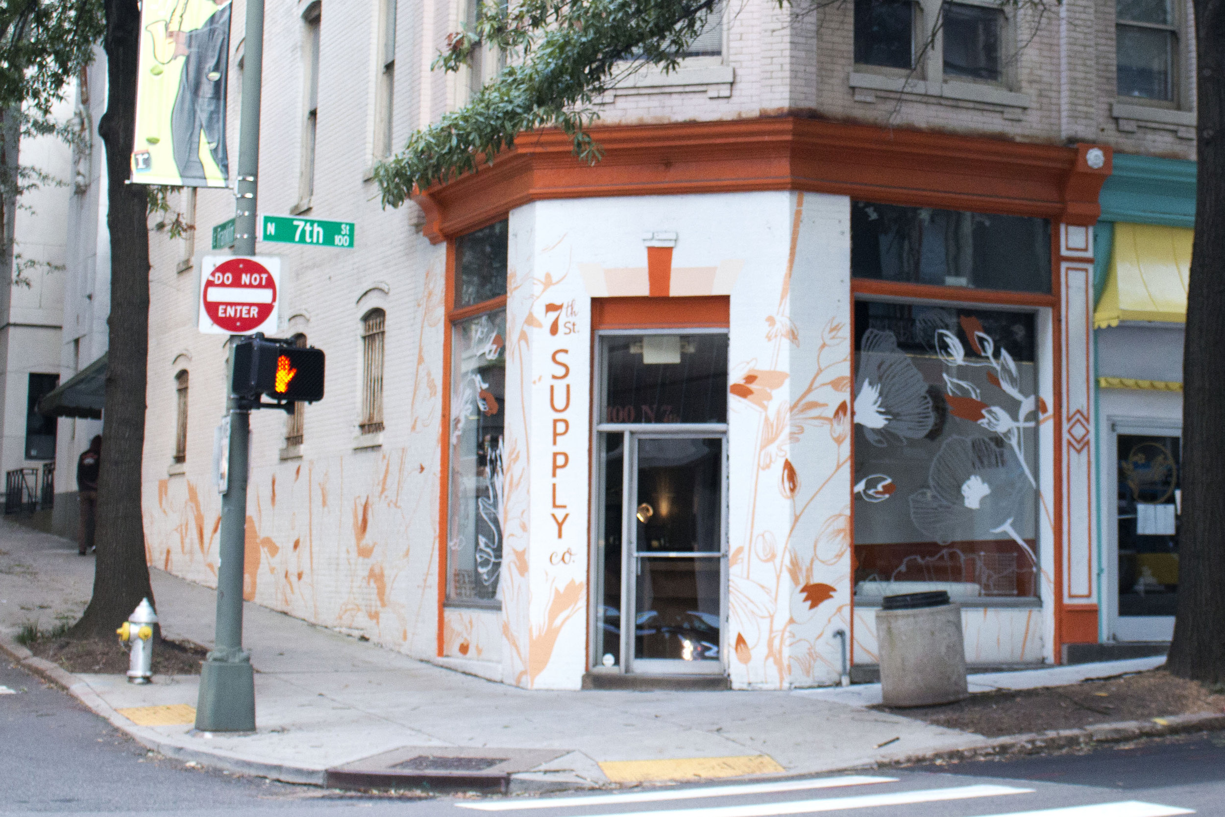
The owner of Sefton Coffee Co. and Apropos is opening a new store just around the corner called 7th St. Supply Co. She asked for a mural that was flowery and subtle, matching the colors that she had already picked for the building's exterior.
To accommodate the giant plate windows, I worked with Cut Cut: a vinyl shop just next door that specializes in working on unique creative projects. They took my design and applied vinyl that carried the flowers from wall to window.
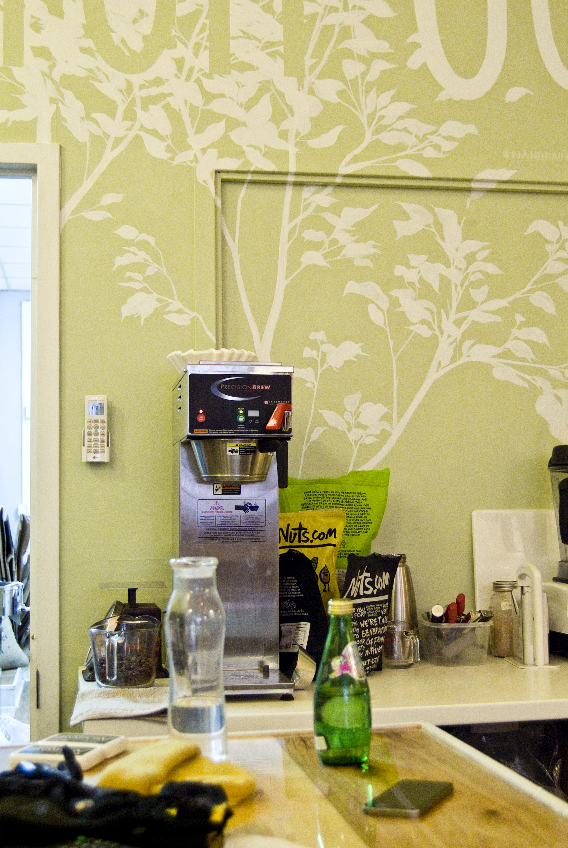
Sefton Coffee Co. is my new favorite coffee shop in Richmond because of their sweet and airy space, extensive menu (for a coffee shop), and friendly folk. I'm lucky enough that in addition to these nice qualities they also had a big blank wall that needed some painting.
I sketched a design which I thought would flow with the organic, soft, and simple feel of the place. It needed to be fairly large without feeling like it was screaming for attention, so I stuck with the very low contrast of white on green (the original wall color). As always I tried to incorporate the architecture and structural flow of the space, in this case by growing the tree up from the door frame and counter, spilling over the molding, and wrapping the words around to the next wall.
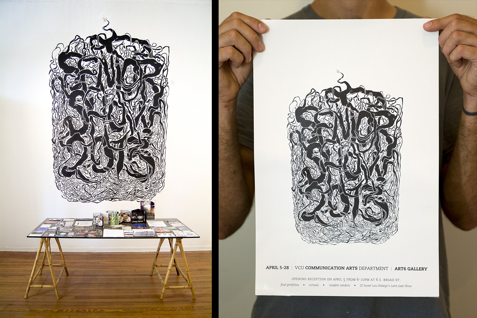
Starting in 2012, I initiated and organized the senior portfolio show for my graduating class at VCU's Communication Arts department. This epic, year-long undertaking gave me experience with event coordination, booking a space, volunteers, printing, hanging a show, liaison duties, and delegation, not to mention preparing work for a show and selling art.
The best part of this process was painting a mural for the show.
The mural design was key: the image would not only be a 13 foot tall announcement welcoming people to the show as they entered the gallery, it would also serve as the identity for the show, get printed on posters and postcards, and function online for social media and the department's website.
This design was inspired by the imagery of a potted plant - when you pull it out to re-pot it, its roots have likely spiraled and snared around each other, outgrowing their current container but with nowhere to go. For us, graduation was a time of release and exposure. All packed in cozily together as we were, it will take us a few stretches now to find our new shapes.
With several volunteers helping, I was also able to make a spotlit list of all the artists participating in the show, as well as hand-label each artist's spot with their name.
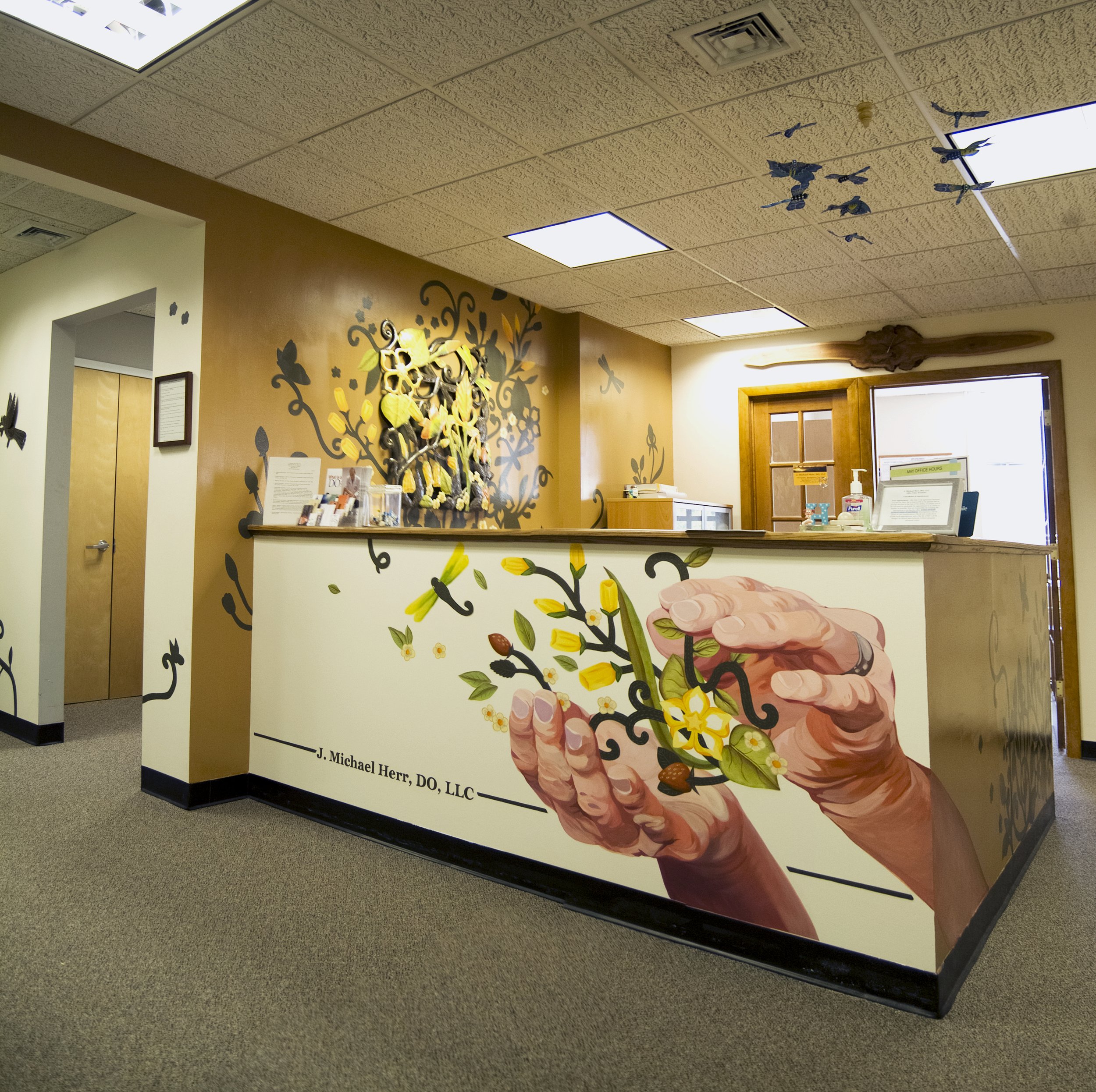
Mike is a Doctor of Osteopathy (J. Michael Herr, DO) who recently took over another doctor friend's practice. The practice came complete with his friend's well wishes, a lot of his mail, and his old office.
He redecorated the office with lots of beautiful artwork from Ten Thousand Villages, but the reception area still felt pretty bare. Interested in giving the space more personality, warmth, and life, he asked me to paint a mural that included some of the Ten Thousand Villages artwork.
We decided that Mike's hands themselves would be a strong symbolic centerpiece for the design, since a doctor of osteopathy commonly treats his patients by using his hands to manipulate their musculoskeletal systems. The accent walls bring color and warmth, and give the reception area definition.
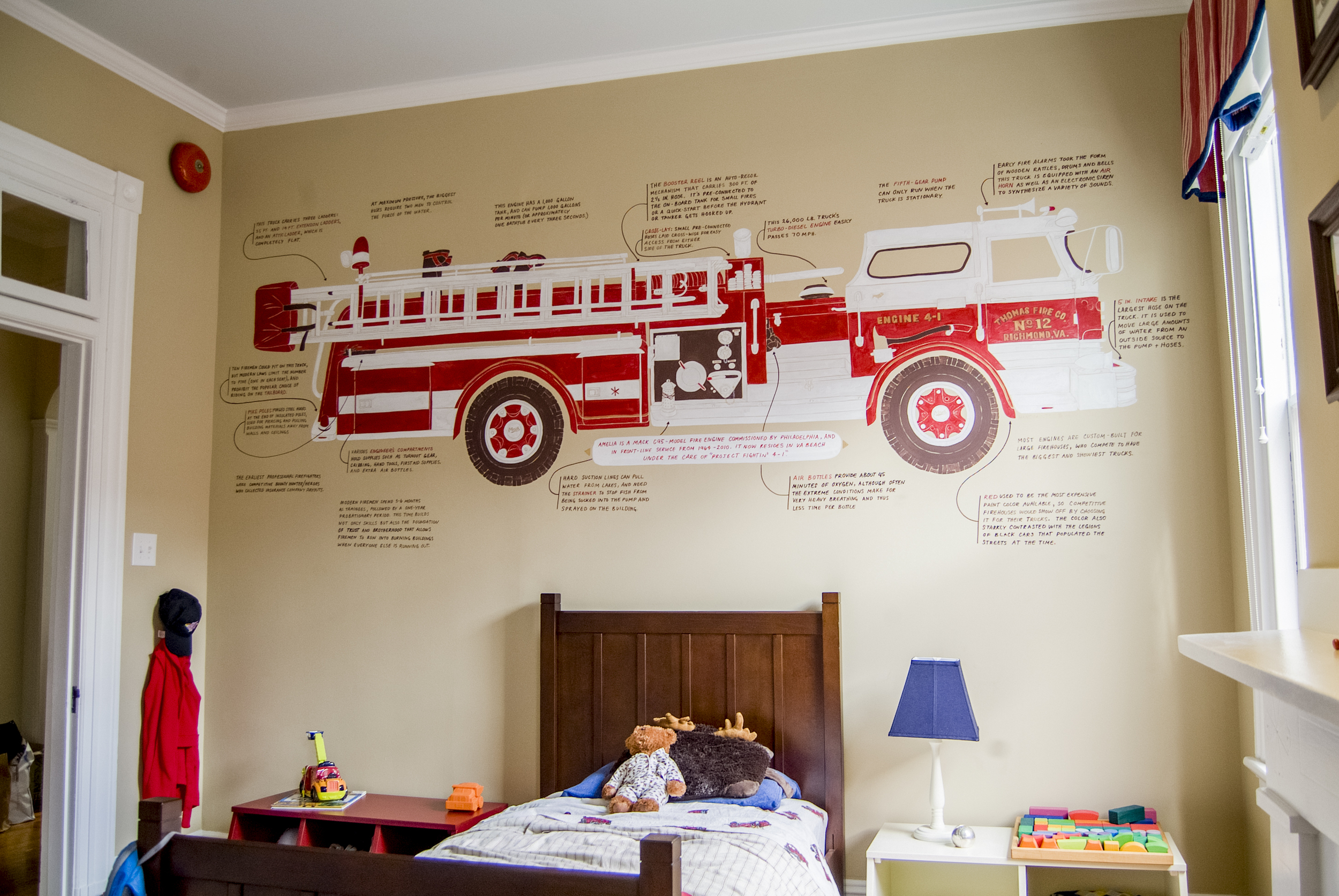
The Carleys’ son Thomas is really really into firetrucks. He can identify more kinds of firehouse-related vehicles than I've even heard of. (Do you know the difference between a tanker truck and an engine? Thomas does.) He was already well on his way to having a firetruck themed room before I came along.
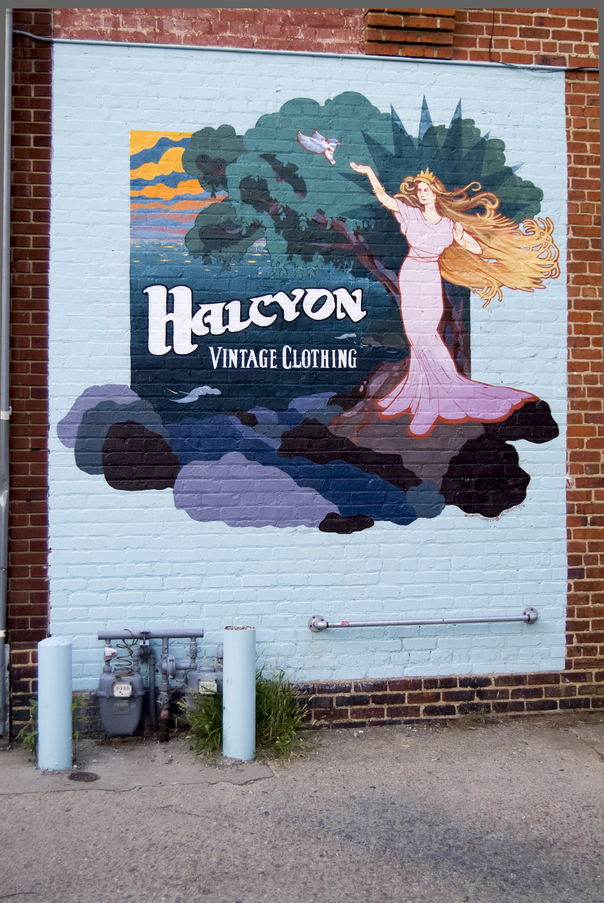
Halcyon Vintage is a vintage clothing shop established in 1983 by the lovely Connie Carroll. It's a staple of the Robinson St / Main St shopping area, and (I'm told by experts) a real hidden treasure for those interested in authentic vintage apparel.
For years the alley-side of the shop has been distinguished by a wooden sign by Billy Pickett, a veteran Richmond sign-painter. As with any wooden sign though, this one finally bit the dust earlier this year and Connie decided to replace it directly on the wall itself.
I worked with Connie to design a mural based off of the original design, which is an illustration of the myth of Alcyone. The new version has several subtle symbols representing Connie's two homes of Virginia and Maine: for example, the tree is a portrait of a specific tree on the James near Pony Pasture, and the rocks are based off of the Maine coastline.
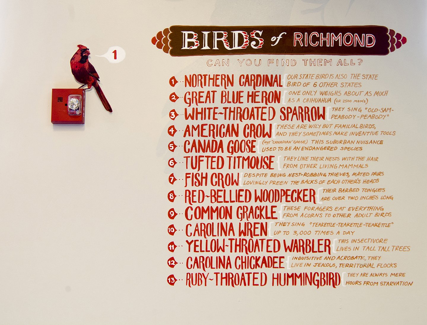
This unconventional mural was a self-motivated school project-come-community service project. Hidden around the back wall of the museum are 13 different birds native to the Richmond area. A list shows the birds to find, and a quick fact about each one.
This project is dedicated to Lois Herr, stalwart bird-watcher, loving grandmother, and amazing lady.
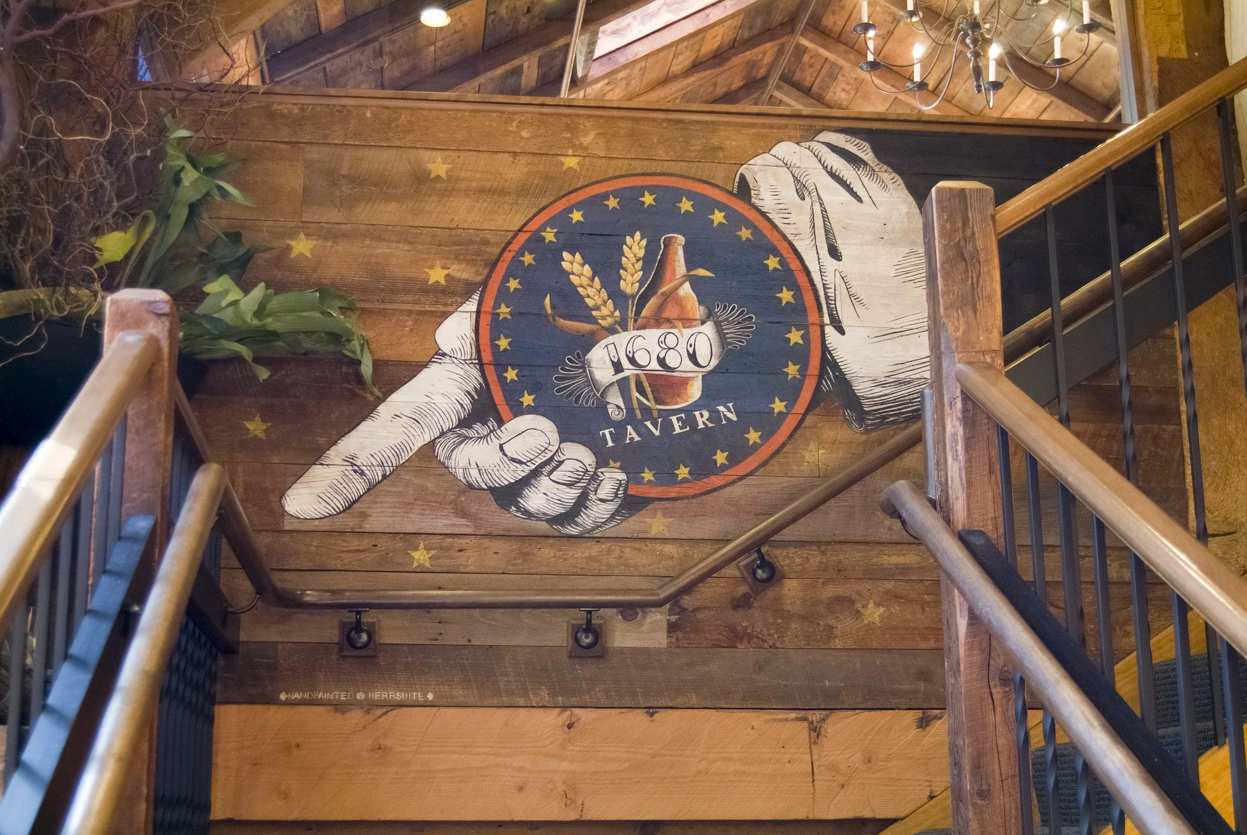
Millwrights Restaurant in Simsbury, CT, offers a beautiful fine-dining experience in a mill house built in the year (you guessed it) 1680. Their upstairs dining room looks out over the mill's waterfall, and their cozy-but-classy bar called 1680 Tavern hides downstairs. To help guests find their way downstairs, they commissioned an americana-style mural to be painted in the stairwell.
This historical building has been elegantly renovated, but still bears much of the layout and wooden timbers from the original 334 year-old construction. For the maximum 'original' feel, I painted directly onto the wood of the stairwell. The raw, unprimed wood helped me achieve a muted, aged look.
In addition to the hand and stars pictured below, a scattering of stars are hidden around the downstairs bar area. If you tell the bartender the correct number of hidden stars, you may get a special "Shooting Star Shot"...!
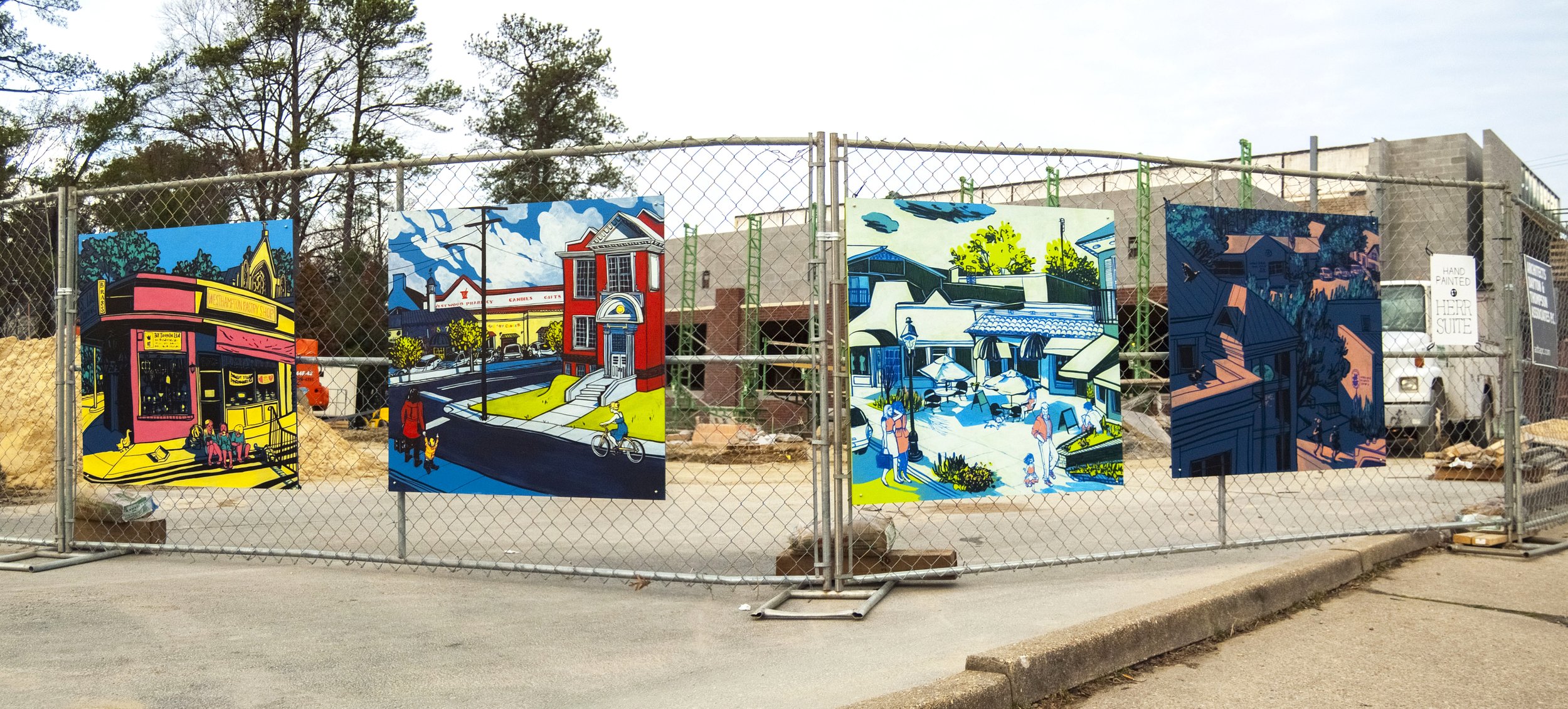
Chesapeake Bank commissioned this mural to beautify the construction site for their first Richmond branch. Designed specifically for the site, the mural runs the full length of the block, capping the corners with detailed portraits of iconic local buildings and sights.
To create these portraits, I started by walking around to many local businesses in the Westhampton shopping area (Grove Ave, Libbie Rd, Patterson Ave) and asking people what they thought of as iconic to their community - which people, buildings, fixtures, events, and etc characterize the area? Many people were somewhat bemused - though they'd lived and worked in the area for a long time, they didn't see their surroundings as "iconic". Nevertheless I ended up with a long list of businesses that had been there for 20, 30, and 40 years, repeated imagery like the streetlights, and groups of people like joggers and shoppers. (Many subjects were mentioned over and over by those same bemused people - hopefully these images act as a mirror for them to see the lovely character of their neighborhood!)
More details below about different parts of the installation.