
This past month or so has been chock full of design and lettering projects for me. I enjoy the technical process of this kind of work, but I try to pull more towards imagery because that's where I get the most fun and satisfaction out of a job. I've been lucky that these projects were pretty interesting and different from each other, but all the same I'm looking forward to some more image-based projects in the near future.
Here's the rundown of the design and lettering that I've been cocooned in recently:
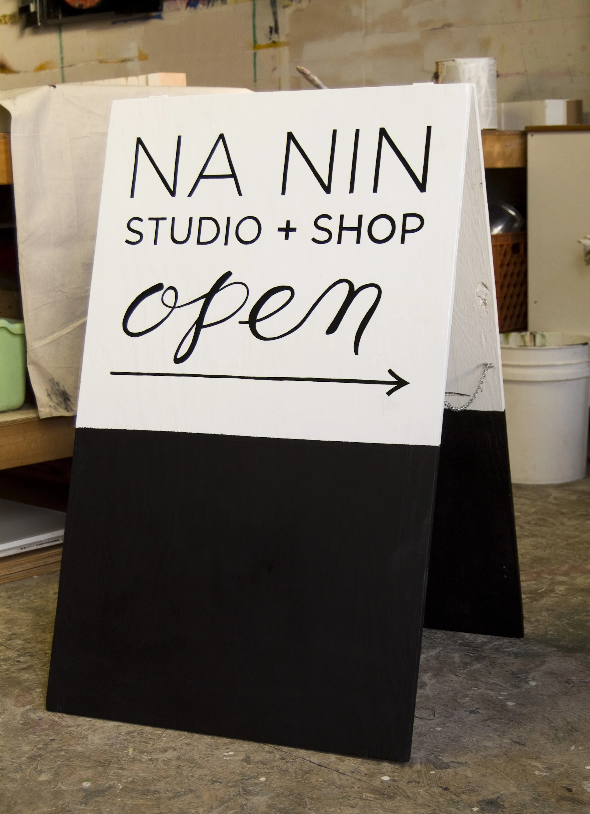
Na Nin (Studio + Shop) : Na Nin is a simple and sweet (and waaaay out of my price range) little clothing store near Lamplighter on Addison. The proprietor needed some signage, which was about as simple as could be because her logo is so spare. (I painted just the "NA NIN" at the top. The window stuff is vinyl stickers.)
Now, normally the simpler something looks the faster and farther you should run from it because its challenges are just harder to see. In this case the challenge was that we didn't have access to the original paint on the shop front, so if I dripped or smudged or miscalculated I'd be in trouble. I'm not sure if I could've done this with any confidence a year ago, but it ended up being almost as easy as it looked :)
The sandwich board was much less risky since I had all the paint colors I needed, and could take the whole thing to my studio (a rare luxury that I try to stay away from for a bevy of reasons). Chalkboard paint makes another appearance on the whole bottom half for that trendy 'dipped' look.
Sefton Coffee Company : Sefton is my new favorite coffee shop in which to hole up with my computer or sketchbook. On my first visit I actually did what many people have recommended from day 1 of HerrSuite: I sat around and sketched something that I thought would be a nice mural idea, brought the drawing to the owner, and asked if she'd like something along those lines painted on her wall. Honestly I didn't expect it to work, but Jennie (the owner) was immediately on board and didn't even want to change anything about my sketch. I look forward to working with her on some future projects too...!
In addition to the mural, I painted a little storefront signage for them - I'd done a house address before, but this was my first big reverse glass-painting job!
Kitchen mural on Boulevard : A mom of two wanted to emphasize some house rules (pulled from Brené Brown's work,) so I painted a giant chalkboard in her kitchen with the rules front and center. All of the black is chalkboard paint so they can write notes and draw all over it. This was another one where I didn't have the original wall paint (it had actually been faux-textured) so I had to be really on top of my drips and measurements. This page has the original poster I was given to work from.
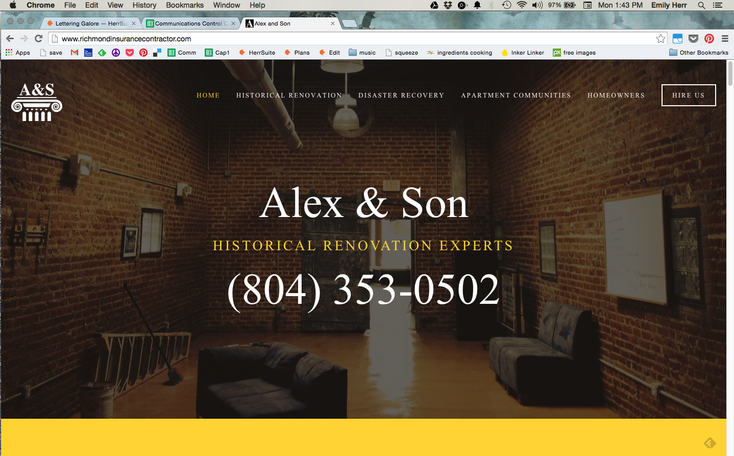
I've also been working on a website re-design for the construction company Alex & Son Contractor LLC, but it's not quiiiite done. While I would not profess to know how to actually build a site, I did design my own site using the tools in Squarespace, and flexing those muscles again has been fun.
Finally, I'm still tooling around with that calendar idea... I've really enjoyed having a year-planner to lay out the grand scheme of trips or projects and mark far-off dates, so I think other people would too. I'm printing a few of them as a test and as gifts, but I probably won't be selling them for real for real until next year when I can plan on getting my act together a little sooner.
HOWEVER if you might be interested in buying a calendar for 2015 please let me know! I can do one-off orders for $45 for a 2' x 4' repositionable wall-sticker print (if you don't want it stuck to your wall, simply leave the backing in place and use thumbtacks ;) They'll have hand-painted signatures ("hand-painted by herrsuite") and big red markers to cross off the days.